Guide
Makeup Product Photography Ideas
Practical makeup product photography ideas for PDPs, shade ranges, texture shots, launch campaigns, and ad creative.
- Guides
- Product Photography Ideas

Examples
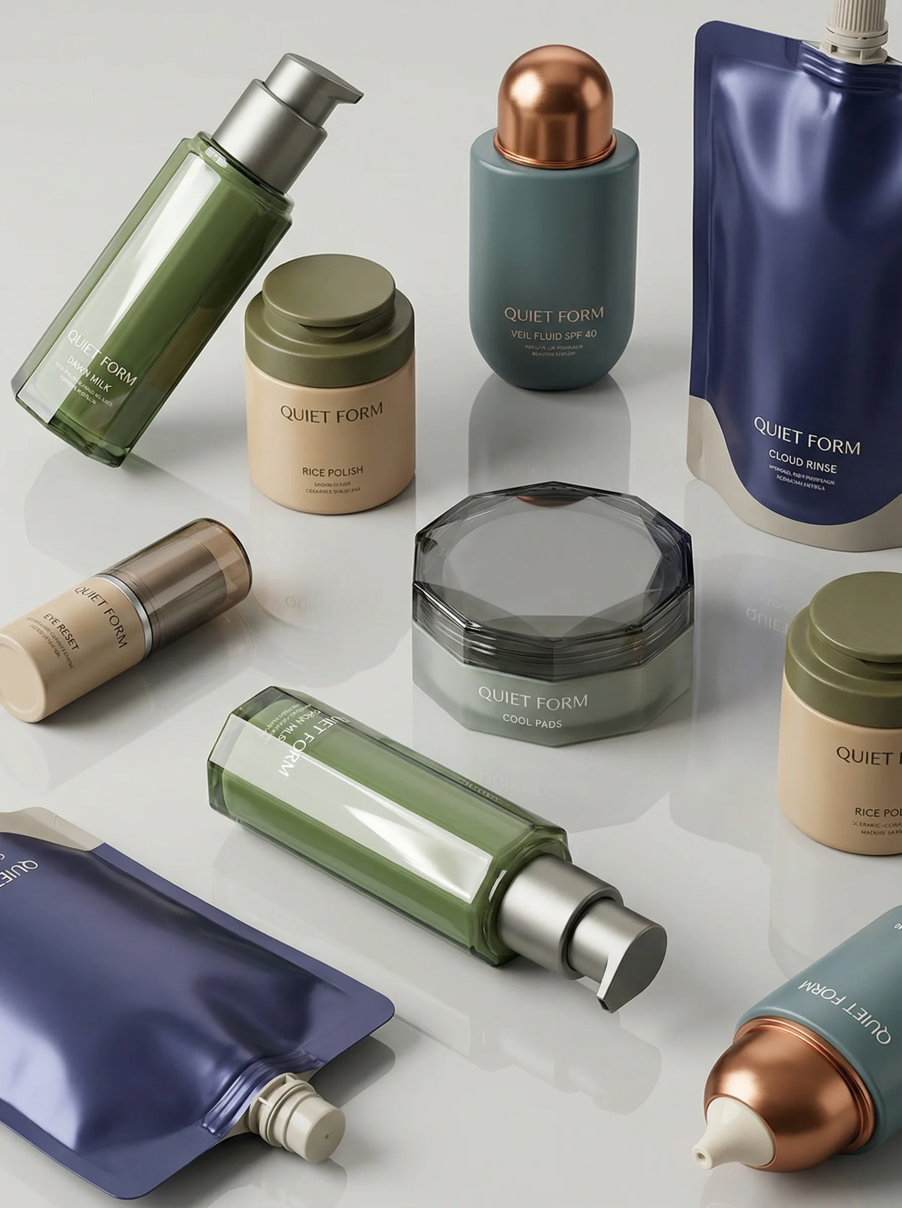
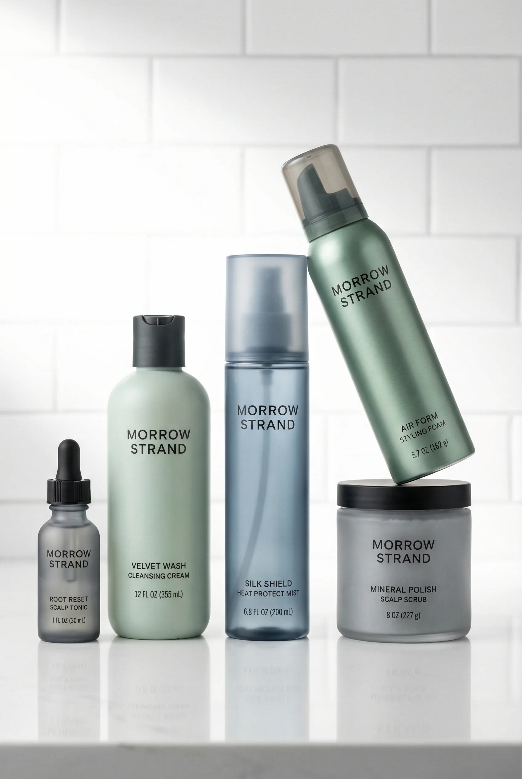
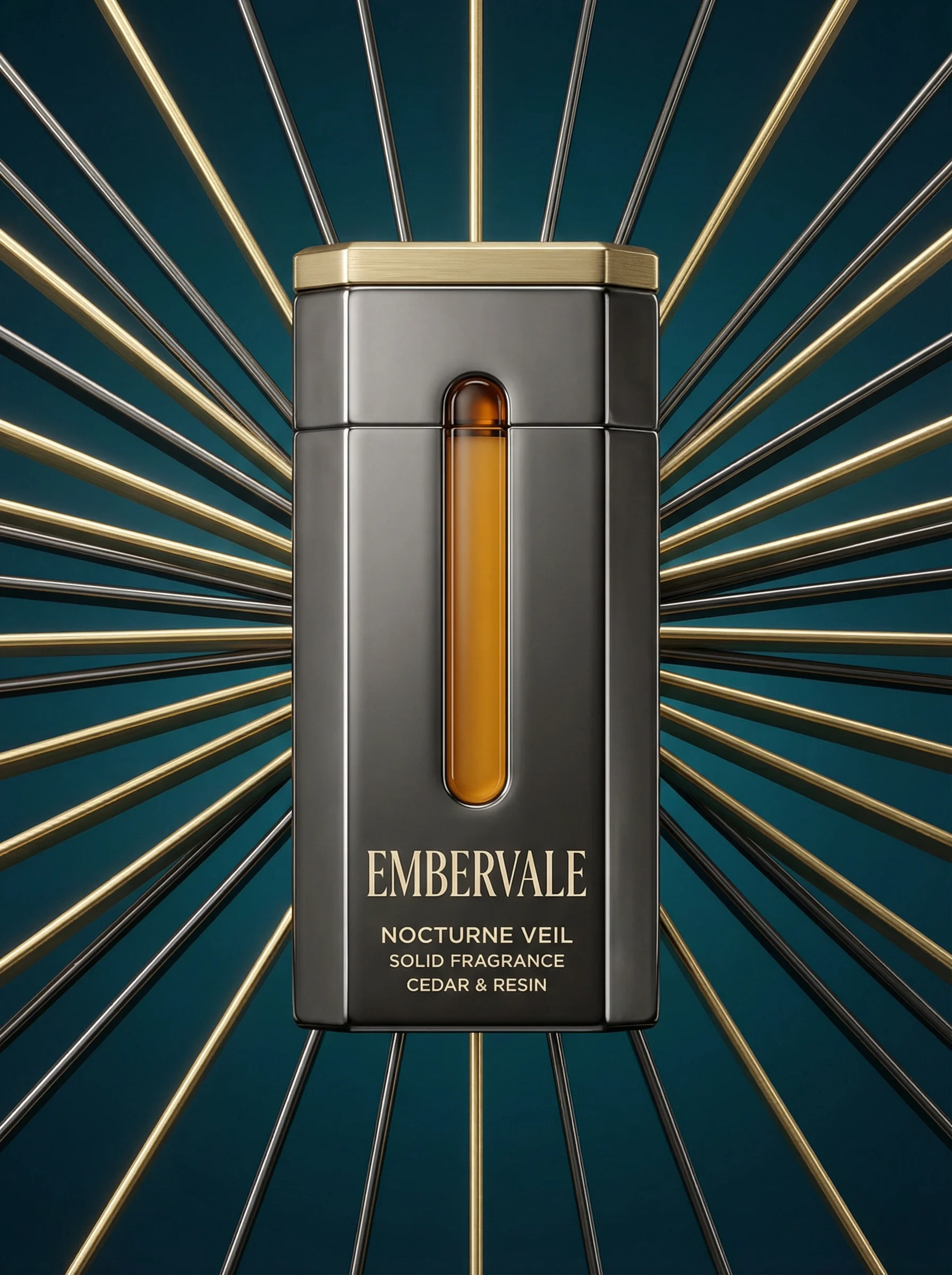
Scenes from the Riverflow library
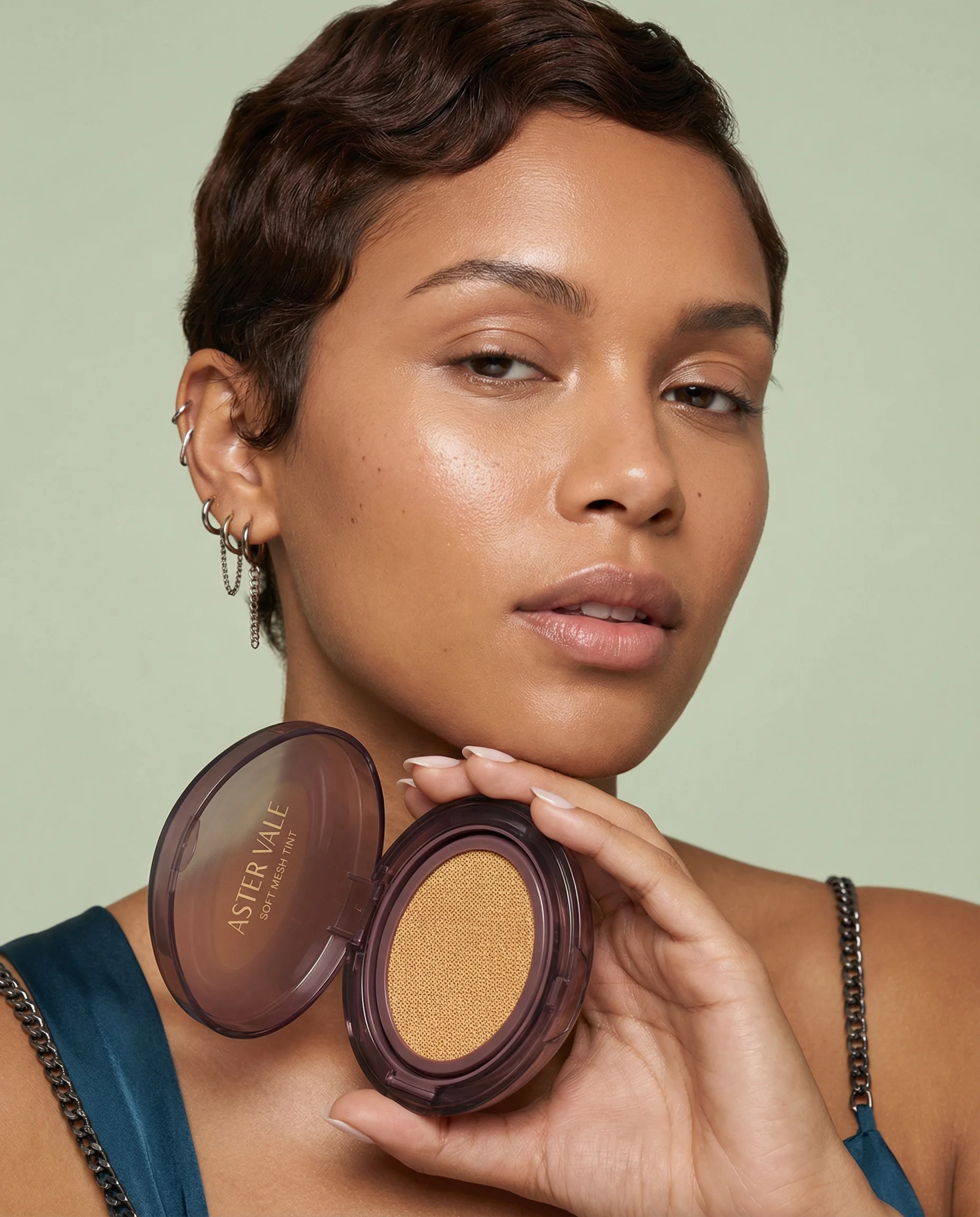
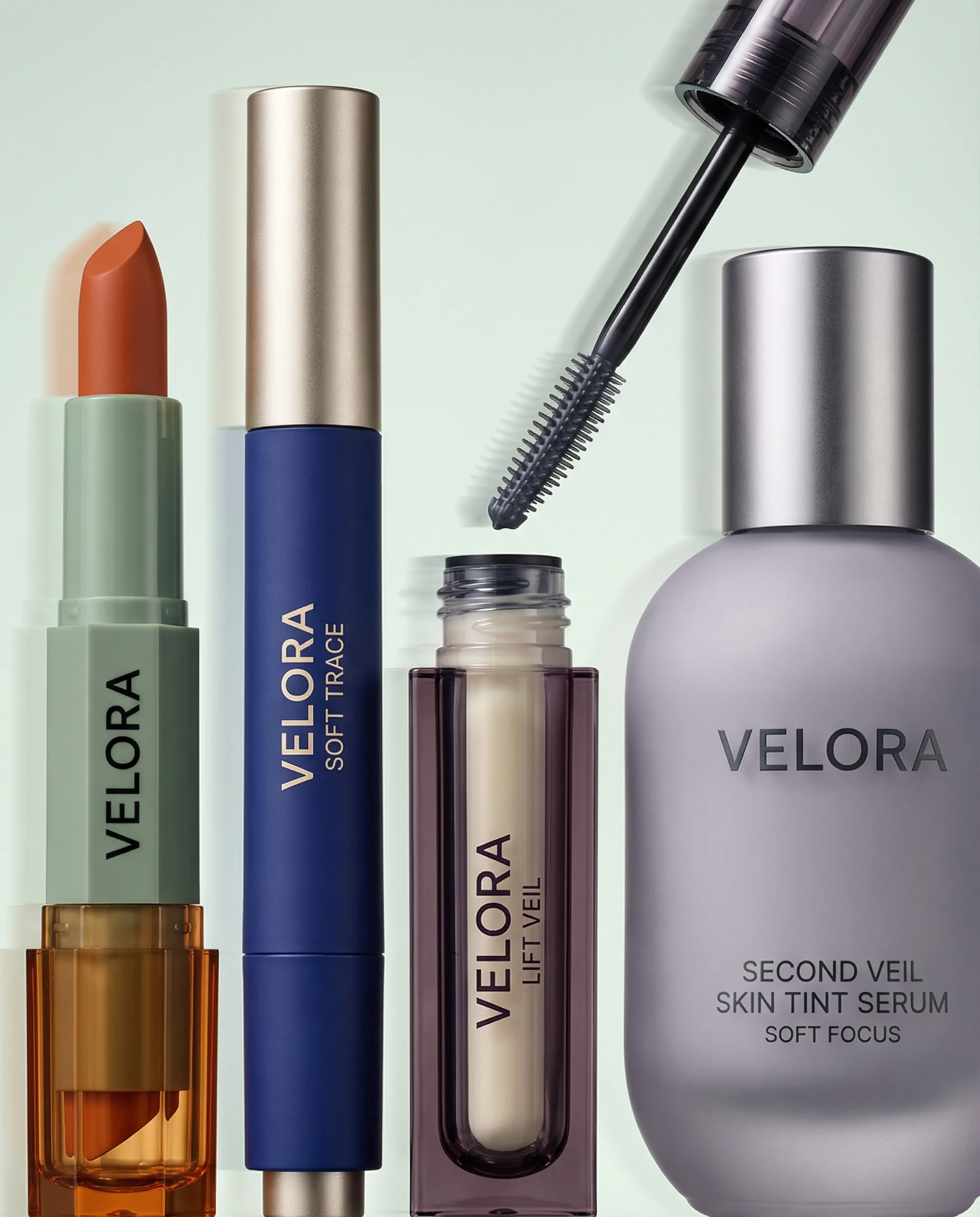
Product-in-hand beauty portrait highlights complexion makeup in context.
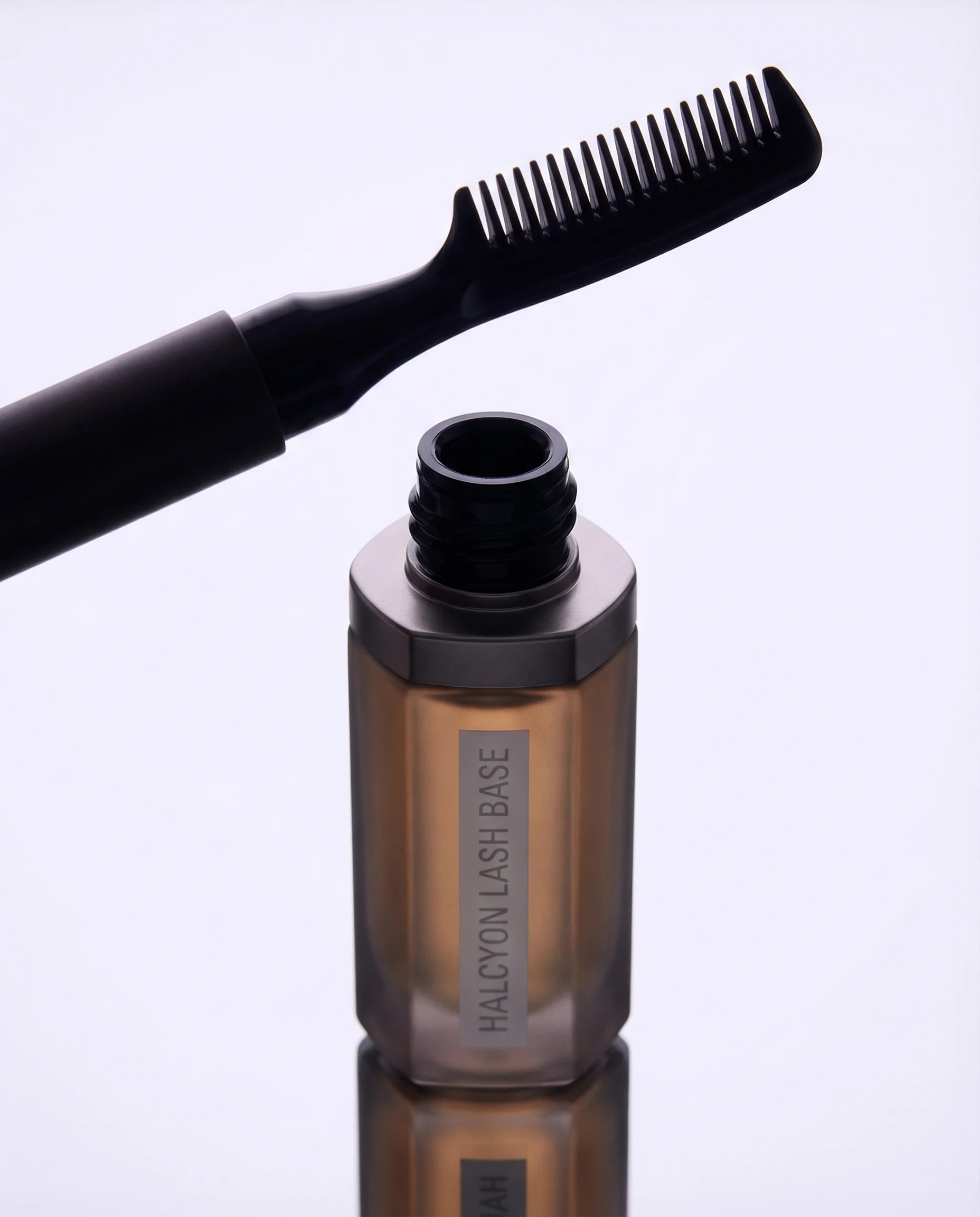
Creative applicator still life adds eye-product variety.
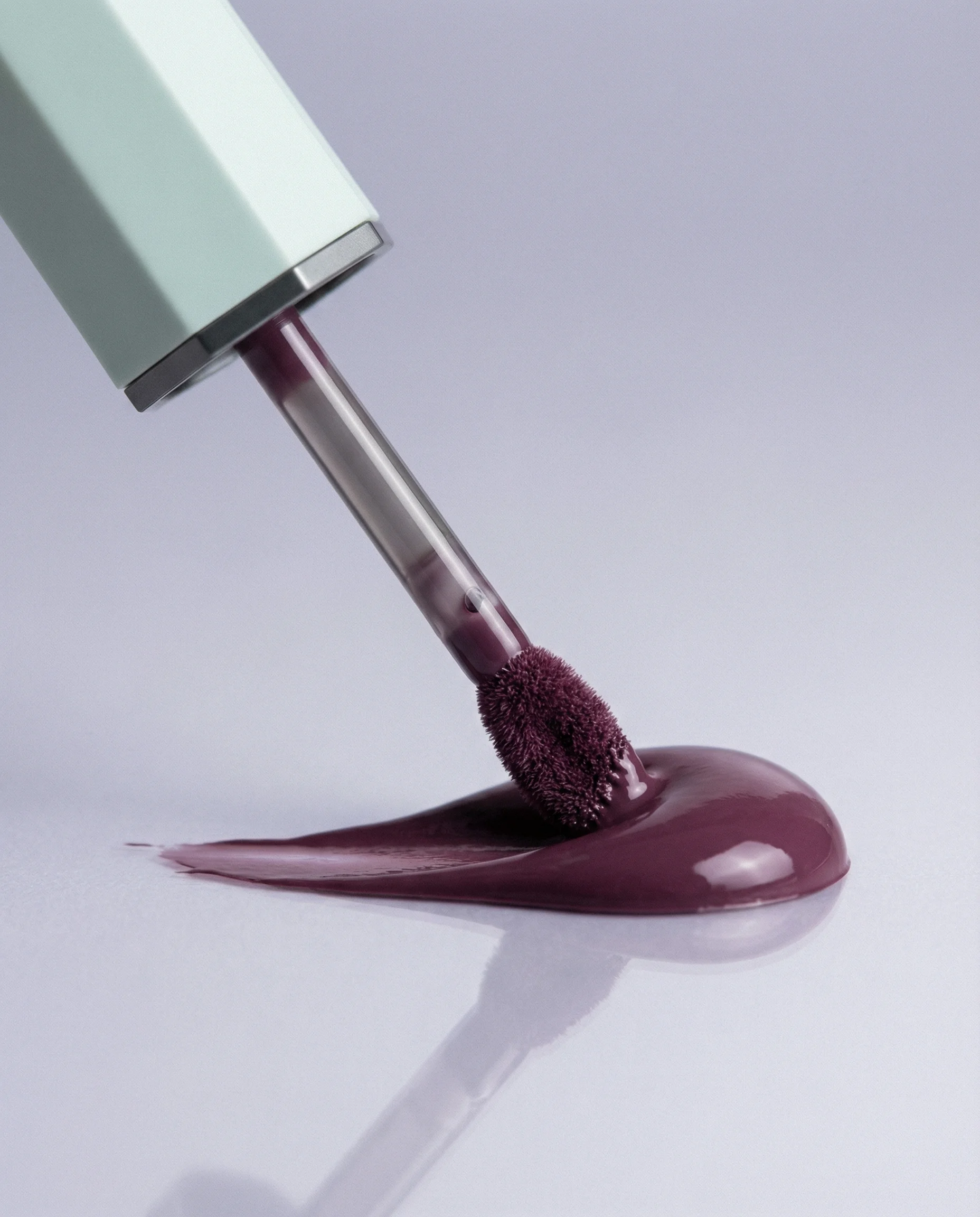
Macro pigment smear brings texture, payoff, and shade storytelling.
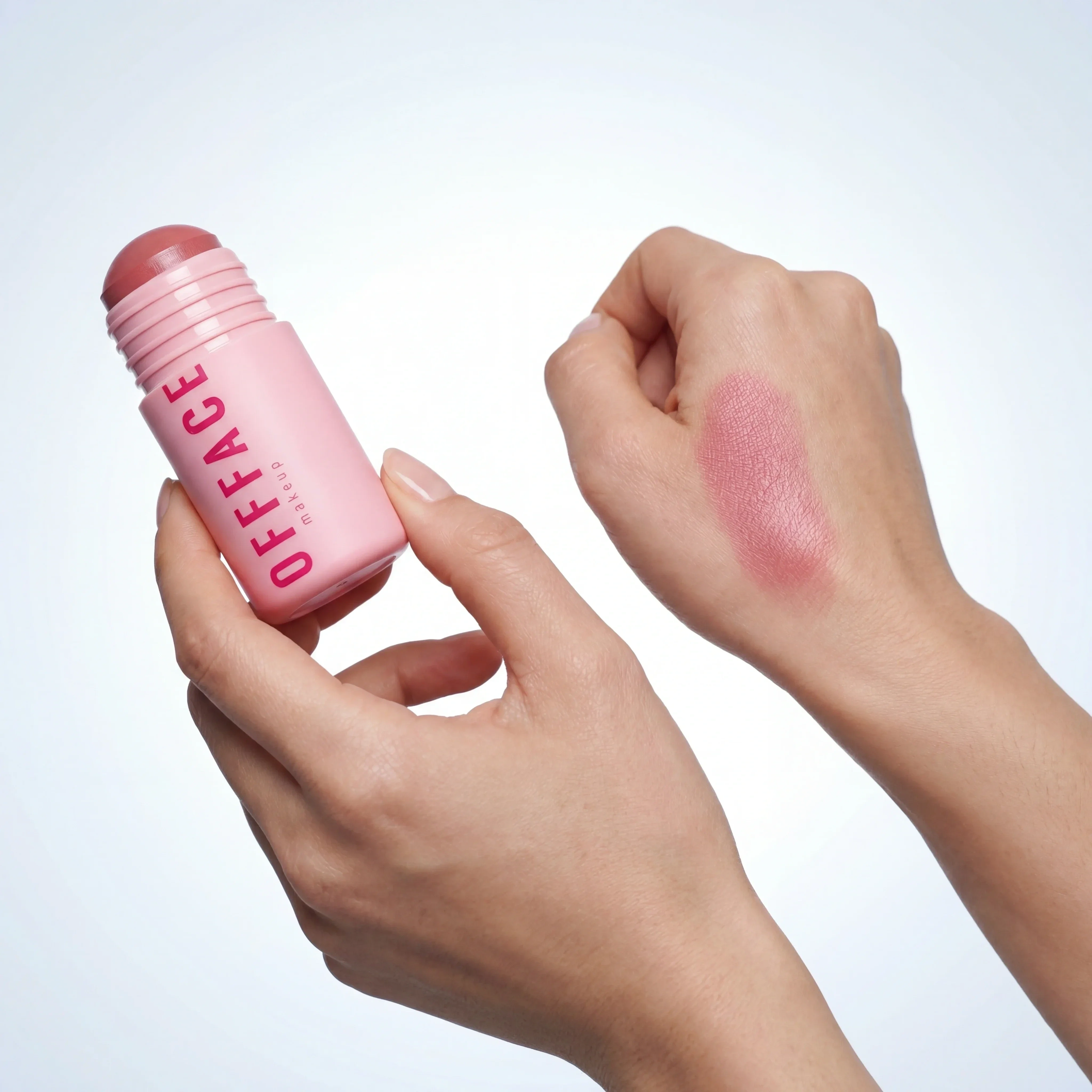
Swatch demonstration communicates shade payoff and helps shoppers compare tones.
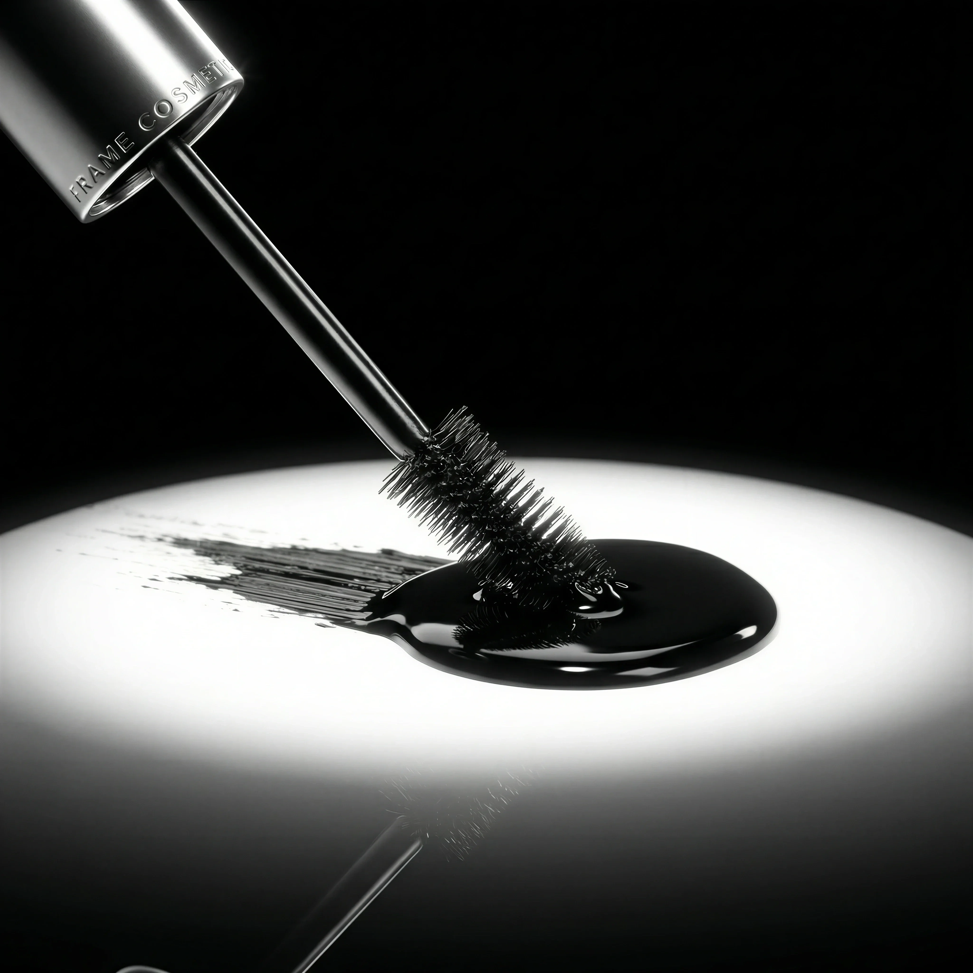
Macro mascara detail adds product texture and applicator-focused specificity.
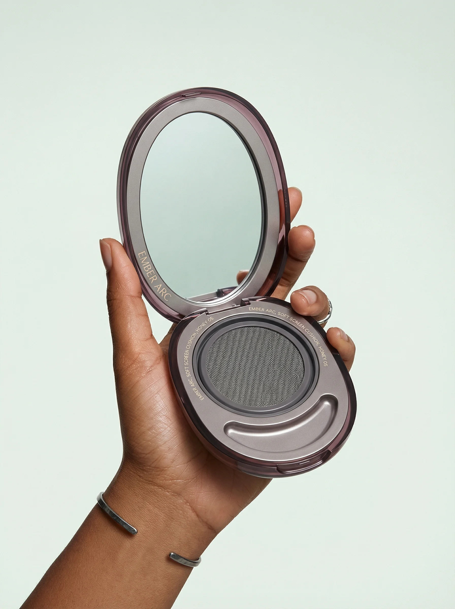
Open compact framing clearly shows format, finish, and complexion-product use.
Makeup product photography has to make shade, finish, applicator, and packaging easy to judge. Cosmetics can carry bold creative direction, but ecommerce images still need disciplined product truth: accurate color, clear format, and enough detail for confident selection.
If you are planning a full cosmetics carousel, use an ecommerce product photography shot list as the production spine. Pair it with detail product photography for applicators and textures, and keep a clean product-on-white photography reference for shade and packaging checks.
Shot ideas for makeup brands
Visual playbook
Makeup visual playbook
Prioritize the images that help shoppers compare shade, finish, payoff, and format quickly.
Swatch proof
Create clean, evenly lit swipes that show matte, satin, shimmer, gloss, or cream finish without over-smoothing the texture.
Use when: Use for PDP galleries, shade pages, shade-finder flows, and comparison emails.
Prompt cue
Create a makeup swatch scene with accurate pigment, neutral lighting, clean skin or surface, visible product packaging, and no exaggerated saturation.
Applicator detail
Show a mascara wand, concealer doe-foot, lipstick bullet, cushion compact, palette pans, or brush tip beside the pack.
Use when: Use when the applicator, pan layout, or format changes how the shopper understands the product.
Prompt cue
Create a macro mascara product image with the wand visible, controlled black pigment texture, readable tube branding, and premium studio highlights.
Launch shade hero
Give the key shade or finish a strong composition with the pack large enough to read and the texture close enough to feel tangible.
Use when: Use for launches, paid social, landing pages, limited editions, and hero campaign assets.
Prompt cue
Create a campaign-ready lip color still life with a rich plum texture swipe, accurate product packaging, soft reflective surface, and clean copy space.
Makeup styling can be sculptural, but the commercial hierarchy should stay simple. The shopper needs to identify the product, understand the shade family, and see the finish before the image asks them to admire the set design.
Additional makeup ideas to brief:
- A cap-off tube, bullet, compact, or palette view that shows what opens and what arrives.
- A two-finish comparison, such as matte versus satin or shimmer versus metallic, shot under identical light.
- A shade-name lineup for hero variants, with each label or bottom sticker visible where possible.
- A controlled powder break, pigment dust, or pressed-pan macro for editorial use only after the clean pan shot is covered.
- A vanity scale image with one hand, mirror, pouch, or brush so small products do not feel oversized.
- A mobile-first crop where the shade remains legible after platform compression.
Shade and finish QA notes
Makeup assets need a review pass that is stricter than general beauty imagery. The question is not just "does it look good?" It is "would this help someone choose the right shade or format?"
Check each image for:
- Color cast from props, walls, flowers, or reflective compacts.
- Swatches that look more saturated, smoother, or glossier than the real product.
- Applicators with altered shapes, missing bristles, impossible bend, or too much product load.
- Complexion products shown under dramatic colored light that makes undertone comparison useless.
- Metallic packaging or mirrors that hide the logo, shade name, pan layout, or product opening.
Riverflow is most useful when you give it the commercial job: shade-range comparison, launch shade hero, swatch proof, applicator detail, or paid crop. That keeps the output from drifting into generic beauty mood boards.
PDP vs ads usage
Choose the right approach
How to use makeup images by channel
Treat PDP imagery as evidence and ad imagery as edited storytelling.
| Moment | What to show | Why it works |
|---|---|---|
| PDP gallery | Closed pack, open pack, applicator or pan, swatch, and scale cue. | Reduces uncertainty about shade, format, finish, and what arrives in the order. |
| Shade range | Consistent rows or grids with identical light, crop, and ordering. | Lets shoppers compare tones without visual bias between variants. |
| Paid social | One hero shade, one finish cue, product large enough for mobile, and short copy space. | Creates quick recognition while keeping the SKU commercially clear. |
| Launch campaign | Hero product with texture, reflective surfaces, shade system, or set components. | Builds energy around a new drop without sacrificing product recognition. |
Avoid using campaign photography as the only product evidence. It may be beautiful, but PDPs still need the straightforward images that help shoppers choose.
For campaign assets, the product hero shots guide is a useful companion. For swatches, pans, wands, and texture crops, keep the close-up discipline from detail product photography so the asset remains useful after the launch moment.
Starter shot list
Before you publish
Makeup SKU checklist
- Closed-pack shot with logo and product name readable.
- Open product view showing pans, bullet, cushion, cap, or tube.
- Applicator shot for wand, doe-foot, brush, pencil, or sponge formats.
- Shade swatch on neutral skin or surface with accurate finish.
- Texture, powder, cream, gloss, or pigment detail.
- Consistent shade range lineup or grid where relevant.
- In-hand or vanity scale image.
- Paid social crop with product, shade, and concise copy zone.
Create this in Riverflow
Create it in Riverflow
Riverflow prompt recipe for makeup
Use this structure to turn the strategy into a specific creative brief that keeps the product accurate and the scene useful.
- 1
Product proof
Use the product reference as the source of truth for logo placement, pack geometry, metallic details, cap shape, and typography.
- 2
Shade
Preserve the real shade family and finish. Keep colored props from casting onto foundations, concealers, nude lips, or complexion products.
- 3
Scene
Create a clean cosmetics ecommerce scene with one product view, one swatch or applicator detail, and a surface that fits the brand.
- 4
Channel
Generate a PDP crop for comparison and a paid social crop with the hero shade prominent and copy-safe negative space.
Example prompt
Soft matte lipstick with cap removed, bullet visible, accurate rose shade swipe on neutral surface, readable tube, clean studio crop.
Open cushion compact with sponge and product pan visible, dewy finish cue, pastel surface, logo readable, mobile ad crop with space above.
Riverflow workflow
How this works in Riverflow
Use Riverflow to keep shade, finish, applicator, and packaging evidence aligned while building PDP, launch, and paid creative from the same product reference.
Photoshoots
Build from cosmetics Scenes
Start with brand-safe vanity, studio, swatch, macro texture, or launch Scenes from Riverflow's library, or bring owned Scenes from your own makeup shoots. Apply a Style so shade ranges, swatches, applicator details, and campaign crops keep consistent lighting and finish handling.
Images
Test shade and texture concepts
Use Riverflow 2.0 Pro, Google's Nano Banana 2, or OpenAI GPT-Image-2 for text-to-image and image-to-image work when exploring pigment swipes, reflective compacts, mascara texture, or a more editorial launch surface.
Editing
Adapt without losing product truth
Generate 9 angle variants for tubes, compacts, palettes, or bullets, change aspect ratio while keeping the hero shade centered naturally, use Riverflow 2.0 Reference-Based Super Resolution to fix logo or shade artwork in place without changing the rest of the image, and Swap product to place another shade or SKU into a proven Scene.
Mistakes to avoid
Props distort shade perception.
Use neutral light for shade-critical images and reserve strong colored sets for campaign crops.
Swatches look more saturated, smoother, or glossier than the real product.
Keep texture honest, especially for matte lips, complexion products, and shimmer finishes.
Powder mess makes the product feel damaged.
Use controlled pigment dust only when it supports the editorial direction.
Ad text is too small for mobile.
Limit copy to one clear idea and keep shade names, product names, and claims readable.
FAQ
When should makeup imagery use neutral lighting?+
Use neutral lighting for shade-critical PDPs, foundation or concealer comparisons, swatches, and range grids. Save colored light for campaign crops.
How do you make powder or pigment mess look intentional?+
Keep one clean product view first, then use controlled dust, breaks, or smears only where they support the editorial direction. Mess should never make the product look damaged.
What is the edge case for glossy or metallic packaging?+
Reflective packaging can hide shade names, logos, and applicators. Review the highlight placement before approving crops for PDPs, ads, or retailer uploads.
Start creating
Get started with on-brand visuals
Turn guide ideas into product-accurate creative in Riverflow, using your brand, products, scenes, styles, and channel crops from the start.