Scenes from the Riverflow library





The workflow
Brand sheets first, then luminous campaign worlds
Lock the references
Generate the still campaign
All 28 supplied images
The complete supplied SABLON image kit
Image 01 — Logo Lockup
Original prompt
Image 01: Logo Lockup
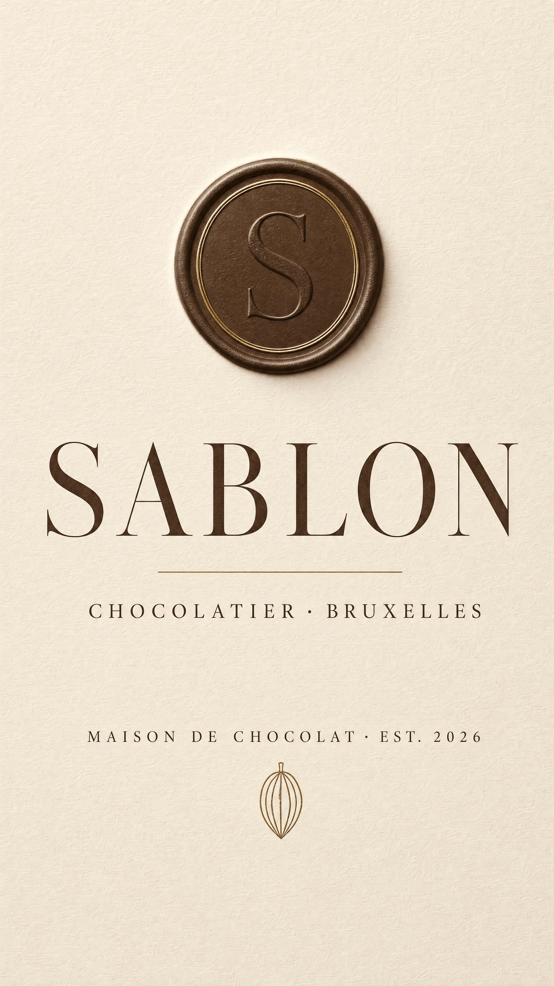
USE CASE: luxury brand logo identity board / logo lockup sheet for an artisan Belgian chocolate brand.
STYLE: quiet-luxury European chocolatier branding, cross between Pierre Marcolini / Le Sablon Brussels elegance and a minimalist Kinfolk editorial brand board.
Timeless, refined, high-contrast serif typography.
SCENE: a clean flat presentation board on a soft warm ivory paper background (#F3ECE0), even diffuse studio light, subtle paper grain, gentle soft shadow, centered
symmetrical layout with generous negative space.
SUBJECT: the brand identity system laid out cleanly and centered vertically:
 - TOP: a refined circular embossed wax-seal style monogram medallion containing a single elegant serif capital letter "S", tone-on-tone deep cocoa, looking like it
could be pressed into chocolate.
 - CENTER (dominant): the primary wordmark "SABLON" in a large elegant high-contrast Didone serif (like Didot/Bodoni), letter-spaced, deep cocoa brown, perfectly
kerned.
 - Directly under it a thin hairline rule and the tagline in small refined caps "CHOCOLATIER · BRUXELLES".
 - BOTTOM: small caps "MAISON DE CHOCOLAT · EST. 2026" and a tiny cocoa-pod line icon.
DETAILS: warm luxury palette, gold foil accents on the monogram ring, everything tone-on-tone cocoa and gold on ivory, museum-grade kerning, crisp vector-clean
edges.
TEXT (EXACT): "SABLON" / "CHOCOLATIER · BRUXELLES" / "MAISON DE CHOCOLAT · EST. 2026" / "S"
TYPOGRAPHY: elegant high-contrast Didone serif for the wordmark; fine letter-spaced caps for the taglines.
PALETTE: #3A2419 deep cocoa · #C9A24B soft gold · #F3ECE0 ivory
IMPERFECTIONS: subtle paper fiber texture, faint natural soft shadow, gentle emboss depth on the seal.
CONSTRAINTS: no watermarks, no extra text beyond the exact strings, no misspellings, no smudged or warped letters, no photo of actual chocolate, no clutter, no gradient
background, spelling must be exactly SABLON.
OUTPUT: Output in exactly 1080px x 1920px (9:16 portrait vertical format).
Image 02 — Product Sheet
Original prompt
Image 02: Product Sheet
USE CASE: product spec sheet / industrial design reference board for an artisan Belgian chocolate BAR (tablet) brand named SABLON. Reference image 1 is the official
SABLON logo lockup — reuse its exact wordmark, the circular "S" seal, and the cocoa/gold/ivory identity.
STYLE: clean minimalist product spec sheet, quiet-luxury chocolatier, technical yet elegant, Kinfolk editorial. Everything on a soft warm ivory paper background
(#F3ECE0), even diffuse studio light, subtle soft shadows, precise flat-lay technical layout with generous negative space.
SCENE: a single well-organized reference sheet, three stacked zones, top-down and 3/4 studio product photography of REAL chocolate.
SUBJECT / LAYOUT (top to bottom):
 - TOP-LEFT small technical stamp text: "SABLON / chocolate bar / spec sheet 01".
 - ZONE A (top, dominant): the NAKED chocolate bar shown two ways side by side — (left) a clean top-down FRONT view of a rectangular tablet made of a classic flat
grid of square segments (5 columns x 4 rows), with ONE single large embossed monogram seal of the letter "S" pressed in relief right in the CENTER of the whole bar
(tone-on-tone glossy dark chocolate, the S clearly debossed/embossed); (right) a low 3/4 angle view of the same bar showing its thickness and glossy tempered
snap.
 - ZONE B (middle): the PACKAGING template — a flat paper sleeve/belly-band wrapper for the bar, shown front-on, in a deep saturated OXBLOOD BURGUNDY color field,
with the gold "SABLON" wordmark centered, the small gold circular "S" seal above it, the flavor line "NOIR 72%" and the index "N°01" in fine gold caps, plus tiny caps
"CHOCOLATIER · BRUXELLES". Matte soft-touch paper look. Next to it a small folded-open corner showing a glimpse of gold inner foil.
 - ZONE C (bottom): a horizontal row of 4 color swatch chips labelled with flavor + hex, matching the four SKUs: "NOIR 72% #6E1E2A" oxblood burgundy, "LAIT
#C98A3B" amber caramel, "FRAMBOISE #C42B6B" magenta raspberry, "ORANGE #D0561F" burnt orange.
DETAILS: real photographic chocolate texture, glossy tempered surface, crisp embossed logo relief, matte premium paper wrapper, gold foil accents, museum-grade
layout, thin hairline separators between zones.TEXT (EXACT): "SABLON" / "NOIR 72%" / "N°01" / "CHOCOLATIER · BRUXELLES" / "spec sheet 01" / "NOIR 72% #6E1E2A" / "LAIT #C98A3B" /
"FRAMBOISE #C42B6B" / "ORANGE #D0561F" / "S"
PALETTE: #3A2419 cocoa · #C9A24B gold · #F3ECE0 ivory · #6E1E2A burgundy
IMPERFECTIONS: subtle paper grain, faint natural soft shadows, tiny realistic chocolate surface highlights.
CONSTRAINTS: no watermarks, no extra text beyond the exact strings, correct spelling SABLON, the embossed letter on the chocolate must be a clean single "S", no
bonbons, no pralines, only flat bars, no clutter, no gradient background.
OUTPUT: Output in exactly 1080px x 1920px (9:16 portrait vertical format).
Image 03 — Packaging & Retail Sheet
Original prompt
Image 03: Packaging & Retail Sheet
USE CASE: packaging & retail system spec sheet (board 02) for the artisan Belgian chocolate bar brand SABLON. Reference image 1 is the official SABLON logo lockup;
reference image 2 is the SABLON product sheet — REUSE the exact wordmark, the circular "S" seal, the four SKU colors (NOIR burgundy #6E1E2A, LAIT amber #C98A3B,
FRAMBOISE magenta #C42B6B, ORANGE burnt-orange #D0561F) and the cocoa/gold/ivory identity.
STYLE: clean quiet-luxury chocolatier packaging board, elegant and consistent, Kinfolk editorial. Soft warm ivory paper background (#F3ECE0), even diffuse studio
light, gentle soft shadows, organized flat-lay + product photography with generous negative space.
SCENE: one well-organized reference board, four zones.
SUBJECT / LAYOUT:
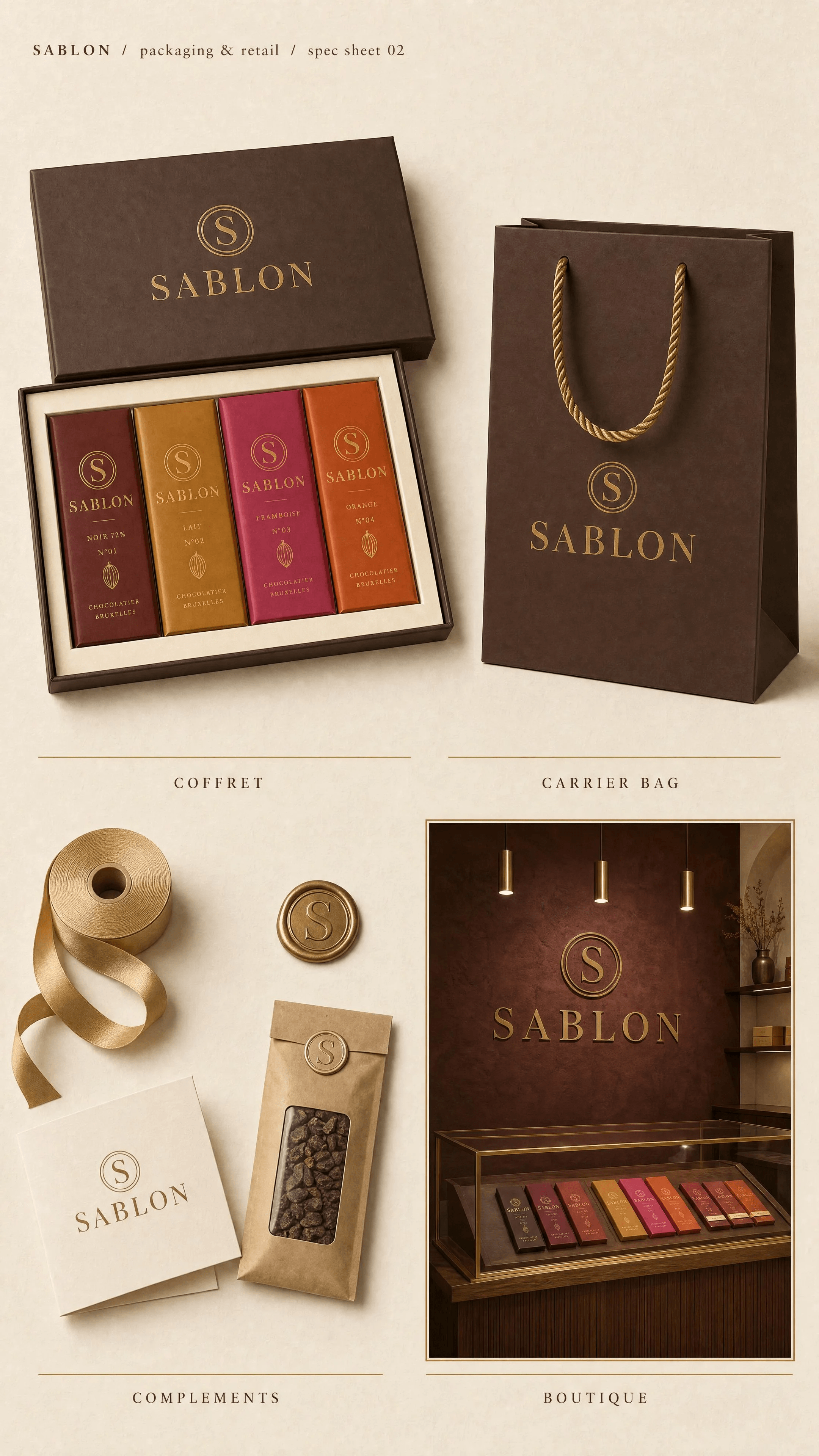
 - TOP-LEFT small technical stamp: "SABLON / packaging & retail / spec sheet 02".
 - ZONE A (top-left, hero): a luxury rigid GIFT BOX / coffret in deep cocoa and ivory with a gold embossed "S" seal and gold "SABLON" wordmark on the lid, shown open
at a 3/4 angle, holding the FOUR wrapped chocolate bars standing in a row, each in its flavor sleeve color (burgundy, amber, magenta, burnt orange) — a clean tidy set
of four.
 - ZONE B (top-right): a premium matte paper SHOPPING BAG (boutique carrier bag) in cocoa brown with twisted gold rope handles, the gold "SABLON" wordmark and
small "S" seal centered on the front.
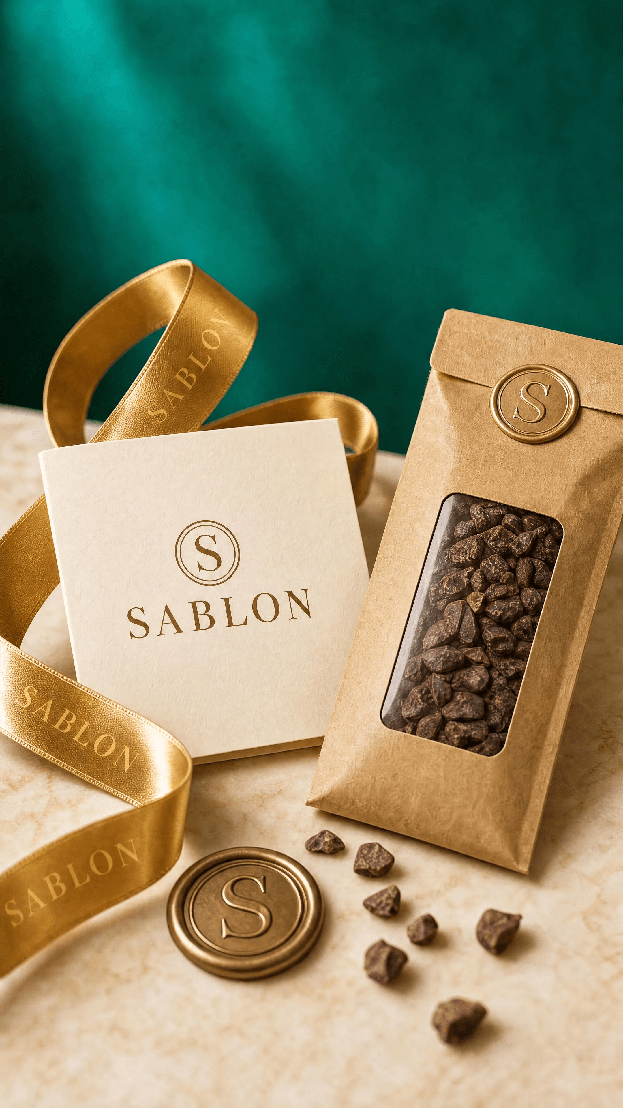
 - ZONE C (bottom-left): brand COMPLEMENTS / props laid out neatly — a spool of gold satin ribbon, a round gold "S" wax seal, a small folded ivory thank-you card with
the SABLON wordmark, and a slim kraft mini-pouch of cocoa nibs; small accessories meant to dress scenes.
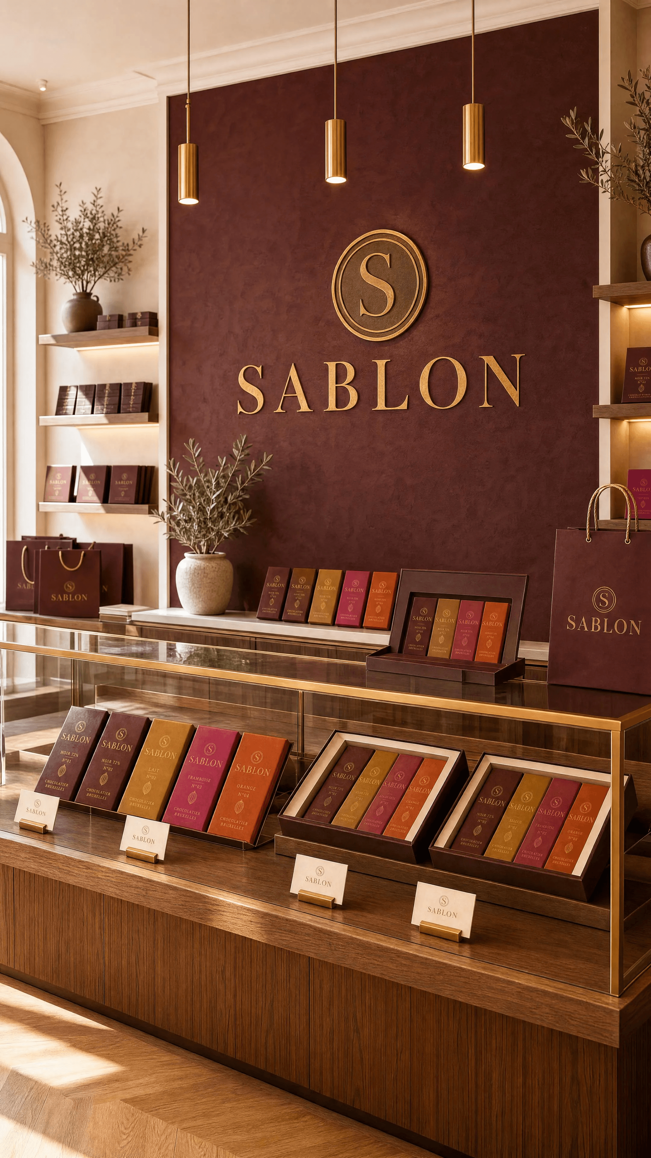
 - ZONE D (bottom-right, framed inset): a small photographic vignette of the SABLON RETAIL SPACE — a warm minimalist boutique counter, a rich burgundy-cocoa
textured plaster feature wall with a large circular "SABLON" brand medallion, brass pendant spotlights, a wood-and-glass display case showing the wrapped bars on
shelves. Inspired by an upscale craft-chocolate café.
DETAILS: consistent branding across every item, matte soft-touch papers, gold foil accents, realistic materials, museum-grade layout, thin hairline separators and small
labels under each zone ("COFFRET", "CARRIER BAG", "COMPLEMENTS", "BOUTIQUE").
TEXT (EXACT): "SABLON" / "spec sheet 02" / "COFFRET" / "CARRIER BAG" / "COMPLEMENTS" / "BOUTIQUE" / "S"
PALETTE: #3A2419 cocoa · #C9A24B gold · #F3ECE0 ivory · #6E1E2A burgundy · #C98A3B amber · #C42B6B magenta · #D0561F burnt orange
IMPERFECTIONS: subtle paper grain, soft natural shadows, faint realistic reflections on foil.
CONSTRAINTS: no watermarks, no extra text beyond the exact strings, correct spelling SABLON, only flat chocolate bars (no bonbons or pralines), consistent logo
everywhere, no clutter, no gradient background.
OUTPUT: Output in exactly 1080px x 1920px (9:16 portrait vertical format).
Image 04 — Hero — Everything Together
Original prompt
Image 04: Hero — Everything Together
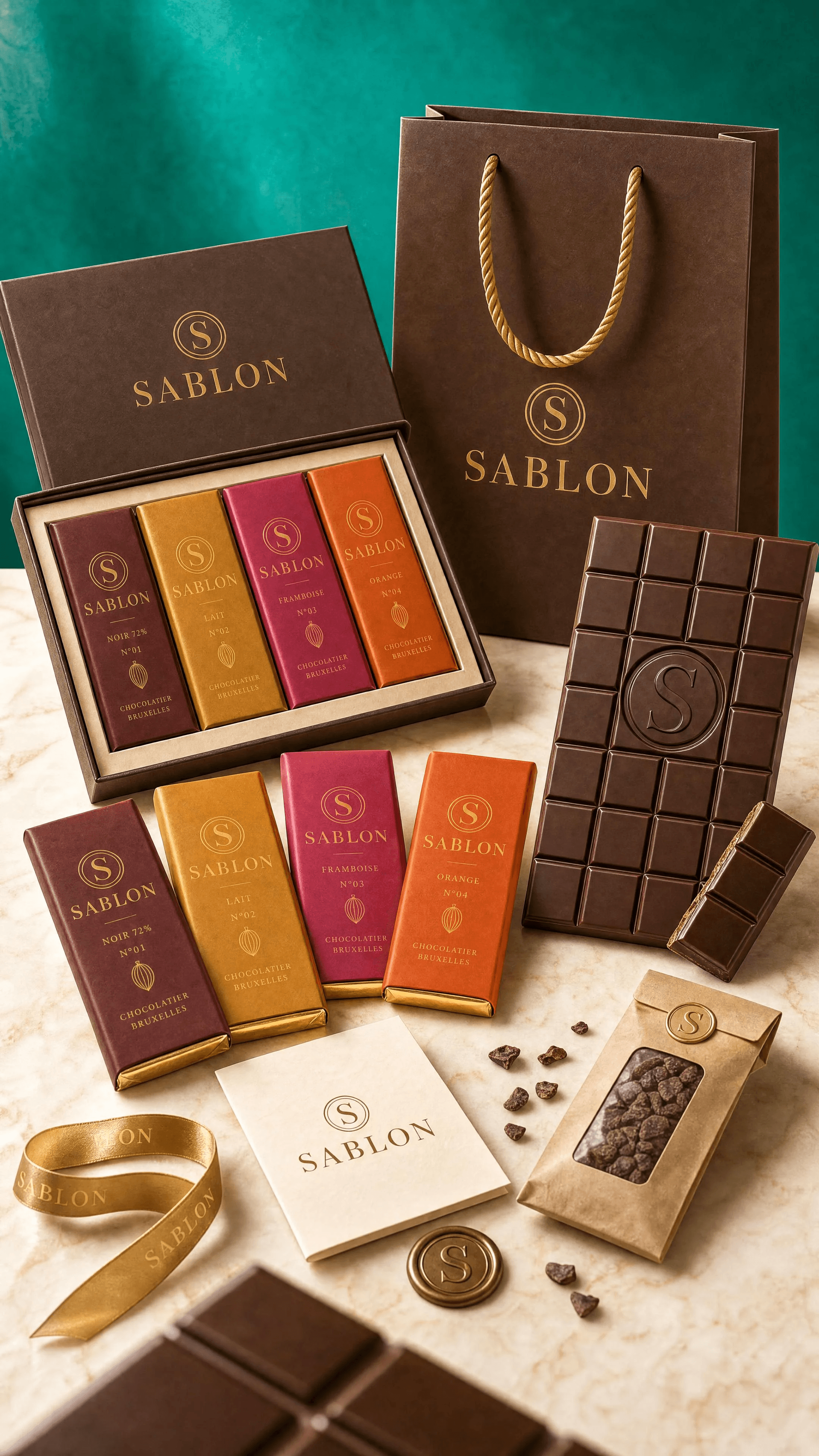
USE CASE: hero campaign still-life / editorial product photograph for the artisan Belgian chocolate bar brand SABLON — the master "everything together" shot.
Reference image 1 = SABLON logo lockup, image 2 = product sheet (bar mould with embossed "S", four SKU sleeve colors), image 3 = packaging sheet (coffret,
carrier bag, complements). REUSE the exact wordmark, the circular "S" seal, the four flavor sleeve colors (NOIR burgundy #6E1E2A, LAIT amber #C98A3B, FRAMBOISE
magenta #C42B6B, ORANGE burnt-orange #D0561F), the embossed "S" on the chocolate, cocoa/gold identity — perfect brand consistency.
STYLE: bright, vivid, luminous luxury food photography — still directed like a cinematographer (dimensional, artful, depth) but HIGH-KEY and radiant, NOT dark or moody.
Fresh, colorful, alive, premium campaign energy.SCENE: an elegant arranged tableau on a bright polished light surface (pale warm marble or honey wood catching light). A richly saturated but WELL-LIT jewel backdrop
— a glowing emerald-teal wall bathed in bright, even light with a soft luminous gradient so it reads vivid and colorful, clearly illuminated (not falling into shadow),
contrasting cleanly with the warm products. Airy, sunny midday feel.
LIGHTING (as a cinematographer, but bright): a large soft key light from upper left giving generous even illumination, a strong bounce/fill from the right so shadows
stay open, luminous and gentle, a bright warm rim/kicker separating products from the glowing backdrop, crisp lively specular highlights dancing on the glossy
chocolate, the foil and the gold seals. Overall exposure bright and clean, colors popping, surfaces vivid and reflective — minimal deep shadow, plenty of light
everywhere.
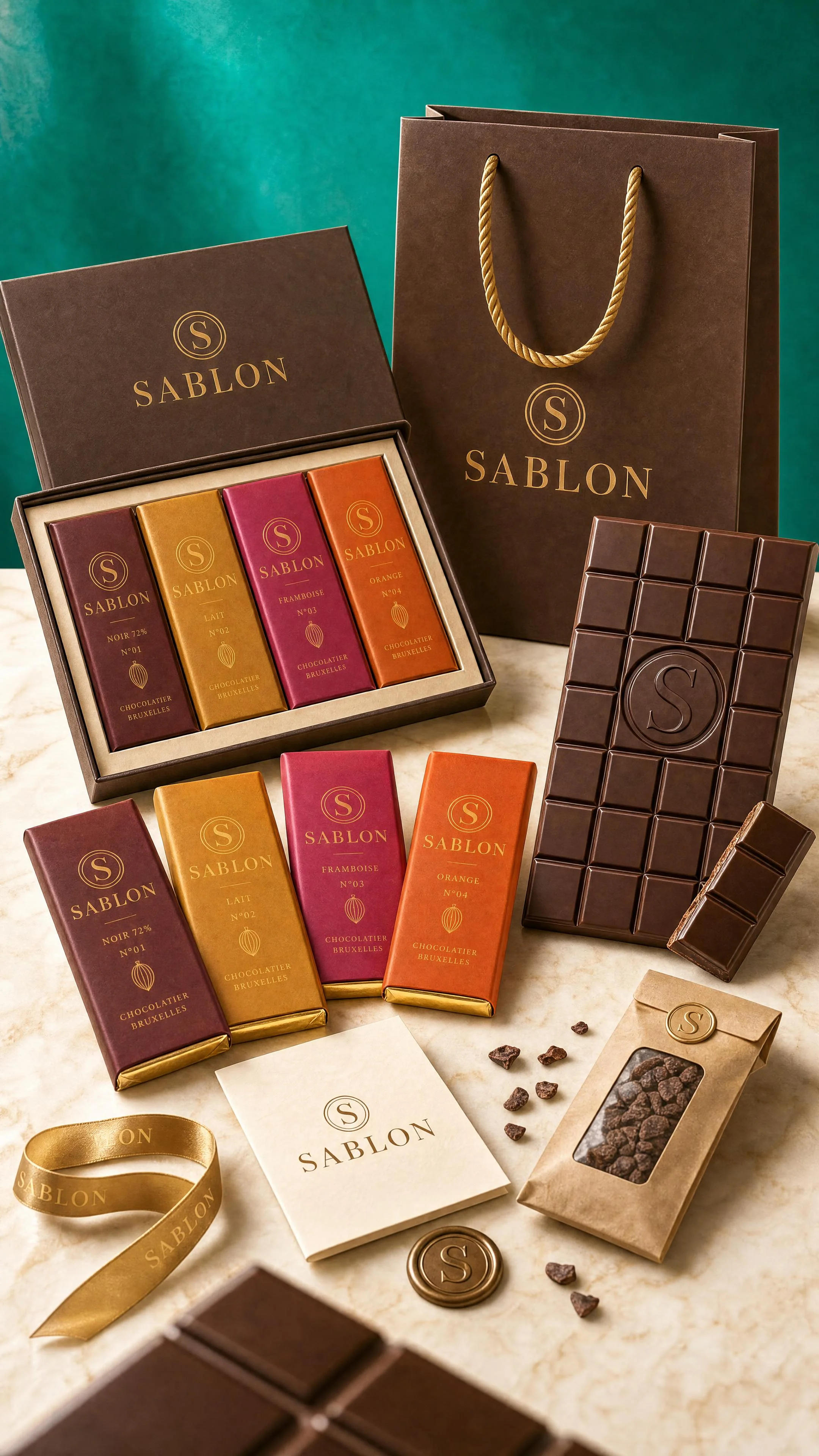
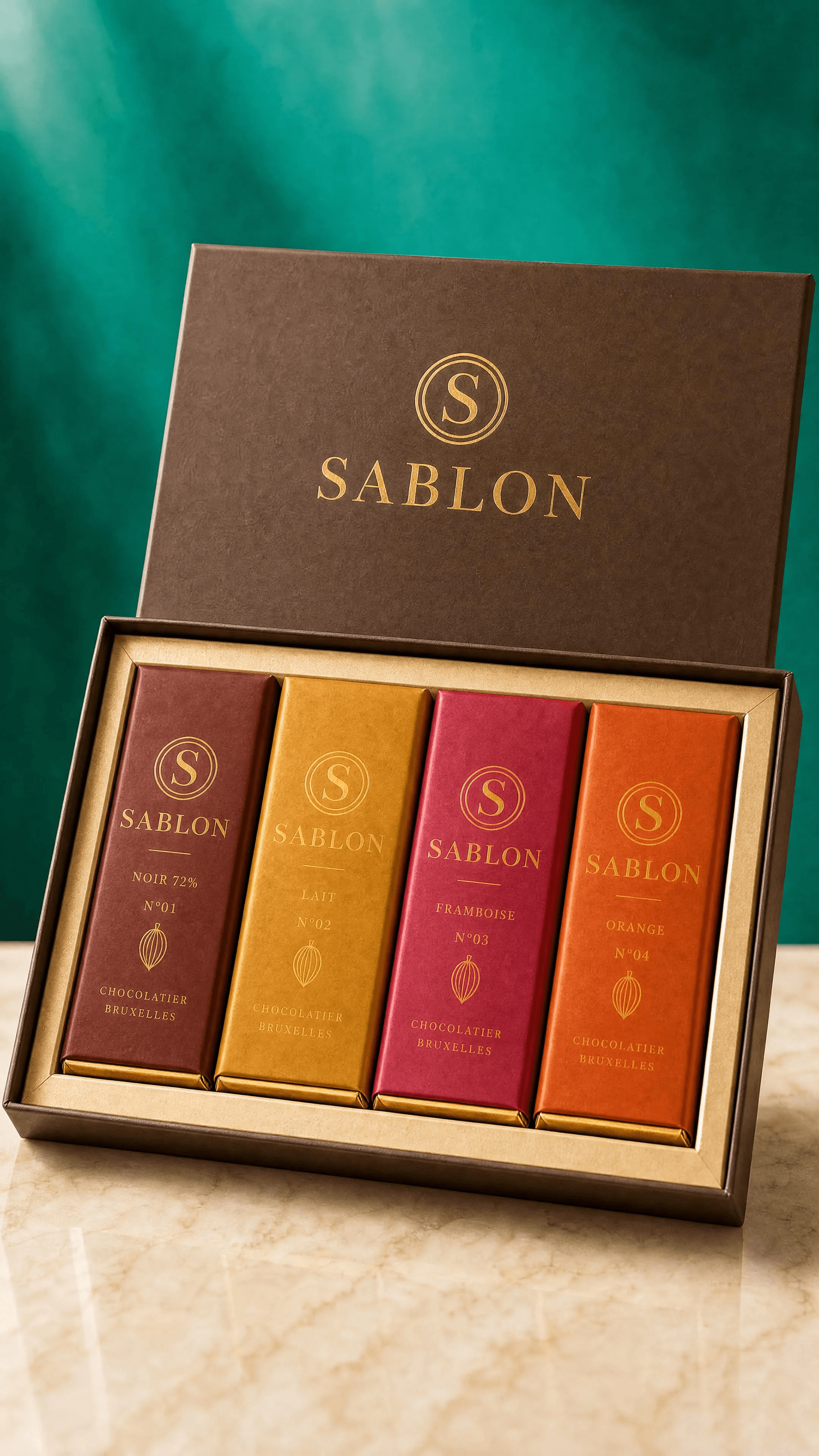
SUBJECT / COMPOSITION: a considered hero arrangement of the full SABLON world — the four wrapped bars (each flavor color) fanned in the mid-ground, one bar
unwrapped in the hero position showing the flat grid tablet with the single large embossed "S" seal and a clean broken piece, the open coffret gift box with bars behind,
the cocoa carrier bag standing tall at the back, and complements (gold ribbon, wax seal, thank-you card) dressing the base. A few loose cocoa nibs and one glossy
chocolate shard.
DEPTH OF FIELD: full-frame cinema camera, ~100mm, wide aperture ~f/2.0 — the unwrapped hero bar tack-sharp, the background bag and glowing backdrop
melting into creamy bokeh, one soft out-of-focus chocolate shard in the extreme foreground framing the shot.
DETAILS: real photographic chocolate texture with lively sheen, glossy tempered surface, crisp embossed logo relief, matte soft-touch wrappers with saturated color,
bright gold foil, clean fresh props, vivid color rendition, museum-grade art direction.
TEXT (EXACT): "SABLON"
PALETTE: #3A2419 cocoa · #C9A24B gold · #F3ECE0 ivory · #6E1E2A burgundy · #C98A3B amber · #C42B6B magenta · #D0561F burnt orange · vivid glowing
emerald-teal backdrop
IMPERFECTIONS: fine lively chocolate surface highlights, a scatter of cocoa nibs, gentle natural grain — but keep it bright and clean.
CONSTRAINTS: no watermarks, no extra text beyond "SABLON", correct spelling, only flat chocolate bars (no bonbons or pralines), embossed mark must be a clean single
"S", consistent branding across every item, NOT dark, NOT moody, NOT underexposed, no muddy shadows, keep it bright vivid and elegant.
OUTPUT: Output in exactly 1080px x 1920px (9:16 portrait vertical format).
Image 05 — Detail — Embossed Bar
Original prompt
Image 05: Detail — Embossed Bar
USE CASE: macro detail campaign photograph for SABLON, EXTRACTED and re-shot from the hero image — a close-up of the embossed chocolate. Reference image 1 =
the SABLON HERO still-life (match its bright vivid look, emerald backdrop, warm surface, lighting and mood). Reference image 2 = the product sheet (match the exact
bar mould: flat square grid, and the single large embossed "S" seal in the center). Reference image 3 = the logo (match the exact "S" letterform of the seal). Stay
perfectly consistent with these references.
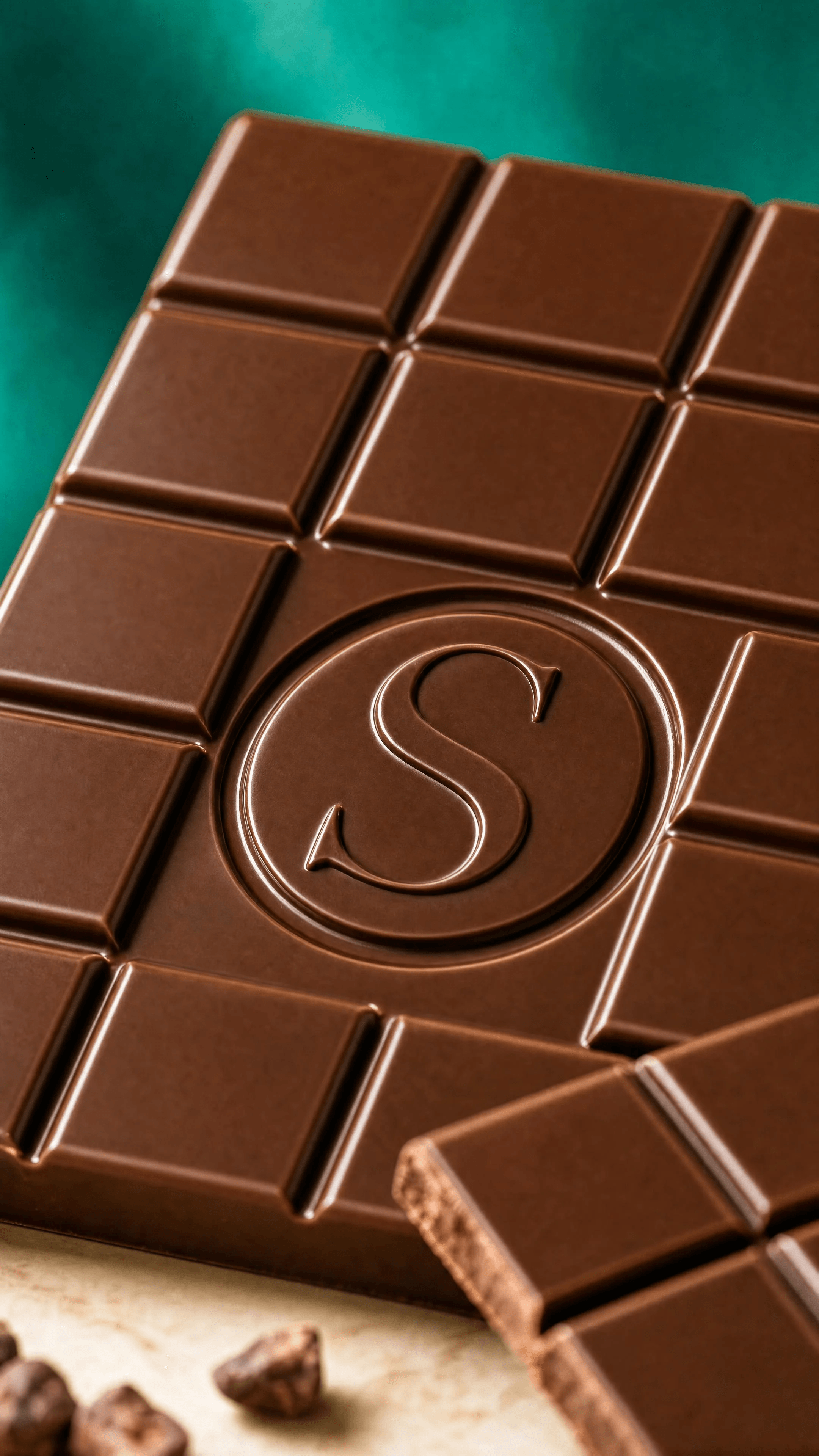
DETAIL TO CAPTURE: an extreme close-up / macro of the unwrapped NOIR dark chocolate tablet from the hero, filling the frame, focused on the single large embossed "S"
monogram pressed in relief into the center of the bar, plus the crisp edges of the flat grid segments and one clean broken piece revealing the snap.
STYLE: bright, vivid, luminous luxury food macro photography, cinematic but high-key, artful and appetizing.
LIGHTING (like a DoP): a raking soft key from upper left grazing across the surface to sculpt the embossed "S" relief and the glossy tempered sheen, bright open fill,
warm gold rim, lively specular highlights, luminous — not dark.
DEPTH OF FIELD: full-frame cinema camera, 100mm macro, ~f/2.8 — the embossed "S" tack-sharp, the far end of the bar and the emerald background melting into
creamy bokeh, a few out-of-focus cocoa nibs in the extreme foreground.
DETAILS: real glossy tempered dark-chocolate texture, crisp deep embossed "S" relief, clean grid geometry, tiny highlights, vivid color.
TEXT (EXACT): "S"
PALETTE: #3A2419 cocoa · #C9A24B gold rim · vivid emerald backdrop bokeh
CONSTRAINTS: no watermarks, no extra text, the embossed mark must be one clean "S" matching the logo, flat bar only (no bonbons), bright and vivid not dark, elegant.
OUTPUT: Output in exactly 1080px x 1920px (9:16 portrait vertical format).
Image 06 — Detail — Coffret
Original prompt
Image 06: Detail — CoffretUSE CASE: detail campaign photograph for SABLON, extracted and re-shot from the hero image — a close-up of the open COFFRET gift box. Reference image 1 = the
SABLON HERO still-life (match its bright vivid look, emerald backdrop, warm surface, lighting, mood). Reference image 2 = the packaging sheet (match the exact coffret
design: deep cocoa rigid box, gold "SABLON" wordmark and "S" seal on the lid). Reference image 3 = the product sheet (match the four flavor sleeve colors: NOIR
burgundy, LAIT amber, FRAMBOISE magenta, ORANGE burnt-orange). Stay perfectly consistent.
DETAIL TO CAPTURE: a three-quarter close-up of the open coffret from the hero, the lid with the gold embossed "S" seal and "SABLON" wordmark clearly reading, and the
four wrapped bars nestled inside in their flavor colors in a row, gold inner lining visible.
STYLE: bright, vivid, luminous luxury packaging photography, cinematic high-key, elegant.
LIGHTING (like a DoP): bright soft key upper-left, open fill, warm gold rim on the box edge and foil, lively highlights, luminous not dark.
DEPTH OF FIELD: full-frame cinema camera 85mm, ~f/2.8 — the lid seal and front bars tack-sharp, the emerald background into creamy bokeh.
DETAILS: matte cocoa rigid box, crisp gold foil wordmark and "S" seal, four matte flavor sleeves consistent with references, gold lining.
TEXT (EXACT): "SABLON" / "S"
PALETTE: #3A2419 cocoa · #C9A24B gold · flavor colors · emerald bokeh
CONSTRAINTS: no watermarks, no extra text beyond the strings, correct spelling SABLON, four flat bars only (no bonbons), consistent branding, bright vivid, elegant.
OUTPUT: Output in exactly 1080px x 1920px (9:16 portrait vertical format).
Image 07 — Detail — Carrier Bag
Original prompt
Image 07: Detail — Carrier Bag
USE CASE: detail campaign photograph for SABLON, extracted and re-shot from the hero image — a close-up of the boutique CARRIER BAG. Reference image 1 = the
SABLON HERO still-life (match its bright vivid look, emerald backdrop, warm surface, lighting, mood). Reference image 2 = the packaging sheet (match the exact carrier
bag design: cocoa matte paper bag, twisted gold rope handles, gold "SABLON" wordmark and "S" seal). Reference image 3 = the logo (match the wordmark and "S"
seal exactly). Stay perfectly consistent.
DETAIL TO CAPTURE: a three-quarter close-up of the cocoa carrier bag from the hero, standing, the gold "SABLON" wordmark and circular "S" seal reading crisply on the
front, the twisted gold rope handles catching light, a folded ivory tissue peeking from the top.
STYLE: bright, vivid, luminous luxury packaging photography, cinematic high-key, elegant.
LIGHTING (like a DoP): bright soft key upper-left, open fill, warm gold rim, lively specular highlights on the foil and rope, luminous not dark.
DEPTH OF FIELD: full-frame cinema camera 85mm, ~f/2.5 — the wordmark and seal tack-sharp, edges and emerald backdrop into creamy bokeh.
DETAILS: matte cocoa soft-touch paper, crisp gold foil wordmark and "S" seal, twisted gold rope handles, subtle paper texture.
TEXT (EXACT): "SABLON" / "S"
PALETTE: #3A2419 cocoa · #C9A24B gold · emerald bokeh
CONSTRAINTS: no watermarks, no extra text beyond the strings, correct spelling SABLON, consistent branding, bright vivid not dark, elegant, no clutter.
OUTPUT: Output in exactly 1080px x 1920px (9:16 portrait vertical format).
Image 08 — Detail — Complements
Original prompt
Image 08: Detail — Complements
USE CASE: detail campaign photograph for SABLON, extracted and re-shot from the hero image — a close-up of the brand COMPLEMENTS / props. Reference image 1 =
the SABLON HERO still-life (match its bright vivid look, emerald backdrop, warm surface, lighting, mood). Reference image 2 = the packaging sheet (match the exact
complements: gold satin ribbon printed with SABLON, round gold "S" wax seal, folded ivory thank-you card with the wordmark, slim kraft mini-pouch of cocoa nibs
with the "S" seal). Reference image 3 = the logo (match the wordmark and "S" seal). Stay perfectly consistent.
DETAIL TO CAPTURE: a close-up styled flat-ish arrangement of the complements from the hero — the gold "SABLON" ribbon curling elegantly, the round gold "S" wax
seal, the folded ivory thank-you card reading "SABLON", and the kraft nib pouch with its "S" seal, a few loose cocoa nibs scattered.
STYLE: bright, vivid, luminous luxury detail photography, cinematic high-key, elegant, artful.
LIGHTING (like a DoP): bright soft key upper-left, open fill, warm gold rim, lively specular highlights on the satin ribbon and wax seal, luminous not dark.
DEPTH OF FIELD: full-frame cinema camera 100mm macro, ~f/2.8 — the wax seal and card wordmark tack-sharp, background into creamy emerald bokeh, one out-of-focus nib in the foreground.
DETAILS: shiny gold satin ribbon, glossy wax seal with crisp "S", matte ivory card, kraft paper texture, consistent branding.TEXT (EXACT): "SABLON" / "S"
PALETTE: #C9A24B gold · #F3ECE0 ivory · kraft brown · emerald bokeh
CONSTRAINTS: no watermarks, no extra text beyond the strings, correct spelling SABLON, consistent branding, bright vivid not dark, elegant, no clutter.
OUTPUT: Output in exactly 1080px x 1920px (9:16 portrait vertical format).
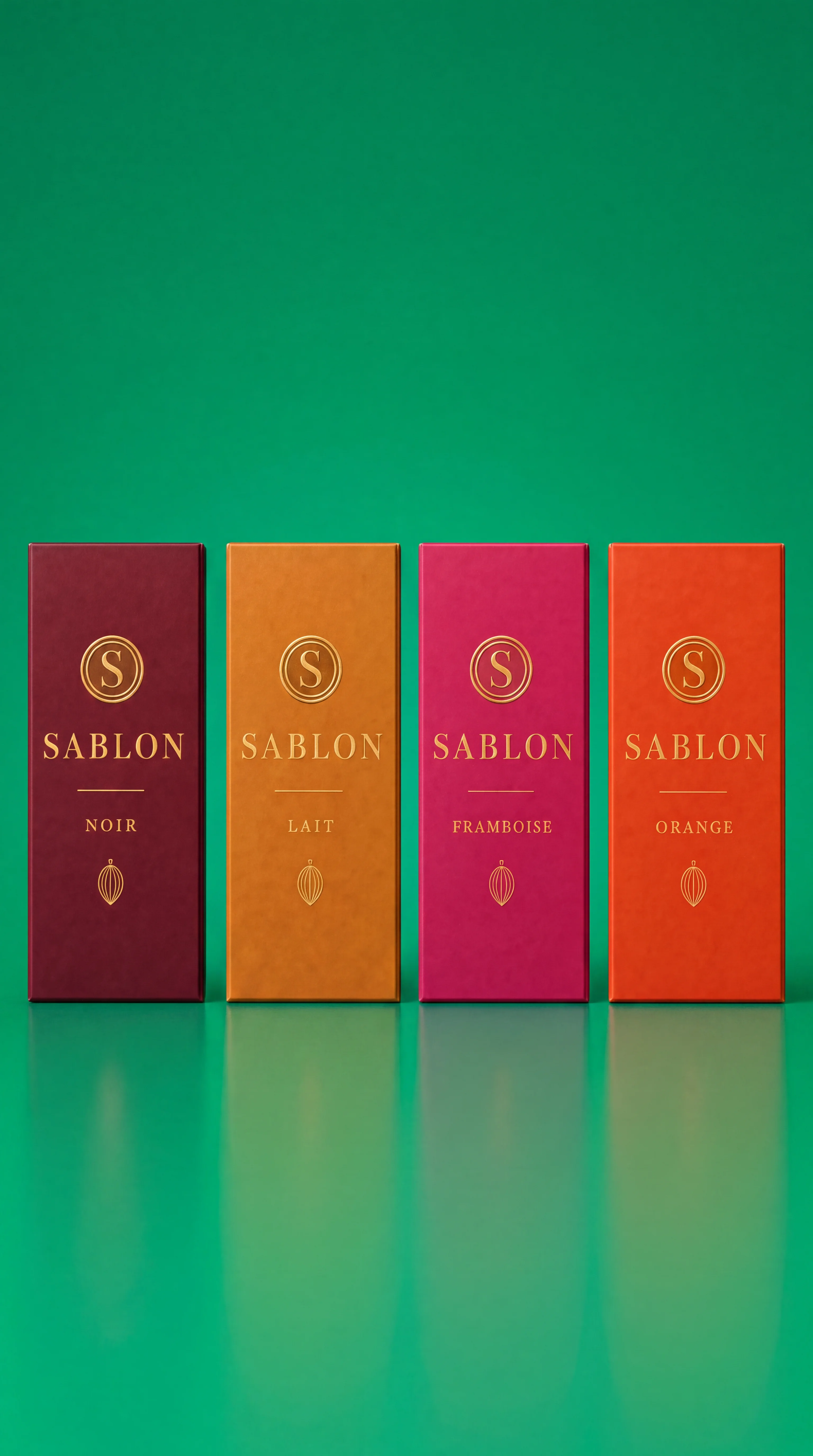
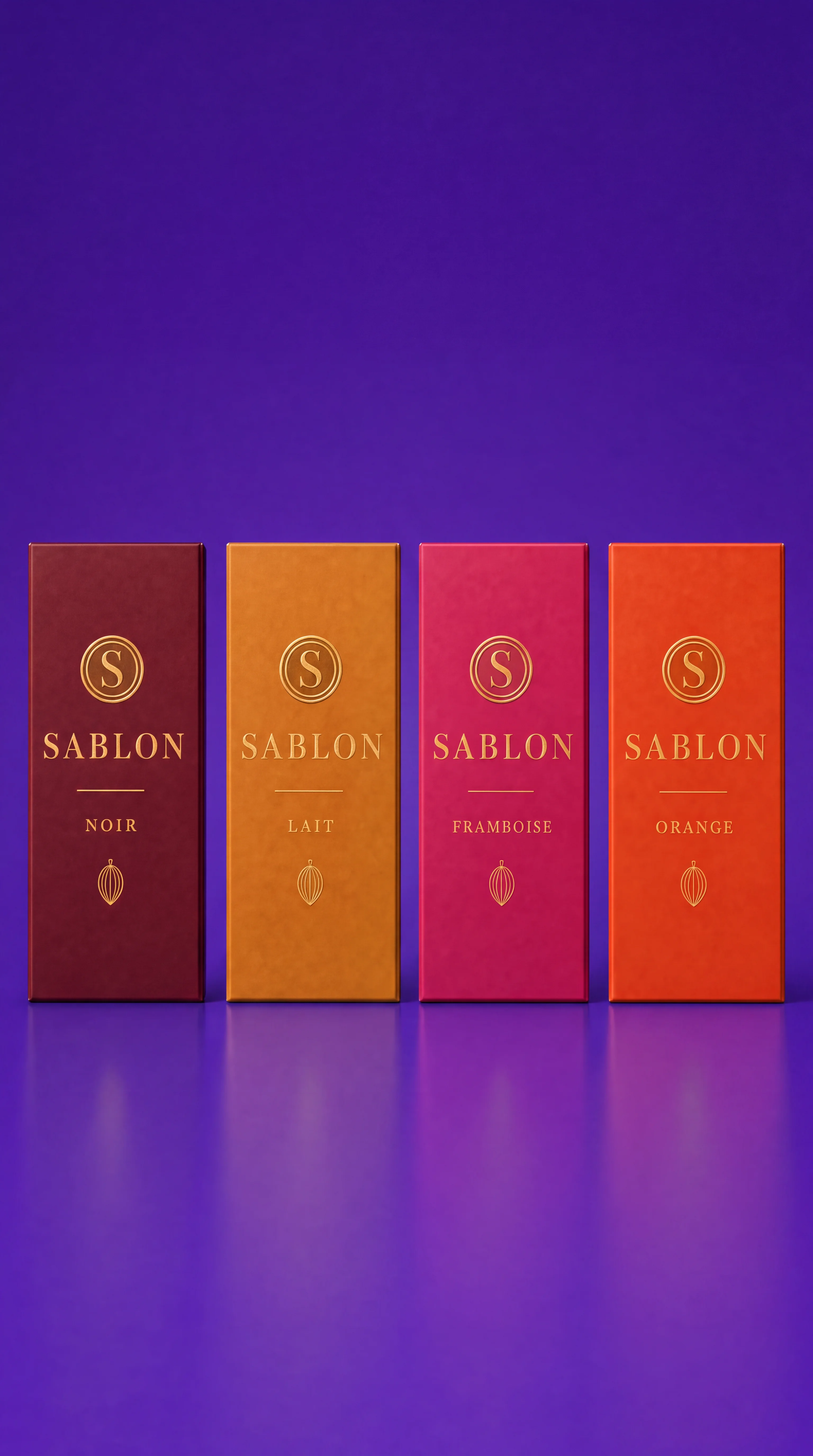
Image 09 — Color-Swap Base — Cobalt
Original prompt
Image 09: Color-Swap Base (Cobalt)
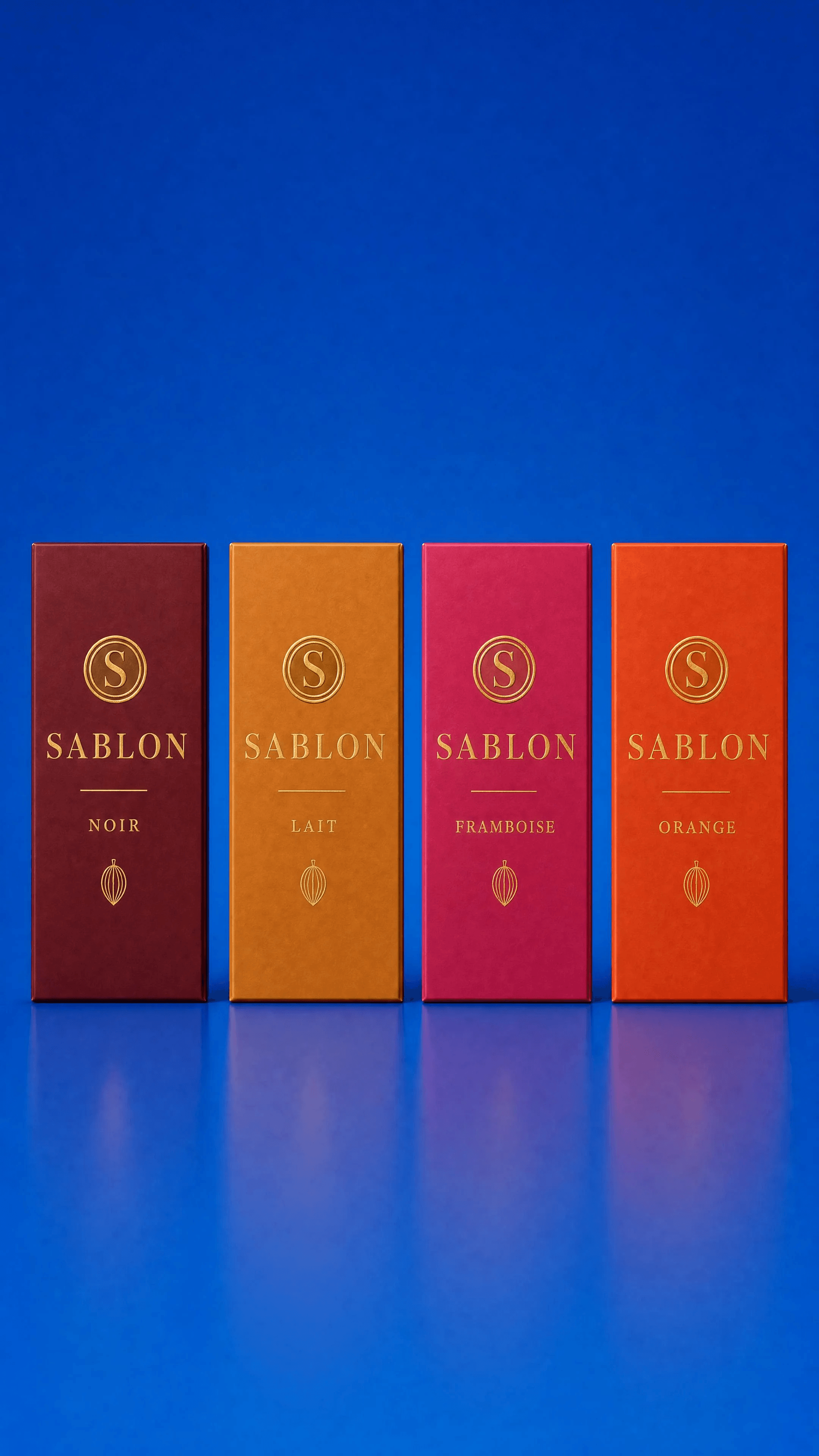
USE CASE: clean packaging line-up base image for the artisan Belgian chocolate bar brand SABLON — a fixed-composition "color-swap master" so the background
color can later be changed without moving anything. Reference image 1 = SABLON logo, image 2 = product sheet, image 3 = packaging sheet. REUSE the exact
wordmark, circular "S" seal, and the four SKU sleeve colors (NOIR burgundy #6E1E2A, LAIT amber #C98A3B, FRAMBOISE magenta #C42B6B, ORANGE burnt-orange
#D0561F).
STYLE: bright, vivid, luminous premium product photography, clean and modern, colorful but tidy.
SCENE: the FOUR wrapped SABLON chocolate bars standing upright in a row, evenly spaced, centered, shot straight-on at a slight 10° angle, on a smooth seamless single-color studio background — a bold saturated flat colour field (use a clean COBALT BLUE seamless) that is brightly and evenly lit, edge to edge, with a soft floor reflection.
Perfectly symmetrical, generous even margins so the layout can be re-colored later.
LIGHTING: big soft frontal key with even fill, bright and shadow-controlled, crisp lively specular highlights on the gold foil seals and wordmarks, clean floor reflection, no
harsh shadows.
SUBJECT: the four bars left-to-right in flavor order — NOIR (burgundy), LAIT (amber), FRAMBOISE (magenta), ORANGE (burnt orange) — each identical in size and
pose, gold "SABLON" wordmark and "S" seal centered, matte soft-touch sleeves, standing at exactly the same height and spacing.
DETAILS: consistent branding, matte premium sleeves, bright gold foil, sharp focus across all four bars (deep depth of field here so all are crisp), studio-clean.
TEXT (EXACT): "SABLON" / "NOIR" / "LAIT" / "FRAMBOISE" / "ORANGE" / "S"
PALETTE: #6E1E2A burgundy · #C98A3B amber · #C42B6B magenta · #D0561F burnt orange · #C9A24B gold · cobalt-blue seamless background
CONSTRAINTS: no watermarks, no extra text beyond the exact strings, correct spelling SABLON, four flat bars only (no bonbons), identical spacing and height, single flat
solid background color (easy to swap), bright even lighting, no gradient other than gentle vignette, no clutter.
OUTPUT: Output in exactly 1080px x 1920px (9:16 portrait vertical format).
Image 10 — Store — Window
Original prompt
Image 10: Store — Window / Storefront
USE CASE: retail environment photograph — the SABLON boutique storefront / window display, for a modern minimalist Belgian chocolate shop. Reference image 1 =
SABLON logo, image 2 = product sheet (bars + colors), image 3 = packaging sheet (coffret, bag, bars). REUSE the exact SABLON wordmark, the circular "S" seal,
cocoa/gold identity and the four flavor colors on any visible products.
STYLE: bright, vivid, luminous architectural retail photography, warm minimalist, editorial, alive — inspired by an upscale craft-chocolate boutique (rich plaster
feature wall, brass, wood, glass). Not dark, plenty of daylight.
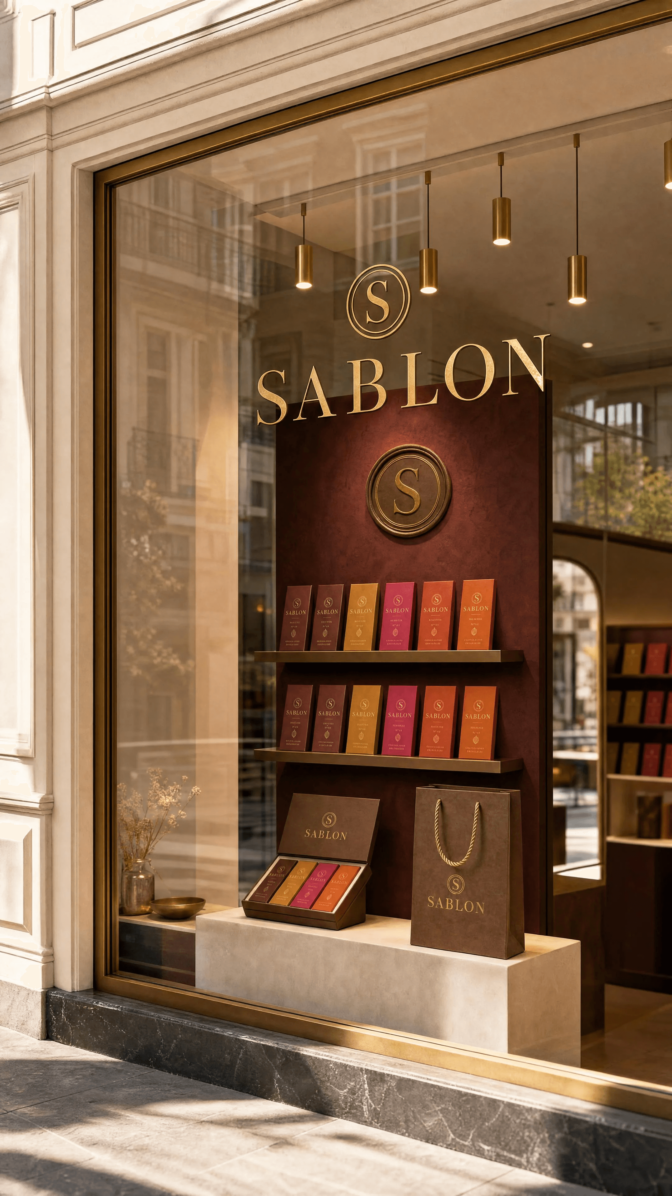
SCENE: the elegant SABLON shopfront / window display seen from just outside on a bright day — a large clean glass window with the gold "SABLON" wordmark and small
"S" seal applied to the glass, behind it a beautifully merchandised minimalist display: warm cocoa-and-ivory shelving and a rich saturated feature wall (deep
burgundy plaster) with a large circular gold "SABLON" medallion, rows of the wrapped chocolate bars in their four flavor colors neatly arranged, a coffret gift box and
the cocoa carrier bag styled on a plinth, brass pendant spotlights glowing warm. Reflections of a bright airy street softly in the glass.
LIGHTING (like a DoP): bright natural daylight filling the scene plus warm interior brass lights, luminous and dimensional, gentle reflections, colors popping, open
shadows.
COMPOSITION: strong architectural framing, the window and wordmark reading clearly, depth into the shop interior with soft background falloff, shot on a full-frame
camera 35mm, crisp foreground and softly blurred interior depth.
DETAILS: premium materials, consistent branding on all products, warm inviting, vivid saturated feature wall contrasting with the light shopfront, clean glass.
TEXT (EXACT): "SABLON"
PALETTE: #3A2419 cocoa · #C9A24B gold · #F3ECE0 ivory · #6E1E2A burgundy feature wall · flavor colors on products
CONSTRAINTS: no watermarks, no extra text beyond "SABLON", correct spelling, only flat chocolate bars visible (no bonbons), consistent branding, bright and luminous not dark, no clutter, realistic architecture.
OUTPUT: Output in exactly 1080px x 1920px (9:16 portrait vertical format).
Image 11 — Store — Interior
Original prompt
Image 11: Store — Interior / Counter
USE CASE: retail interior photograph — inside the SABLON boutique, the counter and display area of a modern minimalist Belgian chocolate shop. Reference image 1 =
SABLON logo, image 2 = product sheet, image 3 = packaging sheet. REUSE the exact SABLON wordmark, circular "S" seal, cocoa/gold identity and the four flavor colors
on the products.
STYLE: bright, vivid, luminous interior photography, warm minimalist boutique, editorial and alive, inspired by an upscale craft-chocolate café — rich plaster feature
wall, brass fixtures, warm wood, glass display case. Daylit and inviting, not dark.
SCENE: the interior of the SABLON shop — a warm wood-and-glass display counter running across the frame, filled with the wrapped chocolate bars neatly
merchandised in their four flavor colors and a couple of open coffret boxes, price cards in gold-on-ivory. Behind the counter a rich saturated deep-emerald or
burgundy plaster feature wall carrying a large circular gold "SABLON" medallion and the wordmark, cocoa-and-ivory shelving with rows of bars and carrier bags,
brass pendant spotlights glowing, a small potted olive branch, honey-wood floor. Airy and premium.
LIGHTING (like a DoP): abundant soft daylight from a shopfront off-frame plus warm brass accent lights, luminous, dimensional, open shadows, colors popping, gentle
highlights on glass and gold.
COMPOSITION: inviting eye-level view into the shop, leading lines along the counter, shot full-frame 35mm, foreground counter crisp and the back wall softly falling into
gentle bokeh for depth.
DETAILS: consistent branding on every product, premium materials, warm and clean, vivid saturated feature wall.
TEXT (EXACT): "SABLON"
PALETTE: #3A2419 cocoa · #C9A24B gold · #F3ECE0 ivory · deep emerald/burgundy feature wall · flavor colors on products
CONSTRAINTS: no watermarks, no extra text beyond "SABLON", correct spelling, only flat chocolate bars (no bonbons or pralines), consistent branding, bright and
luminous, no clutter, realistic interior architecture.
OUTPUT: Output in exactly 1080px x 1920px (9:16 portrait vertical format).
Image 12 — Still Life — Noir 72%
Original prompt
Image 12: Still Life — Noir 72%
USE CASE: single-flavor hero still-life advertising photograph for SABLON — the NOIR 72% dark chocolate bar, colorful narrative campaign image, not a flat packshot.
Reference image 1 = the SABLON hero (match its bright vivid luminous look and consistency), image 2 = product sheet (match the burgundy NOIR sleeve #6E1E2A, the
flat grid tablet and the embossed "S"), image 3 = logo. Stay perfectly consistent with brand wordmark, "S" seal and colors.
STYLE: bright, vivid, hyper-saturated luxury food photography with a cinematographer's eye — colorful, artful, dimensional, alive, narrative editorial still-life.
SCENE: the NOIR bar as hero — one bar wrapped in its deep burgundy sleeve leaning at an angle, beside it the same bar unwrapped showing the flat grid tablet with the
embossed "S" and a clean broken piece. Narrative props: a small espresso cup, a scatter of roasted cocoa beans and nibs, one glossy chocolate shard. Set on a bright
warm reflective surface against a boldly contrasting saturated GOLDEN-OCHRE / warm amber backdrop, brightly evenly lit so it glows and pops against the burgundy.
LIGHTING (like a DoP): bright soft key upper-left, strong open fill, warm gold rim, lively specular highlights on the glossy chocolate and gold foil, luminous and clean,
minimal deep shadow.
DEPTH OF FIELD: full-frame cinema camera, 100mm macro, ~f/2.0 — the unwrapped tablet and "S" tack-sharp, background into creamy warm bokeh, one out-of-focus cocoa bean in the extreme foreground framing the shot.
DETAILS: glossy tempered dark chocolate, crisp embossed "S", matte burgundy soft-touch sleeve, bright gold foil, steam wisp from the espresso, vivid saturated color.
TEXT (EXACT): "SABLON" / "NOIR 72%"
PALETTE: #6E1E2A burgundy · #C9A24B gold · #3A2419 cocoa · golden-ochre backdrop
CONSTRAINTS: no watermarks, no extra text beyond the strings, correct spelling, only flat chocolate bars (no bonbons), embossed mark a clean single "S", bright vivid
not dark, elegant, no clutter.
OUTPUT: Output in exactly 1080px x 1920px (9:16 portrait vertical format).
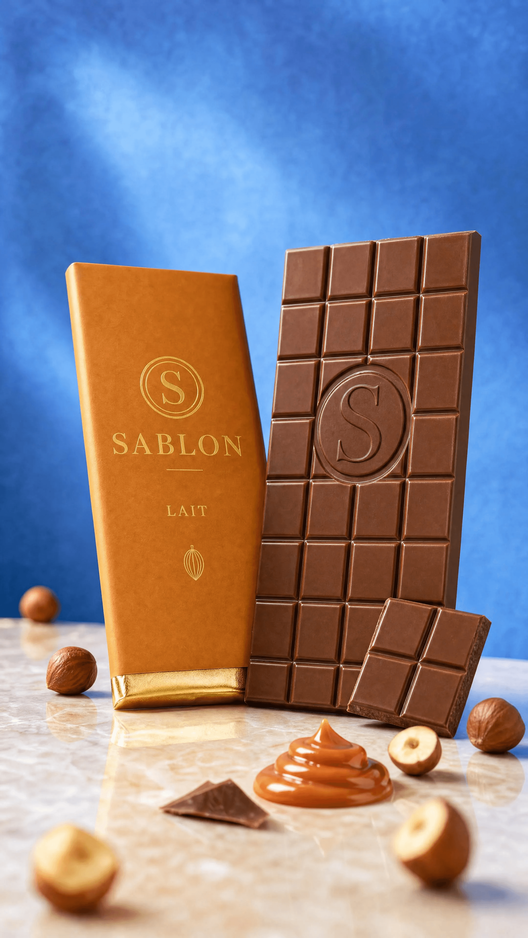
Image 13 — Still Life — Lait
Original prompt
Image 13: Still Life — Lait
USE CASE: single-flavor hero still-life advertising photograph for SABLON — the LAIT (milk chocolate) bar, colorful narrative campaign image, not a flat packshot.
Reference image 1 = the SABLON hero (match its bright vivid luminous look), image 2 = product sheet (match the amber LAIT sleeve #C98A3B, the flat grid tablet and
embossed "S"), image 3 = logo. Stay perfectly consistent with brand wordmark, "S" seal and colors.
STYLE: bright, vivid, hyper-saturated luxury food photography with a cinematographer's eye — colorful, artful, dimensional, alive, narrative editorial still-life.
SCENE: the LAIT bar as hero — one bar wrapped in its warm amber sleeve leaning at an angle, beside it the same bar unwrapped showing the flat grid milk-chocolate
tablet with the embossed "S" and a clean broken piece. Narrative props: a scatter of whole roasted hazelnuts and a small swirl of creamy caramel, one glossy chocolate
shard. Set on a bright reflective surface against a boldly contrasting saturated PERIWINKLE / soft cobalt-blue backdrop, brightly evenly lit so it glows and pops against the
warm amber and milk chocolate.
LIGHTING (like a DoP): bright soft key upper-left, strong open fill, warm gold rim, lively specular highlights on the glossy milk chocolate and gold foil, luminous and clean,
minimal deep shadow.
DEPTH OF FIELD: full-frame cinema camera, 100mm macro, ~f/2.0 — the unwrapped tablet and "S" tack-sharp, background into creamy blue bokeh, one out-of-focus
hazelnut in the extreme foreground framing the shot.
DETAILS: glossy tempered milk chocolate, crisp embossed "S", matte amber soft-touch sleeve, bright gold foil, glossy caramel, vivid saturated color.
TEXT (EXACT): "SABLON" / "LAIT"
PALETTE: #C98A3B amber · #C9A24B gold · milk-chocolate brown · periwinkle-blue backdrop
CONSTRAINTS: no watermarks, no extra text beyond the strings, correct spelling, only flat chocolate bars (no bonbons), embossed mark a clean single "S", bright vivid
not dark, elegant, no clutter.
OUTPUT: Output in exactly 1080px x 1920px (9:16 portrait vertical format).
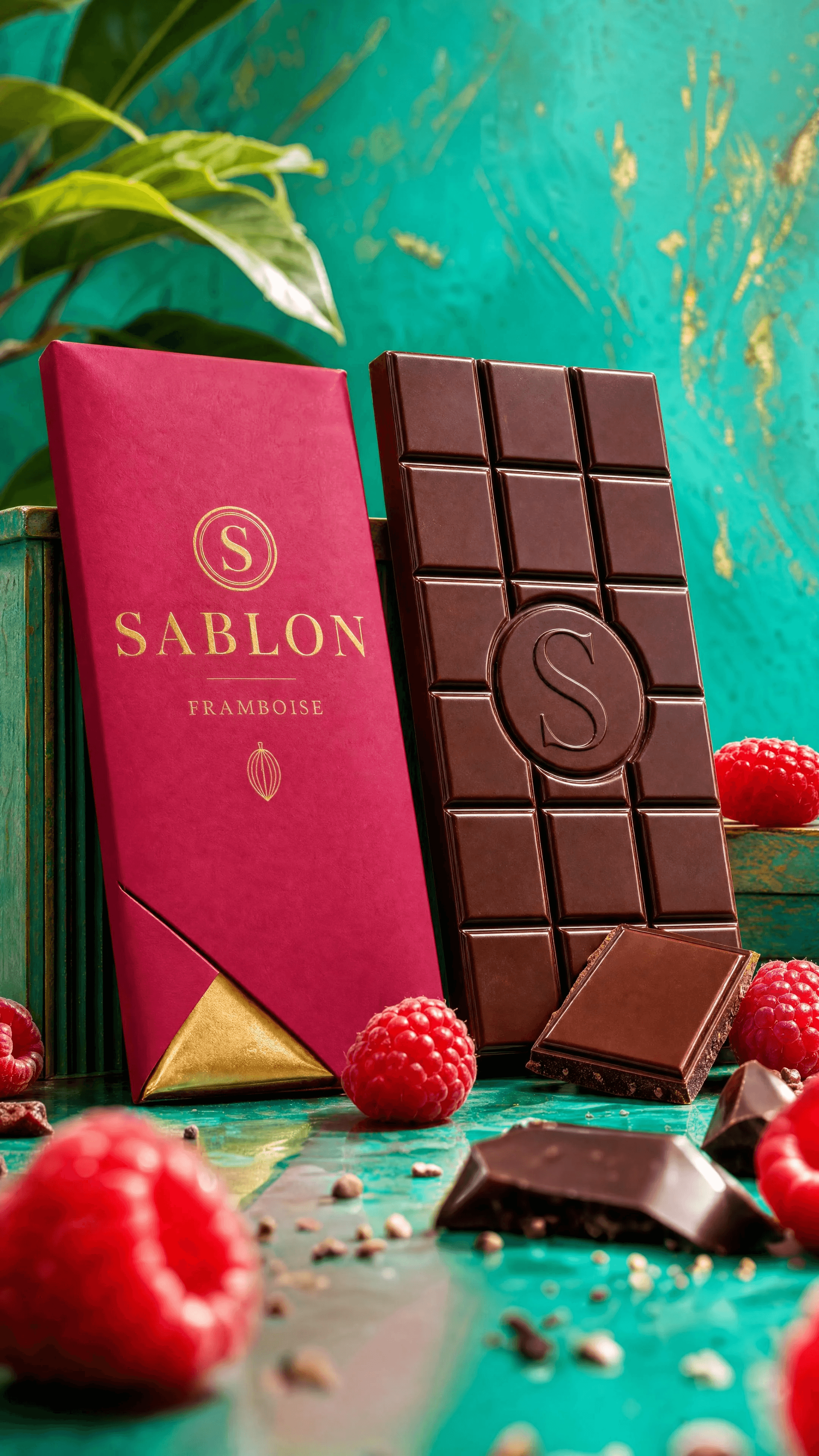
Image 14 — Still Life — Framboise
Original prompt
Image 14: Still Life — Framboise
USE CASE: single-flavor hero still-life advertising photograph for SABLON — the FRAMBOISE (raspberry) chocolate bar, a colorful narrative campaign image, not a flat
packshot. Reference image 1 = logo, image 2 = product sheet, image 3 = packaging sheet. REUSE the exact SABLON wordmark, "S" seal, and the magenta FRAMBOISE
sleeve color #C42B6B.
STYLE: bright, vivid, hyper-saturated luxury food photography with a cinematographer's eye — colorful, artful, dimensional, alive. Playful editorial still-life with
narrative, not a sterile ad.
SCENE: the FRAMBOISE bar as hero — one bar wrapped in its magenta sleeve leaning against a small prop, and beside it the same bar unwrapped showing the flat grid
tablet with the embossed "S" seal and a clean broken piece. Fresh raspberries and a couple of glossy chocolate shards artfully placed. Set on a bright reflective surface
against a boldly contrasting saturated background — a vivid electric-teal / spring-green painted backdrop that pops hard against the magenta, brightly and evenly lit
so it glows.
LIGHTING (like a DoP): bright soft key from upper left, strong open fill, a colorful rim/kicker separating product from the vivid backdrop, lively specular highlights on the
glossy chocolate and gold foil, luminous and clean, minimal deep shadow.
DEPTH OF FIELD: full-frame cinema camera, 100mm macro, ~f/2.0 — the unwrapped tablet and its "S" tack-sharp, background melting into creamy colored bokeh, and
one out-of-focus raspberry in the extreme foreground creating a soft blurred frame.
DETAILS: real glossy tempered chocolate texture, crisp embossed "S" relief, matte magenta soft-touch sleeve, bright gold foil, dewy fresh raspberries, vivid saturated
color rendition.
TEXT (EXACT): "SABLON" / "FRAMBOISE"
PALETTE: #C42B6B magenta · #C9A24B gold · #3A2419 cocoa · vivid electric-teal / spring-green backdrop
IMPERFECTIONS: fine chocolate highlights, a scatter of cocoa nibs, dew on the raspberries, gentle natural grain — keep it bright.
CONSTRAINTS: no watermarks, no extra text beyond the exact strings, correct spelling, only flat chocolate bars (no bonbons), embossed mark a clean single "S", bright
vivid not dark, elegant, no clutter.
OUTPUT: Output in exactly 1080px x 1920px (9:16 portrait vertical format).
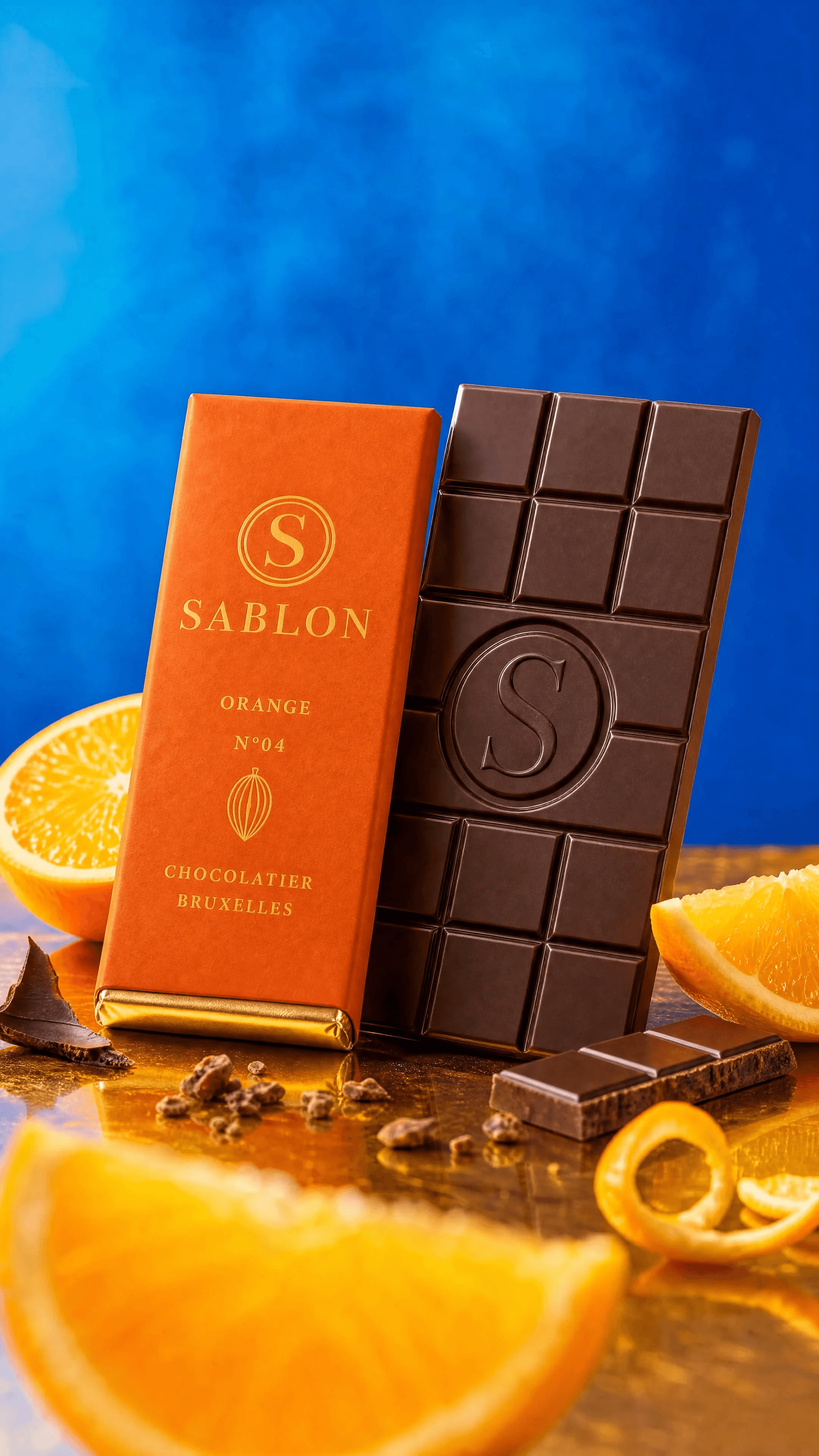
Image 15 — Still Life — Orange
Original prompt
Image 15: Still Life — Orange
USE CASE: single-flavor hero still-life advertising photograph for SABLON — the ORANGE (dark chocolate & orange) bar, colorful narrative campaign image, not a flat
packshot. Reference image 1 = the SABLON hero (match its bright vivid luminous look), image 2 = product sheet (match the burnt-orange ORANGE sleeve #D0561F, the
flat grid tablet and embossed "S"), image 3 = logo. Stay perfectly consistent with brand wordmark, "S" seal and colors.
STYLE: bright, vivid, hyper-saturated luxury food photography with a cinematographer's eye — colorful, artful, dimensional, alive, narrative editorial still-life.
SCENE: the ORANGE bar as hero — one bar wrapped in its burnt-orange sleeve leaning at an angle, beside it the same bar unwrapped showing the flat grid dark tablet
with the embossed "S" and a clean broken piece. Narrative props: fresh juicy orange slices and a curl of candied orange peel, a scatter of cocoa nibs, one glossy
chocolate shard. Set on a bright reflective surface against a boldly contrasting saturated ELECTRIC COBALT-BLUE backdrop, brightly evenly lit so it glows and pops hard
against the orange.
LIGHTING (like a DoP): bright soft key upper-left, strong open fill, warm gold rim, lively specular highlights on the glossy chocolate, the juicy orange and gold foil,
luminous and clean, minimal deep shadow.
DEPTH OF FIELD: full-frame cinema camera, 100mm macro, ~f/2.0 — the unwrapped tablet and "S" tack-sharp, background into creamy blue bokeh, one out-of-focus
orange slice in the extreme foreground framing the shot.
DETAILS: glossy tempered dark chocolate, crisp embossed "S", matte burnt-orange soft-touch sleeve, bright gold foil, dewy fresh orange, vivid saturated color.
TEXT (EXACT): "SABLON" / "ORANGE"
PALETTE: #D0561F burnt orange · #C9A24B gold · #3A2419 cocoa · electric cobalt-blue backdrop
CONSTRAINTS: no watermarks, no extra text beyond the strings, correct spelling, only flat chocolate bars (no bonbons), embossed mark a clean single "S", bright vivid
not dark, elegant, no clutter.
OUTPUT: Output in exactly 1080px x 1920px (9:16 portrait vertical format).
Image 16 — Lifestyle — Hands
Original prompt
Image 16: Lifestyle — Hands
USE CASE: lifestyle campaign photograph for SABLON — HANDS holding chocolate, no face. Reference image 1 = the SABLON hero (match its bright vivid luminous look,
warm surface and consistency), image 2 = product sheet (match the bar mould, embossed "S", and the four flavor sleeve colors), image 3 = logo (wordmark +
"S" seal). Stay perfectly consistent with the brand.
COMPOSITION: framed from the forearms down — only two hands visible, NO face, no head, cropped at the wrists/forearms. Elegant hands snapping/holding a SABLON
chocolate bar: one hand holds the unwrapped NOIR tablet showing the embossed "S" seal, breaking off a clean piece; the other hand holds the half-wrapped burgundy
sleeve so the gold "SABLON" wordmark reads. Cozy, tactile, appetizing.
STYLE: bright, vivid, luminous lifestyle food photography, cinematic high-key, warm and inviting, colorful.
SCENE / BACKGROUND: keep it inside our existing world — a softly blurred vivid emerald backdrop with a warm reflective surface, or a hint of the warm boutique; do
NOT invent a new outdoor location. Sleeve cuff of a soft cocoa knit visible.
LIGHTING (like a DoP): bright soft key upper-left, open fill, warm gold rim, lively specular highlights on the glossy chocolate and gold foil, luminous not dark.
DEPTH OF FIELD: full-frame cinema camera 85mm, ~f/2.0 — the embossed "S" and the breaking piece tack-sharp, background into creamy emerald bokeh, natural
shallow focus.
DETAILS: realistic natural hands with clean neutral nails, glossy tempered chocolate, crisp embossed "S", matte burgundy sleeve, gold foil, a few cocoa nibs. Do not show
any face.
TEXT (EXACT): "SABLON"
PALETTE: #6E1E2A burgundy · #C9A24B gold · #3A2419 cocoa · emerald bokeh
CONSTRAINTS: no face, no head, hands only; no watermarks, no extra text beyond "SABLON", correct spelling, only a flat chocolate bar (no bonbons), embossed mark a
clean single "S", bright vivid, elegant, natural realistic hands (correct fingers), no clutter.
OUTPUT: Output in exactly 1080px x 1920px (9:16 portrait vertical format).
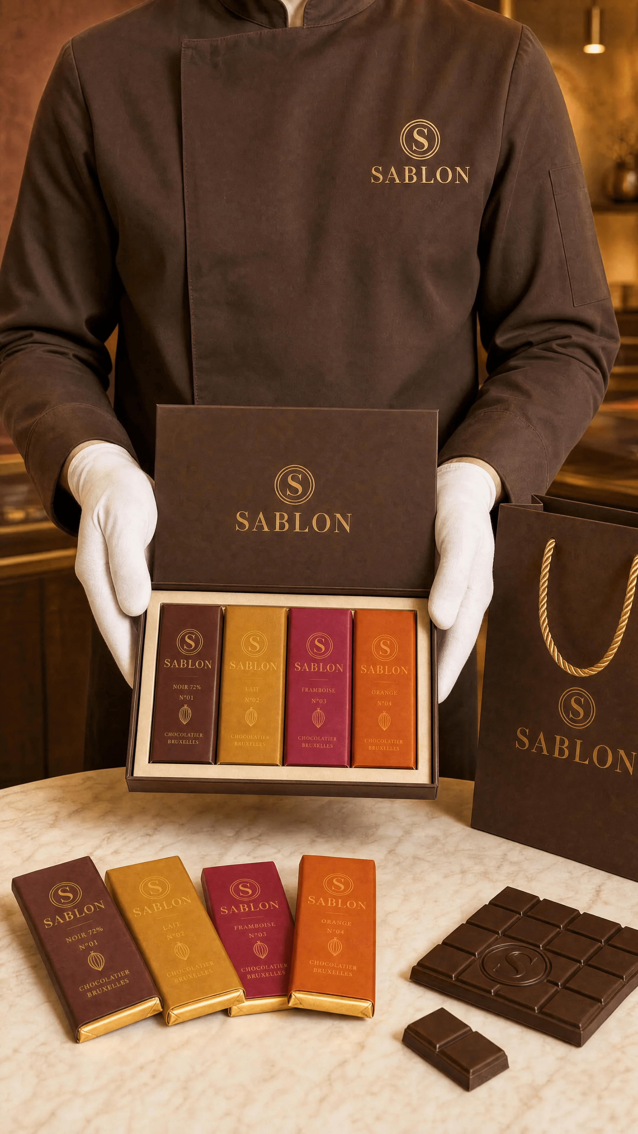
Image 17 — Lifestyle — Chocolatier
Original prompt
Image 17: Lifestyle — Chocolatier (brand jacket)USE CASE: lifestyle campaign photograph for SABLON — a chocolatier in the brand's chef jacket presenting the product, NO face. Reference image 1 = the SABLON hero
(match bright vivid luminous look and consistency), image 2 = packaging sheet (match the coffret, carrier bag, bars and the four flavor colors), image 3 = logo
(wordmark + "S" seal). Stay perfectly consistent with the brand.
COMPOSITION: a male chocolatier shown from the CHEST DOWN — framed so NO face and no head are visible, cropped above the shoulders. He wears an elegant cocoa-brown mandarin/stand-collar chef's jacket (a "chaquetilla") with a small gold embroidered "S" monogram on the chest and a subtle "SABLON" wordmark, clean
white gloves. He holds out, presenting to camera, an open SABLON coffret revealing the four wrapped bars in their flavor colors (or holds two wrapped bars fanned).
Poised, premium, hospitality gesture — echo the elegant torso-only luxury chocolatier portrait style.
STYLE: bright, vivid, luminous editorial lifestyle photography, cinematic high-key, refined, warm.
SCENE / BACKGROUND: stay inside our world — the warm SABLON boutique softly blurred behind (rich plaster feature wall, brass), or a clean warm studio tone; do not
invent an unrelated location.
LIGHTING (like a DoP): bright soft key upper-left, open fill, warm gold rim separating him from the background, luminous, colors popping, gentle highlights on gloves and
gold foil, not dark.
DEPTH OF FIELD: full-frame camera 50mm, ~f/2.2 — the coffret and jacket monogram tack-sharp, background into gentle bokeh.
DETAILS: matte cocoa chef jacket, crisp gold "S" embroidery, clean white gloves, consistent branding on the coffret and bars, premium.
TEXT (EXACT): "SABLON" / "S"
PALETTE: #3A2419 cocoa · #C9A24B gold · #F3ECE0 ivory · flavor colors on bars
CONSTRAINTS: NO face, no head — crop above the shoulders; no watermarks, no extra text beyond the strings, correct spelling SABLON, only flat chocolate bars (no
bonbons), consistent branding, realistic natural hands in gloves, bright vivid not dark, elegant.
OUTPUT: Output in exactly 1080px x 1920px (9:16 portrait vertical format).
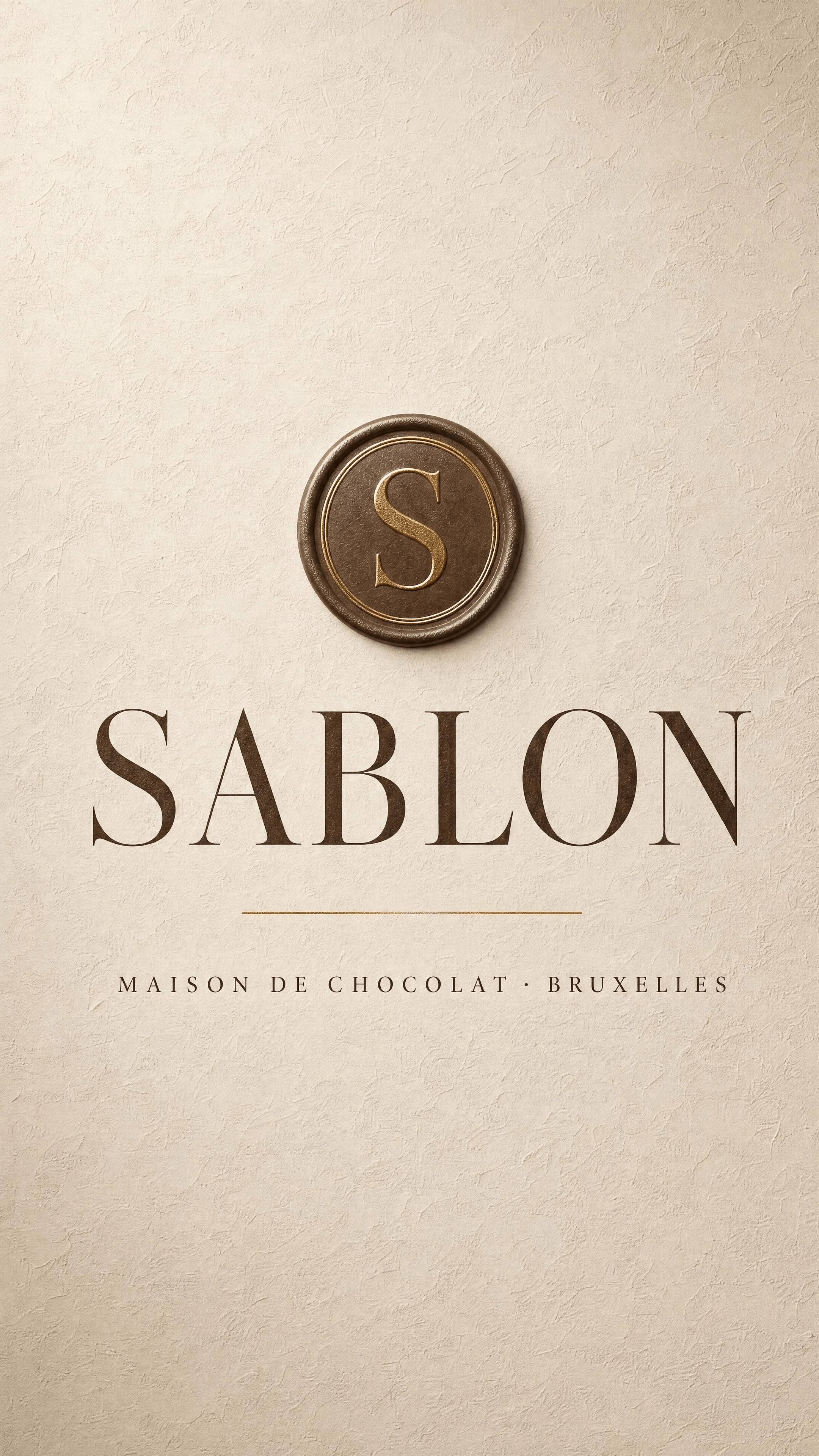
Image 18 — Text Board — Ivory
Original prompt
Image 18: Text Board — Ivory
USE CASE: corporate brand TEXT BOARD (typographic title card) for the Belgian chocolate brand SABLON. Reference image 1 = the SABLON logo — reuse its
exact Didone serif wordmark, the circular "S" seal, and the cocoa/gold/ivory identity.
STYLE: elegant quiet-luxury typographic poster, refined, editorial, textured.
BACKGROUND: a richly TEXTURED surface — warm ivory hand-troweled plaster / fine art paper with subtle tactile grain and a soft vignette, tasteful and premium (not
flat).
LAYOUT: centered composition with generous negative space — the small gold circular "S" seal at top, the large deep-cocoa serif wordmark "SABLON" in the center, a
thin gold hairline rule, and the tagline in fine letter-spaced caps below "MAISON DE CHOCOLAT · BRUXELLES".
DETAILS: subtle gold foil on the seal and hairline, tone-on-tone cocoa typography on textured ivory, museum-grade kerning, luminous soft light.
TEXT (EXACT): "SABLON" / "MAISON DE CHOCOLAT · BRUXELLES" / "S"
PALETTE: #3A2419 cocoa · #C9A24B gold · #F3ECE0 textured ivory
CONSTRAINTS: no watermarks, no extra text beyond the exact strings, correct spelling SABLON, no photo of chocolate, keep it a clean textured typographic board, elegant.
OUTPUT: Output in exactly 1080px x 1920px (9:16 portrait vertical format).
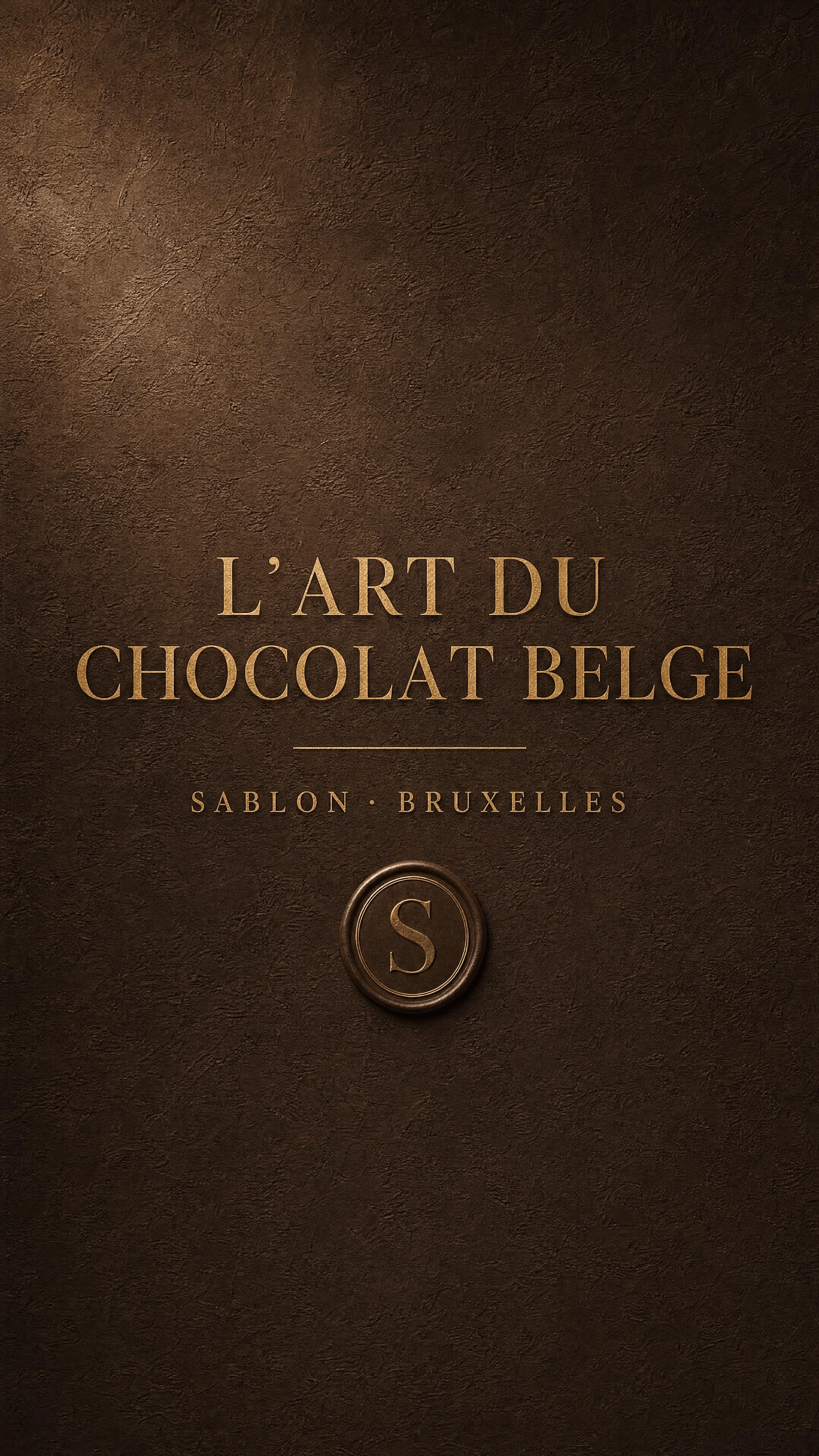
Image 19 — Text Board — Cocoa
Original prompt
Image 19: Text Board — Cocoa
USE CASE: corporate brand TEXT BOARD (statement / tagline card) for the Belgian chocolate brand SABLON. Reference image 1 = the SABLON logo — reuse its
exact Didone serif wordmark, circular "S" seal, cocoa/gold/ivory identity.
STYLE: elegant quiet-luxury typographic poster, refined, editorial, textured — a brand statement slide.
BACKGROUND: a richly TEXTURED deep COCOA surface — dark chocolate-brown troweled plaster / suede-like matte texture with subtle tactile grain and a soft luminous
vignette (premium, not flat).
LAYOUT: centered, generous negative space — a large elegant gold serif statement in two lines "L'ART DU / CHOCOLAT BELGE", with a thin gold hairline rule, and below in
fine letter-spaced caps "SABLON · BRUXELLES", plus the small gold "S" seal.
DETAILS: warm gold foil typography glinting on the textured cocoa background, museum-grade kerning, tone-on-tone luxury, soft directional light catching the plaster texture.
TEXT (EXACT): "L'ART DU" / "CHOCOLAT BELGE" / "SABLON · BRUXELLES" / "S"
PALETTE: #3A2419 textured cocoa · #C9A24B gold · warm highlights
CONSTRAINTS: no watermarks, no extra text beyond the exact strings, correct spelling, no photo of chocolate, keep it a clean textured typographic board, elegant.
OUTPUT: Output in exactly 1080px x 1920px (9:16 portrait vertical format).
Image 20 — Solid — Burgundy
Original prompt
Image 20: Solid — Burgundy (textured)
USE CASE: corporate textured SOLID color background board for the Belgian chocolate brand SABLON — a branded backdrop for campaign layouts (no products, no
text).
STYLE: premium textured color field, tactile and luxurious.
CONTENT: a full-frame richly TEXTURED deep OXBLOOD BURGUNDY (#6E1E2A) surface — hand-troweled matte plaster with a subtle soft gradient from a slightly brighter
warm-lit upper-left into a deeper shadow lower-right, fine tactile grain, gentle vignette, and a very subtle tone-on-tone debossed circular "S" monogram watermark
faintly embossed into the plaster (barely visible, elegant). Cinematic soft directional light grazing the texture.
DETAILS: soft luminous gradient, realistic plaster/suede micro-texture, premium, calm, no clutter.
PALETTE: #6E1E2A burgundy gradient · faint gold
CONSTRAINTS: no visible text, no wordmark text (only the very subtle embossed "S" watermark), no products, no watermarks/logos of other brands, keep it an elegant
textured solid color field, not flat.
OUTPUT: Output in exactly 1080px x 1920px (9:16 portrait vertical format).
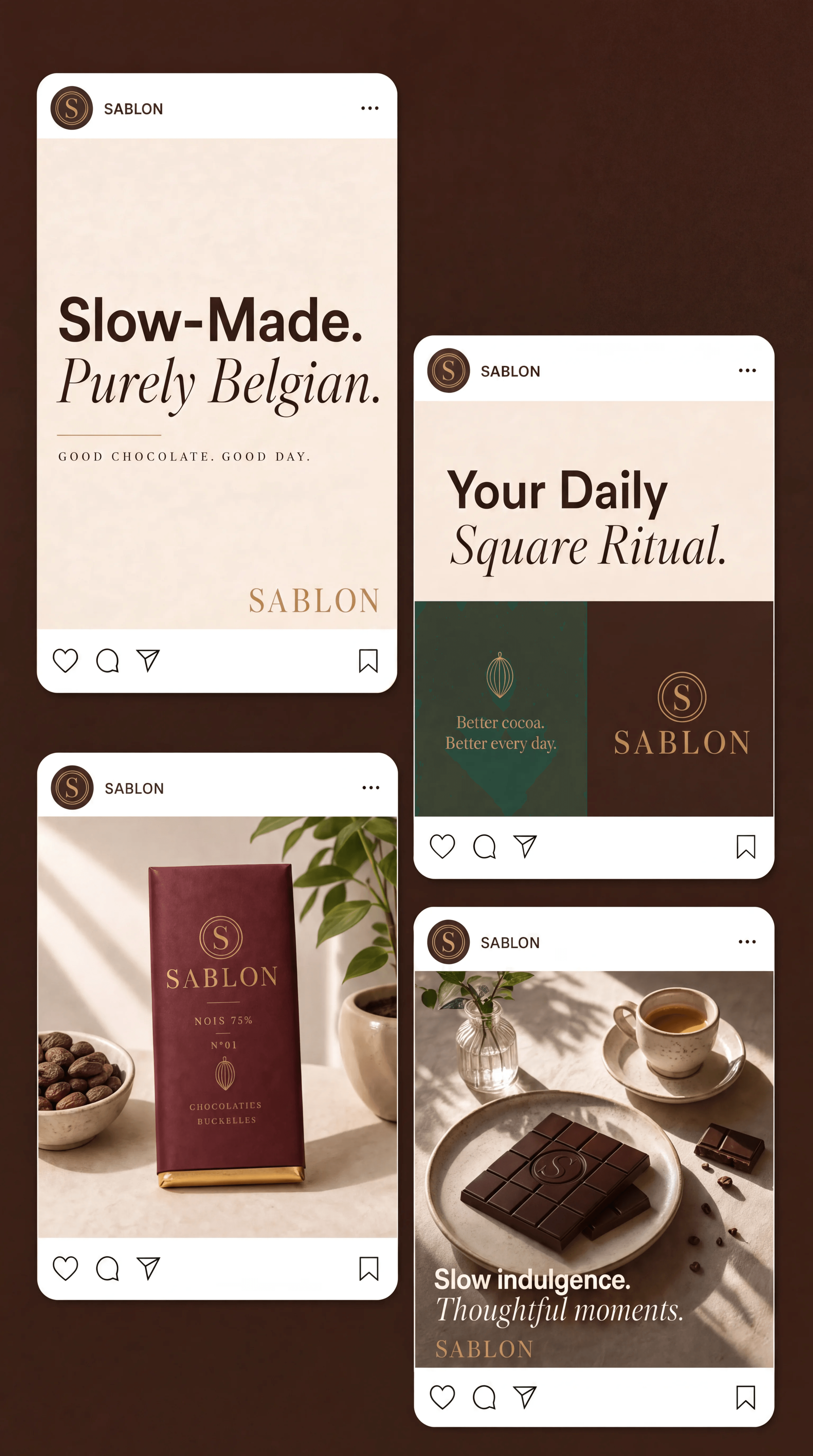
Image 21 — Instagram Posts Board — No Title
Original prompt
Image 21: Instagram Posts board
USE CASE: a social-media presentation board titled "Instagram posts" showing four mocked-up Instagram feed posts for the Belgian chocolate brand SABLON — a
brand-kit showcase slide. Reference image 1 = SABLON logo (reuse the exact Didone serif "SABLON" wordmark and circular "S" seal), image 2 = SABLON hero (match
cocoa/gold/ivory palette and the chocolate look), image 3 = product sheet (bar mould, embossed S, flavor colors). Keep perfect brand consistency.
STYLE: clean modern brand-kit mockup, quiet-luxury editorial, exactly emulating a reference Instagram-posts layout board.
BACKGROUND: a deep warm COCOA (#3A2419) canvas. The cream title text "Instagram posts" set large in the upper-right area in an elegant mix of bold sans + italic
serif.
LAYOUT: four rounded-corner white Instagram post cards arranged like a scattered grid — one large card top-left, one card on the right slightly lower, one card
bottom-left, one card bottom-right. Each card has realistic Instagram chrome: a small round avatar with the "S" seal, the username "SABLON", a "..." menu, and along
the bottom the like / comment / share icons on the left and a bookmark icon on the right.
THE FOUR POSTS:
 1) Top-left card — a TEXT post on ivory: huge bold sans headline "Slow-Made." then an italic Didone serif line "Purely Belgian.", with small caps "GOOD CHOCOLATE. GOOD
DAY." and the gold "SABLON" wordmark bottom-right.
 2) Right card — a COLOR-BLOCK post: light area with bold+italic headline "Your Daily Square Ritual.", the lower half split into a sage-emerald block and a cocoa block,
small text "Better cocoa. Better every day." and the "SABLON" wordmark.
 3) Bottom-left card — a PRODUCT photo post: a wrapped SABLON NOIR chocolate bar (deep burgundy sleeve, gold SABLON wordmark and S seal) standing on a soft ivory
surface beside a small bowl of cocoa beans and a green plant, soft daylight (echo the reference product post).
 4) Bottom-right card — a LIFESTYLE food post: an elegant flat table with SABLON chocolate squares on a plate, an espresso cup, a small vase with a sprig, warm daylight;
overlaid text "Slow indulgence. / Thoughtful moments." and the "SABLON" wordmark.
DETAILS: consistent branding on every card, refined typography, tasteful cocoa/gold/ivory + a touch of emerald and dusty-blue, realistic app UI, crisp.
TEXT (EXACT): "Instagram posts" / "SABLON" / "Slow-Made." / "Purely Belgian." / "GOOD CHOCOLATE. GOOD DAY." / "Your Daily Square Ritual." / "Better
cocoa. Better every day." / "Slow indulgence." / "Thoughtful moments." / "S"
PALETTE: #3A2419 cocoa · #C9A24B gold · #F3ECE0 ivory · sage-emerald · dusty blue · #6E1E2A burgundy
CONSTRAINTS: no misspellings, correct spelling SABLON, only flat chocolate bars/squares (no bonbons), no real other brand names, clean legible UI, elegant, no clutter.OUTPUT: Output in exactly 1080px x 1920px (9:16 portrait vertical format).
NOTE: the delivered board (InstagramPosts_NoTitle) is the same generation with the top-right "Instagram posts" title cleanly removed via a Nano Banana 2 edit; the
four post cards keep all their content.
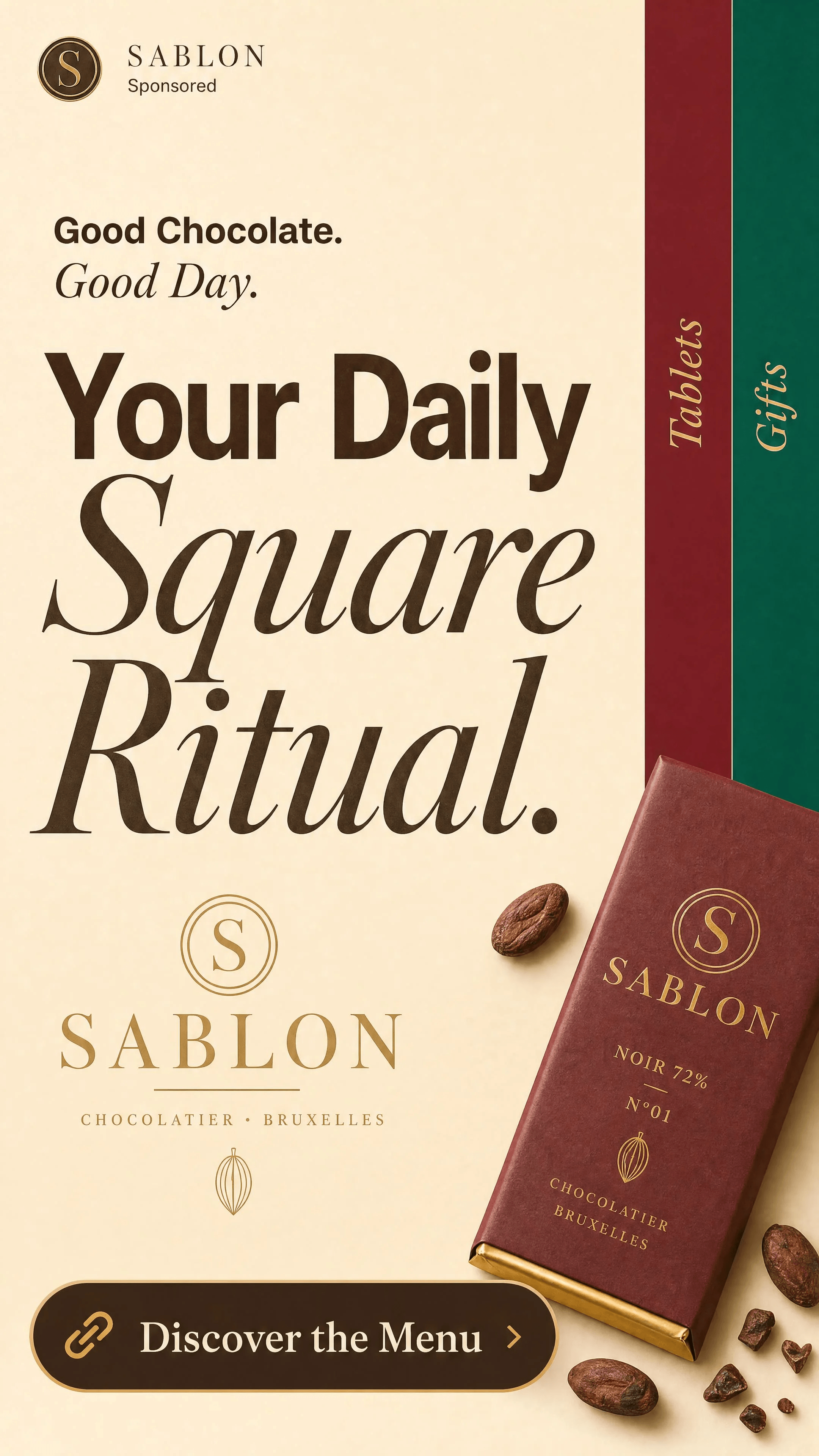
Image 22 — Ad — Your Daily Square Ritual
Original prompt
Image 22: Ad — Your Daily Square Ritual
USE CASE: a full-frame vertical ADVERTISEMENT (sponsored-post style) for the Belgian chocolate brand SABLON — a full-bleed 9:16 ad poster (NOT inside a phone
mockup, it fills the entire frame edge to edge). Reference image 1 = SABLON logo (reuse the exact Didone serif "SABLON" wordmark and circular "S" seal), image 2 =
SABLON hero, image 3 = product sheet. Perfect brand consistency.
STYLE: quiet-luxury editorial ad, big confident typography, clean color-blocking, emulating a premium lifestyle-brand sponsored ad.
LAYOUT (full bleed):
 - top-left small header: the "S" avatar seal + "SABLON" and under it "Sponsored".
 - a short kicker line top: "Good Chocolate. / Good Day." (bold + italic).
 - the dominant hero headline stacked large, filling most of the frame: "Your Daily" / "Square" / "Ritual." — mixing bold sans and italic Didone serif in deep cocoa
on a warm ivory (#F3ECE0) field.
 - on the right edge, two tall vertical color stripes with rotated labels: a burgundy stripe labelled "Tablets" and an emerald stripe labelled "Gifts".
 - the gold "SABLON" wordmark lower-left.
 - a rounded CTA bar pinned near the bottom: a link icon + "Discover the Menu" + a ">" chevron.
 - tuck a wrapped SABLON bar and a few cocoa beans elegantly along one lower corner so the ad still shows product.
DETAILS: refined kerning, tasteful cocoa/gold/ivory with burgundy + emerald accents, crisp premium UI for the CTA, full-frame edge to edge (no phone frame, no
rounded phone bezel).
TEXT (EXACT): "SABLON" / "Sponsored" / "Good Chocolate." / "Good Day." / "Your Daily" / "Square" / "Ritual." / "Tablets" / "Gifts" / "Discover the
Menu" / "S"
PALETTE: #F3ECE0 ivory · #3A2419 cocoa · #C9A24B gold · #6E1E2A burgundy · emerald
CONSTRAINTS: full-bleed ad (NOT a phone mockup, no device frame), no misspellings, correct spelling SABLON, only flat chocolate bars (no bonbons), no other real brand
names, elegant, legible.
OUTPUT: Output in exactly 1080px x 1920px (9:16 portrait vertical format).
Image 23 — Ad — Freshly Made / Quietly Belgian
Original prompt
Image 23: Ad — Freshly Made / Quietly Belgian
USE CASE: a full-frame vertical ADVERTISEMENT for the Belgian chocolate brand SABLON — full-bleed 9:16 poster ad (NOT a phone mockup, fills the entire frame).
Reference image 1 = SABLON logo (exact Didone serif "SABLON" wordmark + circular "S" seal), image 2 = SABLON hero (match bright vivid look), image 3 = product
sheet (bar mould, embossed S, burgundy NOIR sleeve). Perfect brand consistency.
STYLE: quiet-luxury editorial product ad, big confident typography over a beautiful product photograph — premium, bright, vivid.
LAYOUT (full bleed):
 - top-left small header: "S" seal + "SABLON" and "Sponsored" under it.
 - the upper half is a large bright product photograph: a wrapped SABLON NOIR bar (burgundy sleeve, gold SABLON wordmark and S seal) standing next to its unwrapped
tablet showing the embossed "S", cocoa beans scattered, on a warm surface against a glowing emerald backdrop (echo the hero look), depth of field.
 - the lower half an ivory (#F3ECE0) band with the big headline "Freshly Made." (bold sans) / "Quietly Belgian." (italic Didone serif) in deep cocoa, a thin gold
hairline, and small caps "72% BELGIAN DARK · N°01".
 - the gold "SABLON" wordmark, and a rounded CTA bar near the bottom: link icon + "Shop the Bar" + ">" chevron.
DETAILS: refined typography, bright vivid product photography merged cleanly with the type band, cocoa/gold/ivory + burgundy + emerald, full-frame edge to edge
(no device frame).
TEXT (EXACT): "SABLON" / "Sponsored" / "Freshly Made." / "Quietly Belgian." / "72% BELGIAN DARK · N°01" / "Shop the Bar" / "S"PALETTE: #6E1E2A burgundy · #C9A24B gold · #F3ECE0 ivory · #3A2419 cocoa · emerald
CONSTRAINTS: full-bleed ad (NOT a phone mockup, no device frame), no misspellings, correct spelling SABLON, only a flat chocolate bar (no bonbons), embossed mark a
clean single "S", no other real brand names, elegant, legible, bright vivid.
OUTPUT: Output in exactly 1080px x 1920px (9:16 portrait vertical format).
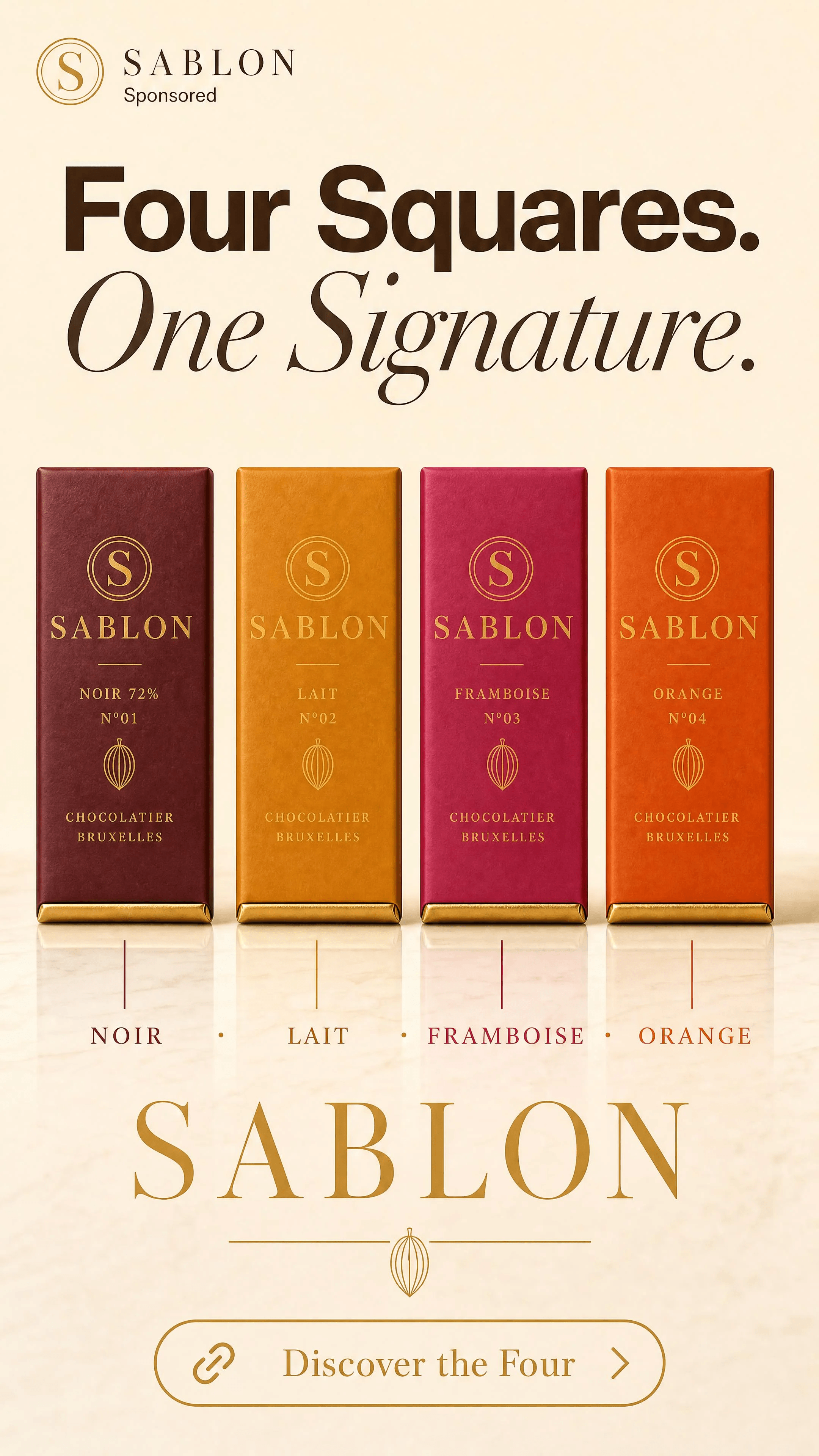
Image 24 — Ad — Four Squares / One Signature
Original prompt
Image 24: Ad — Four Squares / One Signature
USE CASE: a full-frame vertical ADVERTISEMENT for the Belgian chocolate brand SABLON — full-bleed 9:16 poster ad (NOT a phone mockup, fills the entire frame),
showcasing the four flavors. Reference image 1 = SABLON logo (exact Didone serif "SABLON" wordmark + circular "S" seal), image 2 = SABLON hero, image 3 =
product sheet (the four sleeve colors: NOIR burgundy #6E1E2A, LAIT amber #C98A3B, FRAMBOISE magenta #C42B6B, ORANGE burnt-orange #D0561F). Perfect brand
consistency.
STYLE: quiet-luxury editorial ad, big confident typography + a clean four-color system, premium, vivid.
LAYOUT (full bleed):
 - top-left small header: "S" seal + "SABLON" and "Sponsored" under it.
 - big stacked headline top on ivory: "Four Squares." (bold sans) / "One Signature." (italic Didone serif) in deep cocoa.
 - the center: the four wrapped SABLON bars standing in a neat row in their four flavor colors, each gold "SABLON" wordmark and "S" seal reading, bright even product
light, subtle reflection (echo the clean line-up look).
 - four thin vertical color tabs / labels under each bar: "NOIR" · "LAIT" · "FRAMBOISE" · "ORANGE" in their colors.
 - the gold "SABLON" wordmark, and a rounded CTA bar near the bottom: link icon + "Discover the Four" + ">" chevron.
DETAILS: refined typography, the four-color SKU system reading clearly, cocoa/gold/ivory base, full-frame edge to edge (no device frame), bright vivid.
TEXT (EXACT): "SABLON" / "Sponsored" / "Four Squares." / "One Signature." / "NOIR" / "LAIT" / "FRAMBOISE" / "ORANGE" / "Discover the Four" / "S"
PALETTE: #6E1E2A burgundy · #C98A3B amber · #C42B6B magenta · #D0561F burnt orange · #C9A24B gold · #F3ECE0 ivory · #3A2419 cocoa
CONSTRAINTS: full-bleed ad (NOT a phone mockup, no device frame), no misspellings, correct spelling SABLON and the four flavor names, only flat chocolate bars (no
bonbons), no other real brand names, elegant, legible, bright vivid.
OUTPUT: Output in exactly 1080px x 1920px (9:16 portrait vertical format).
Image 25 — Color Swap — Emerald
Original prompt
Image 25: Color Swap — Emerald (Nano Banana 2 edit)
EDIT on the Color-Swap Base (prompt 09), model Nano Banana 2, 9:16 4K.
Change ONLY the seamless background color to a vivid saturated EMERALD GREEN. Keep absolutely everything else identical and unchanged: the four SABLON chocolate
bars, their exact positions, spacing, heights, the flavor sleeve colors, the gold wordmarks and S seals, the lighting, the floor reflection, the framing and composition. Only
the background color changes, nothing else moves or changes.
Image 26 — Color Swap — Violet
Original prompt
Image 26: Color Swap — Violet (Nano Banana 2 edit)
EDIT on the Color-Swap Base (prompt 09), model Nano Banana 2, 9:16 4K.
Change ONLY the seamless background color to a vivid saturated ROYAL VIOLET / purple. Keep absolutely everything else identical and unchanged: the four SABLON
chocolate bars, their exact positions, spacing, heights, the flavor sleeve colors, the gold wordmarks and S seals, the lighting, the floor reflection, the framing and
composition. Only the background color changes, nothing else moves or changes.
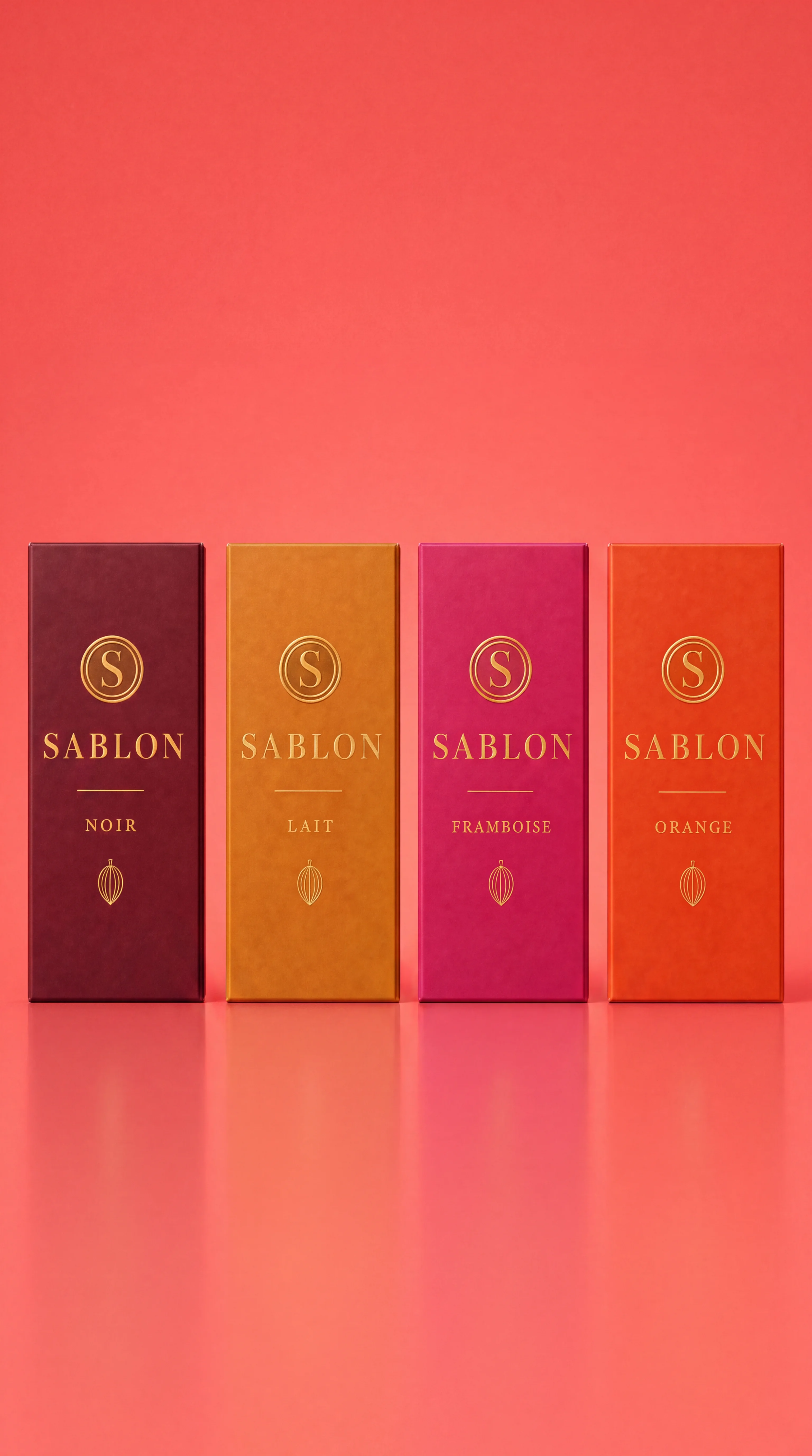
Image 27 — Color Swap — Coral
Original prompt
Image 27: Color Swap — Coral (Nano Banana 2 edit)
EDIT on the Color-Swap Base (prompt 09), model Nano Banana 2, 9:16 4K.
Change ONLY the seamless background color to a vivid saturated CORAL / warm coral-pink. Keep absolutely everything else identical and unchanged: the four SABLON
chocolate bars, their exact positions, spacing, heights, the flavor sleeve colors, the gold wordmarks and S seals, the lighting, the floor reflection, the framing and
composition. Only the background color changes, nothing else moves or changes.
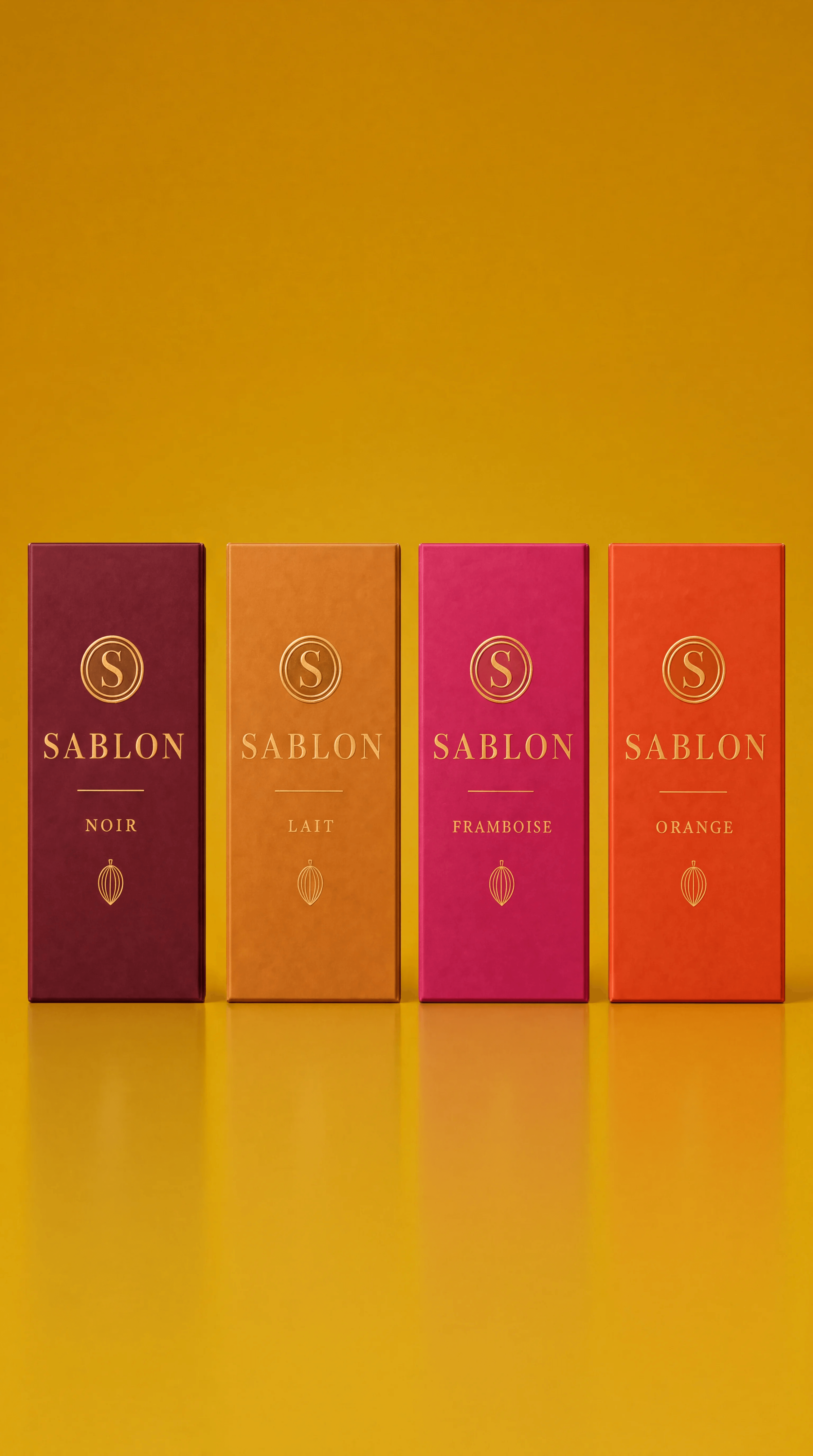
Image 28 — Color Swap — Mustard
Original prompt
Image 28: Color Swap — Mustard (Nano Banana 2 edit)
EDIT on the Color-Swap Base (prompt 09), model Nano Banana 2, 9:16 4K.
Change ONLY the seamless background color to a vivid saturated MUSTARD / golden-yellow. Keep absolutely everything else identical and unchanged: the four SABLON
chocolate bars, their exact positions, spacing, heights, the flavor sleeve colors, the gold wordmarks and S seals, the lighting, the floor reflection, the framing and
composition. Only the background color changes, nothing else moves or changes.
Review checklist
Review checklist
FAQ
Get started with on-brand visuals
Your catalog into campaign-ready Creative
Riverflow connects your products, brand rules and creative workflows so your team can create on-brand photoshoots, ads, videos and edits across every campaign.