Scenes from the Riverflow library

The workflow
Brand references, product consistency, then campaign scenes
Prepare and lock the references
Generate each scene
Compare against the approved product
Copy the image prompts
PULP image prompts
Logo. Brand Identity
Original prompt
Create a clean brand logo lockup on a pure white background, nothing else in frame. Brand name: "PULP" — a liquid blush and lip tint beauty brand. Wordmark: bold, rounded, juicy sans-serif lowercase "pulp", letterforms slightly plump/bulbous echoing a berry or a bead of liquid, in a deep saturated raspberry-magenta red (#C21E4A style tone). Paired icon mark: a small solid rounded dot/bead shape (like a drop of liquid or a berry) in the same raspberry-magenta color, positioned to the left of or above the wordmark, simple enough to work alone as a stamp/seal. No tagline, no product, no mockup, no shadow gradients besides a soft flat drop shadow. Vector-clean, commercial cosmetics branding quality, centered composition, generous white margin.
0. Product Reference Sheet
Original prompt
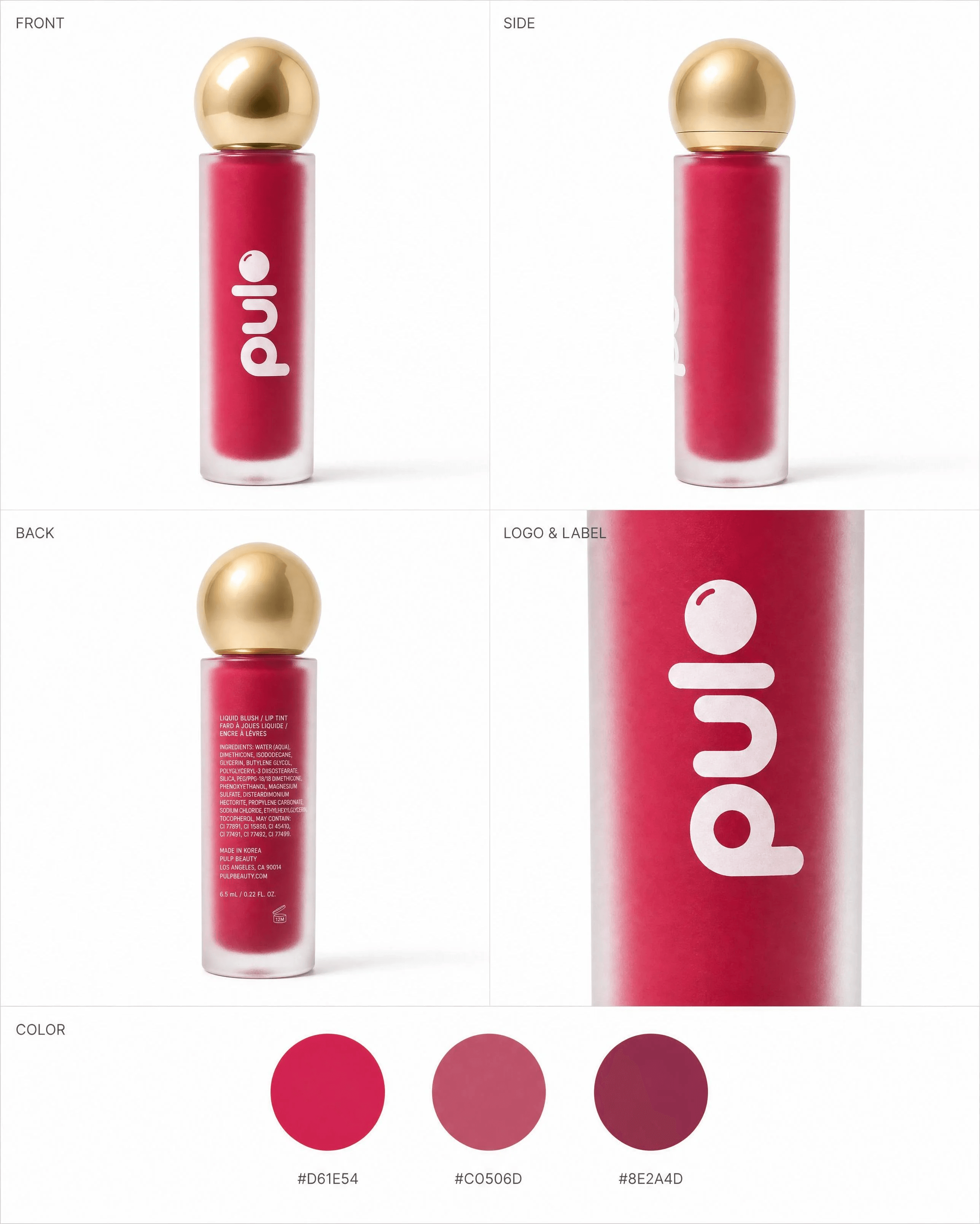
Product spec sheet for a cosmetics brand called "PULP" (liquid blush / lip tint). Use the attached logo lockup exactly as the brand's wordmark and icon reference — do not redraw or alter the letterforms. Layout: a clean white studio spec sheet with four labeled quadrants, each with a small caption in a simple sans-serif label style:
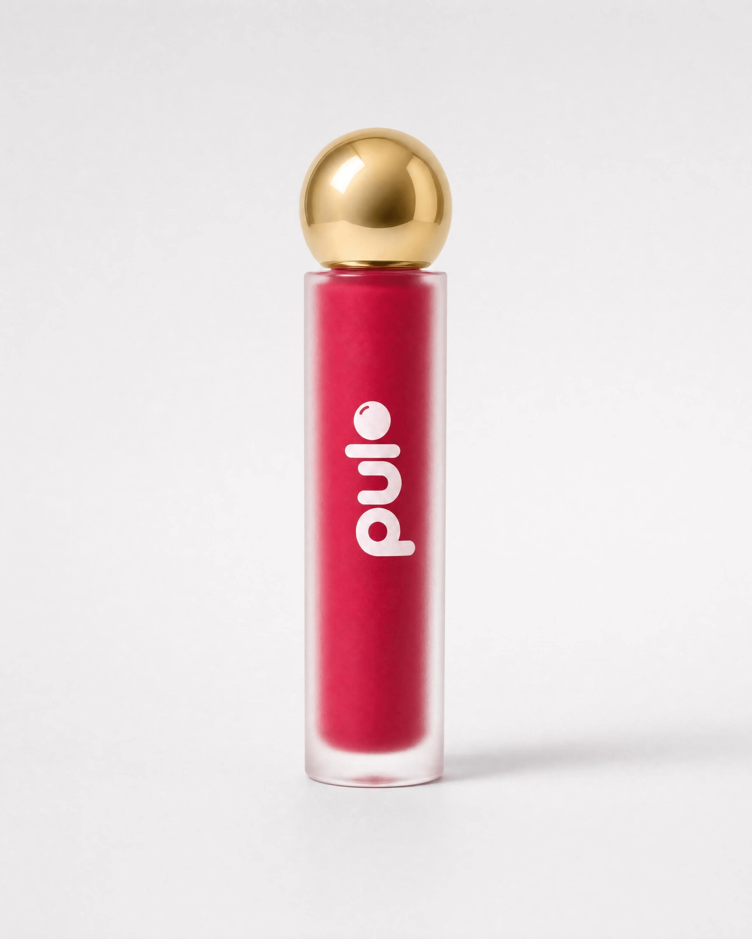
1) "FRONT" — a frosted glass cylindrical bottle with a glossy gold spherical cap and a doe-foot applicator wand hidden inside, filled with a saturated raspberry-magenta liquid, the "pulp" wordmark and bead icon printed vertically down the front of the bottle in white or the brand's raspberry-magenta color depending on contrast, photographed straight-on studio product shot with soft shadow.
2) "SIDE" — the same bottle rotated 90°, showing the cap seam and bottle profile.
3) "BACK" — the same bottle rotated 180°, plain back label area with small ingredient-style text block (illegible/generic, not real text needed to be readable).
4) "LOGO & LABEL" — a zoomed close-up of the wordmark and bead icon as printed on the bottle surface, showing exact placement, size and finish (matte print on frosted glass). Plus a bottom strip "COLOR" with 3 circular color swatches and small hex-style labels beneath each: a deep raspberry-magenta hero shade, a dusty mauve-pink secondary shade, and a warm berry-plum third shade — all saturated, cohesive family of tones. White seamless background throughout, even soft studio lighting, high-end cosmetics catalog photography, ultra sharp product focus, no people, no extra props.
1. The Cover
Original prompt
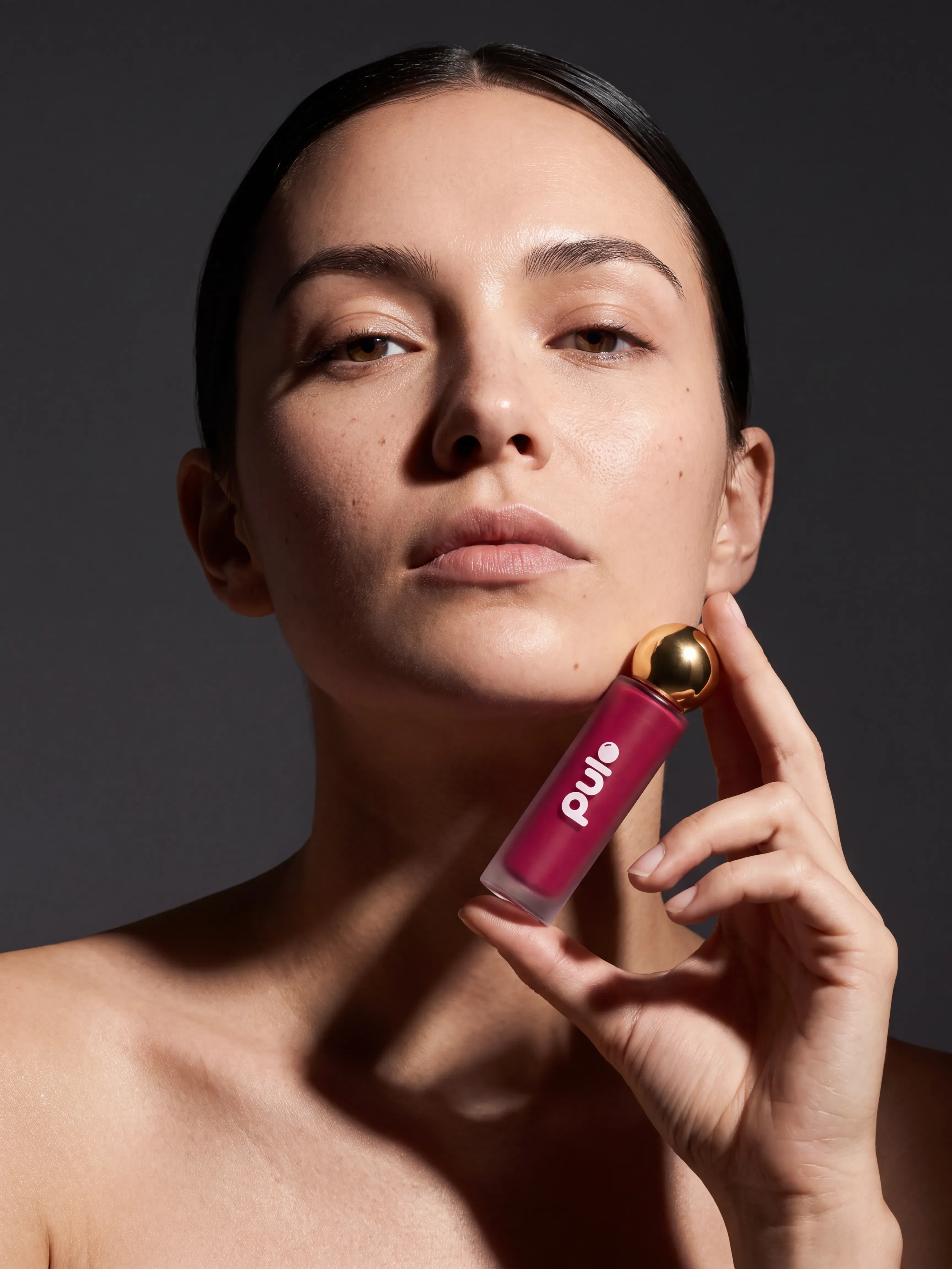
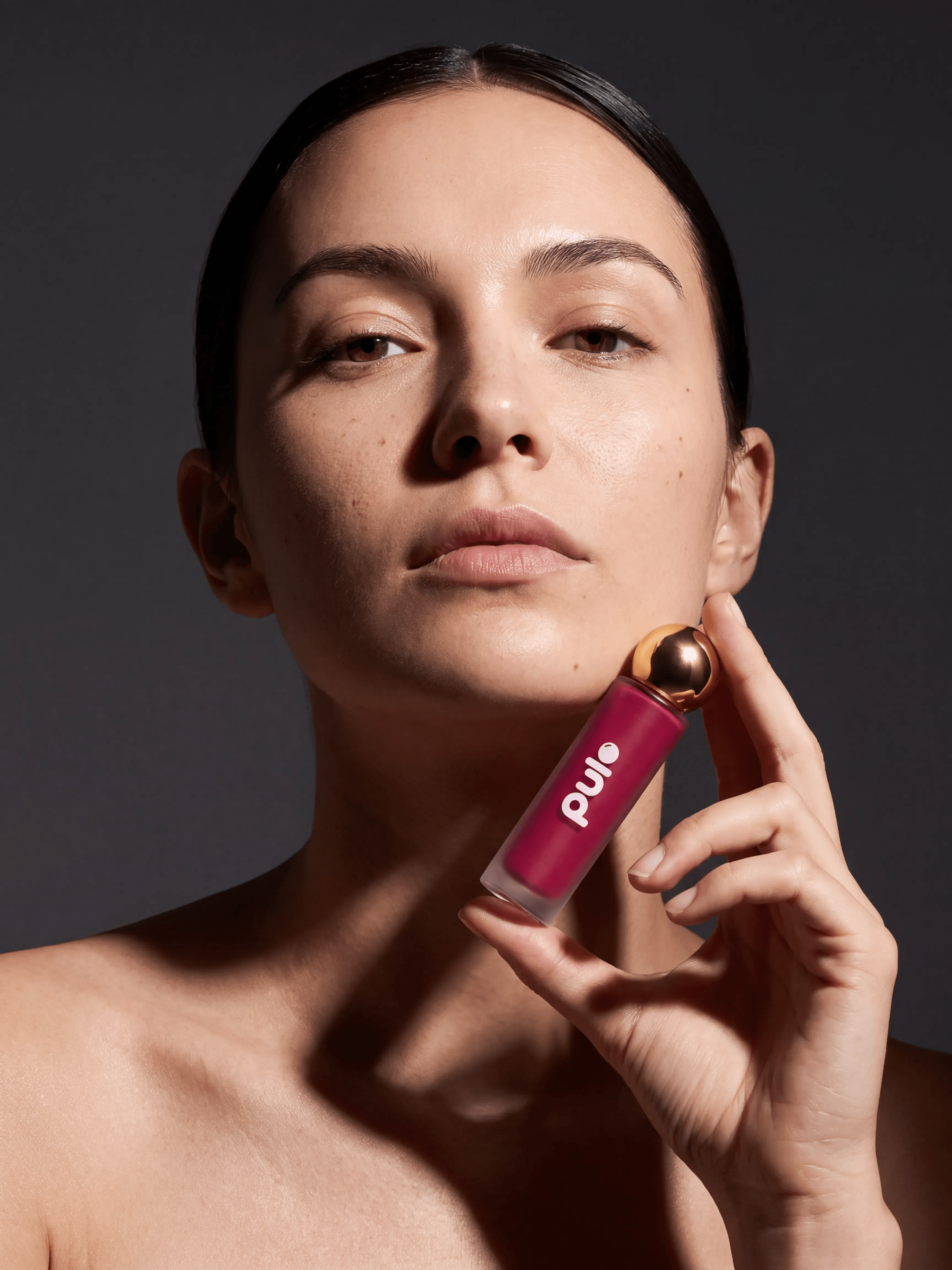
USE CASE: editorial beauty cover shot, PDP-style hero cover image for ecommerce/social carousel — photographic realism, not a 3D render.
STYLE: photorealistic high-fashion beauty editorial photography, shot like a real commercial photo not a CGI render, hard directional studio lighting, natural true-to-life skin tones and color grading, not oversaturated.
SCENE: seamless dark charcoal-grey studio background, single hard directional light source from upper camera-left creating a defined shadow line across the face and a visible contact shadow cast on the background, high contrast lighting ratio, camera positioned at a low angle looking slightly upward at the subject.
SUBJECT: a professional adult female model, clear healthy skin with realistic visible pores and fine texture (not airbrushed smooth), defined cheekbones, calm direct gaze toward camera, dark hair styled sleek and pulled back, chin slightly raised. She holds one of the exact same PULP products shown in the attached reference images near her jawline — a frosted glass cylindrical bottle with a glossy gold spherical cap and doe-foot applicator wand, deep raspberry-magenta liquid, the rounded plump lowercase "pulp" wordmark and matching bead icon printed vertically on the bottle, rendered as real glass and metal with genuine specular highlights and micro-imperfections. Her hand holding the bottle is anatomically correct: exactly five fingers of normal proportion, natural relaxed grip, correctly bent joints, no extra or merged fingers.
DETAILS: do not change the product shape, bottle design, cap, wordmark, logo, or liquid color from the reference — use it exactly as shown, but render its material as real glass and metal. Hard specular highlights on skin and glass, deep controlled shadows, sharp focus on skin texture, hand, and product.
CONSTRAINTS: no other brand names or logos, no watermarks, no extra text, no malformed hands, no extra or fused fingers, no over-smoothed airbrushed skin, no flat soft lighting, no oversaturation.
OUTPUT: "Output in exactly 1080px x 1350px (4:5 portrait format).
2. The Drop
Original prompt
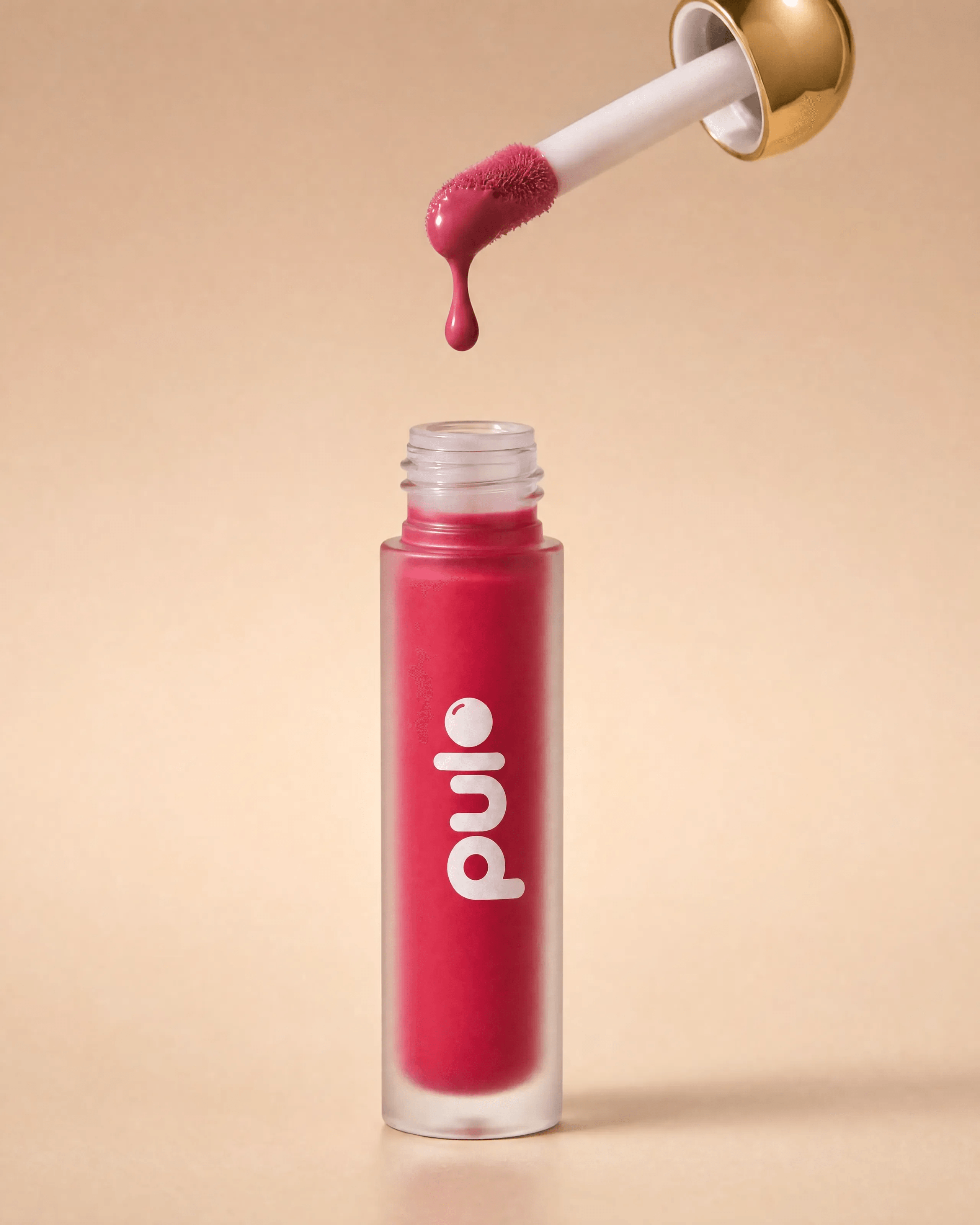
USE CASE: product photoshoot, PDP-style hero image for ecommerce/social carousel — photographic realism, not a 3D render.
STYLE: photorealistic editorial cosmetic product photography, shot like a real commercial photo not a CGI render, warm minimal studio look, natural true-to-life color grading.
SCENE: warm beige seamless studio background, single directional warm light source with real falloff and a visible soft-edged contact shadow beneath the bottle, vertical centered composition, shallow depth of field.
SUBJECT: the exact same PULP product shown in the attached reference images — a frosted glass cylindrical bottle with a glossy gold spherical cap and doe-foot applicator wand, deep raspberry-magenta liquid, the rounded plump lowercase "pulp" wordmark and matching bead icon printed vertically on the bottle. Render the frosted glass with real specular highlights and subtle surface micro-imperfections, visible light transmission through the frosted body rather than flat opaque color; the gold cap has real anisotropic metal reflections. The gold-capped doe-foot applicator wand is held above the open bottle — CRITICAL: the wand is fully extended to its correct full length exactly as shown in the reference product sheet, a long slender rod from the gold cap down to the doe-foot tip, NOT a short or truncated stick — tip loaded with raspberry-magenta liquid, a single drop caught mid-air with realistic surface tension and refraction, falling toward the open bottle neck below.
DETAILS: do not change the product shape, bottle design, cap, wordmark, logo, liquid color, or applicator wand length/proportions from the reference — use it exactly as shown, but render its material as real glass and metal. Natural, slightly muted color palette matching a real campaign shoot, not an oversaturated "brand pop" look.
CONSTRAINTS: no other brand names or logos, no watermarks, no extra text, no illegible labels, no distorted geometry, no hands, no plastic-looking CGI material, no flat uniform studio glow, no oversaturation, no shortened or truncated applicator wand.
OUTPUT: "Output in exactly 1080px x 1350px (4:5 portrait format).
3. The Berries
Original prompt
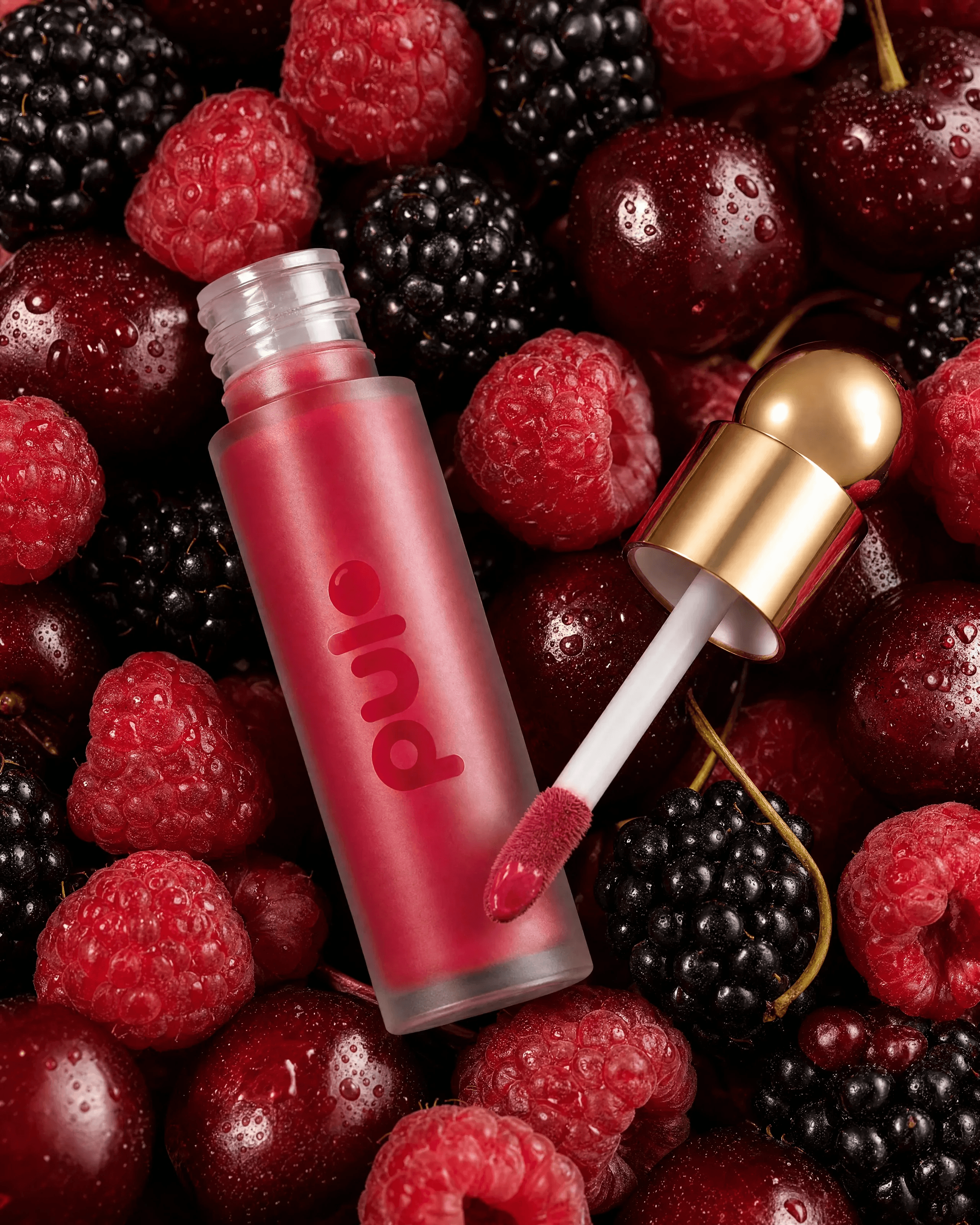
USE CASE: product photoshoot, PDP-style hero image for ecommerce/social carousel — photographic realism, not a 3D render.
STYLE: photorealistic luxury cosmetic campaign photography, shot like a real commercial photo not a CGI render, macro product photography, true-to-life color grading (not oversaturated), rich but natural contrast.
SCENE: warm directional studio lighting with visible falloff and a real contact shadow beneath the product, close-up composition, the product lying open among fresh mixed berries — raspberries, blackberries, and dark cherries — with realistic fine fuzz visible on the raspberry drupelets, individual water droplets with real refraction and surface tension, slight translucency in the fruit flesh where light passes through. Shallow depth of field with a soft falloff to background blur.
SUBJECT: the exact same PULP product shown in the attached reference images — a frosted glass cylindrical bottle with a glossy gold spherical cap and doe-foot applicator wand, deep raspberry-magenta liquid, the rounded plump lowercase "pulp" wordmark and matching bead icon printed vertically on the bottle. Render the frosted glass as real photographed glass: soft specular highlights, subtle real-world edge imperfections, visible light transmission through the frosted material rather than flat plastic-looking color. The gold cap has realistic anisotropic metal reflections, not a flat CGI gold shader. The gold spherical cap is removed and placed to the side of the bottle. The doe-foot applicator wand is pulled fully out of the bottle and resting beside it — CRITICAL: the wand must be its full correct length exactly as shown in the reference product sheet, a long slender rod reaching from the gold cap all the way to the doe-foot tip, NOT a short or truncated stick — showing raspberry-magenta product on the tip.
DETAILS: do not change the product shape, bottle design, cap, wordmark, logo, liquid color, or applicator wand length/proportions from the reference — use it exactly as shown, but render its material as real glass and metal, not plastic-clean CGI. Natural, slightly muted color palette matching a real campaign shoot, not a saturated "brand pop" look.
CONSTRAINTS: no other brand names or logos, no watermarks, no extra text, no illegible labels, no distorted geometry, no hands, no plastic-looking CGI material, no flat uniform studio glow, no oversaturation, no shortened or truncated applicator wand.
OUTPUT: "Output in exactly 1080px x 1350px (4:5 portrait format).
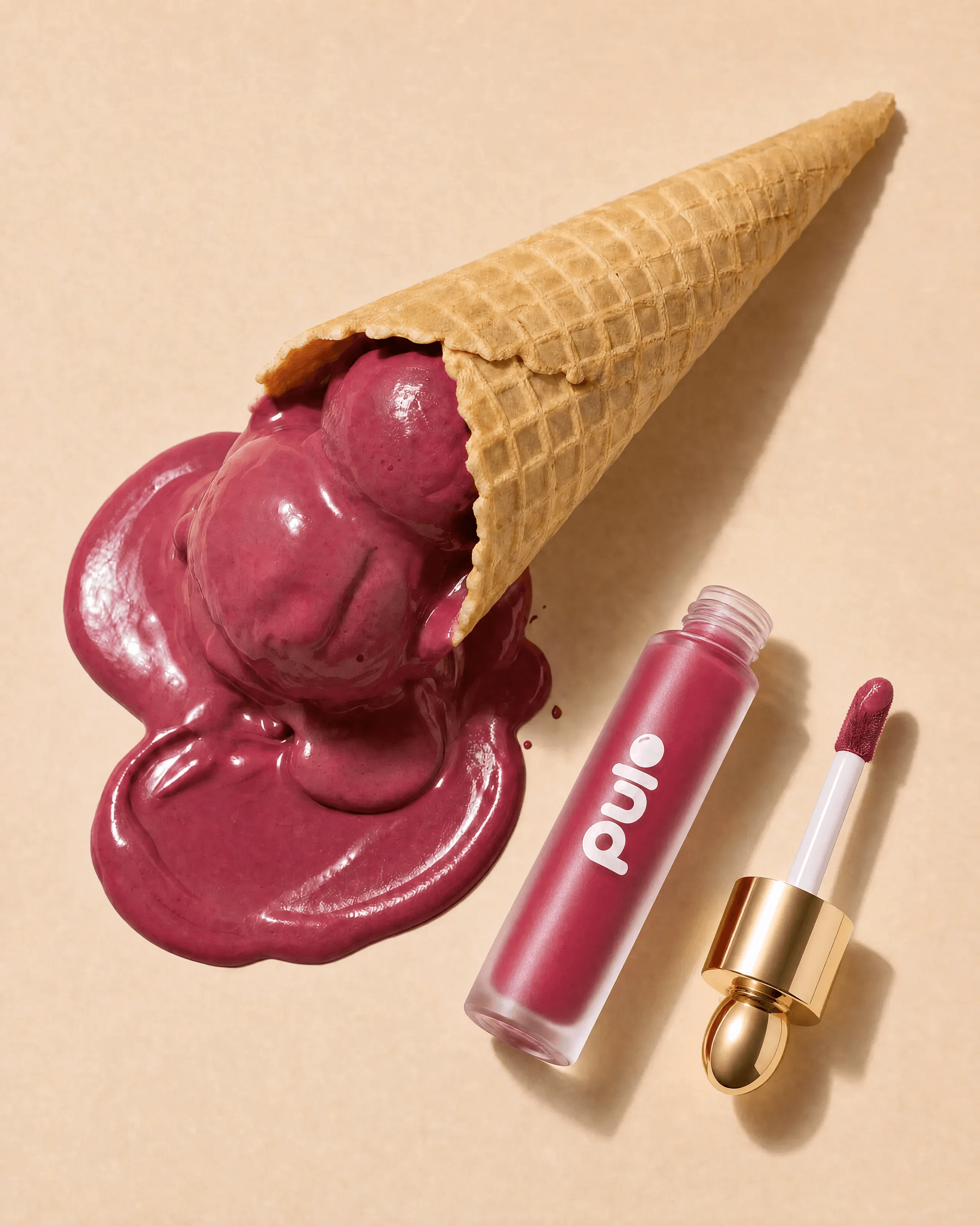
4. The Melt
Original prompt
GENERATION PROMPT (wand-length corrected pass):
USE CASE: playful product photoshoot, PDP-style hero image for ecommerce/social carousel — photographic realism, not a 3D render.
STYLE: photorealistic playful product photography, shot like a real high-end commercial food-and-cosmetic crossover photo not a CGI render, product-as-flavor visual pun, natural true-to-life color grading.
SCENE: warm beige seamless studio background, directional studio light with real falloff and a visible contact shadow, shallow depth of field.
SUBJECT: a waffle ice cream cone with melting scoops of ice cream rendered in the exact same deep raspberry-magenta tone as the product — real melting-ice-cream texture: uneven drips, glossy wet sheen where melted, matte soft texture where still frozen, dripping and pooling onto the surface beside it with realistic viscosity. The waffle cone has real laminated waffle texture with visible crumb and broken edges. Next to it, the exact same PULP product shown in the attached reference images — a frosted glass cylindrical bottle with a glossy gold spherical cap and doe-foot applicator wand, deep raspberry-magenta liquid, the rounded plump lowercase "pulp" wordmark and matching bead icon printed vertically on the bottle, rendered as real glass and metal with genuine specular highlights and micro-imperfections, not flat CGI material. The open bottle and its applicator wand rest beside the melting cone — CRITICAL: the wand must be its full correct length exactly as shown in the reference product sheet, a long slender rod reaching from the gold cap all the way to the doe-foot tip, NOT a short or truncated stick.
DETAILS: do not change the product shape, bottle design, cap, wordmark, logo, liquid color, or applicator wand length/proportions from the reference — use it exactly as shown, but render its material as real glass and metal. Natural, slightly muted color palette matching a real campaign shoot, not an oversaturated "brand pop" look. Top-down or three-quarter flat-lay angle.
CONSTRAINTS: no other brand names or logos, no watermarks, no extra text, no illegible labels, no distorted geometry, no hands, no plastic-looking CGI material, no flat uniform studio glow, no oversaturation, no shortened or truncated applicator wand.
OUTPUT: "Output in exactly 1080px x 1350px (4:5 portrait format)." EDIT PROMPT (Nano Banana 2, final version, applied on top of the generation above): Change only the applicator wand resting beside the bottle: it is currently far too long, way out of proportion. Shorten it so its total length (from the gold ball tip to the doe-foot applicator tip) is realistically coherent with the bottle's own height — roughly the same length as the bottle body itself, matching the true proportions shown in the reference product sheet exactly. Keep everything else unchanged: the bottle, cap, liquid color, wordmark, ice cream cone, melting texture, background, lighting, and composition must stay exactly as they are.
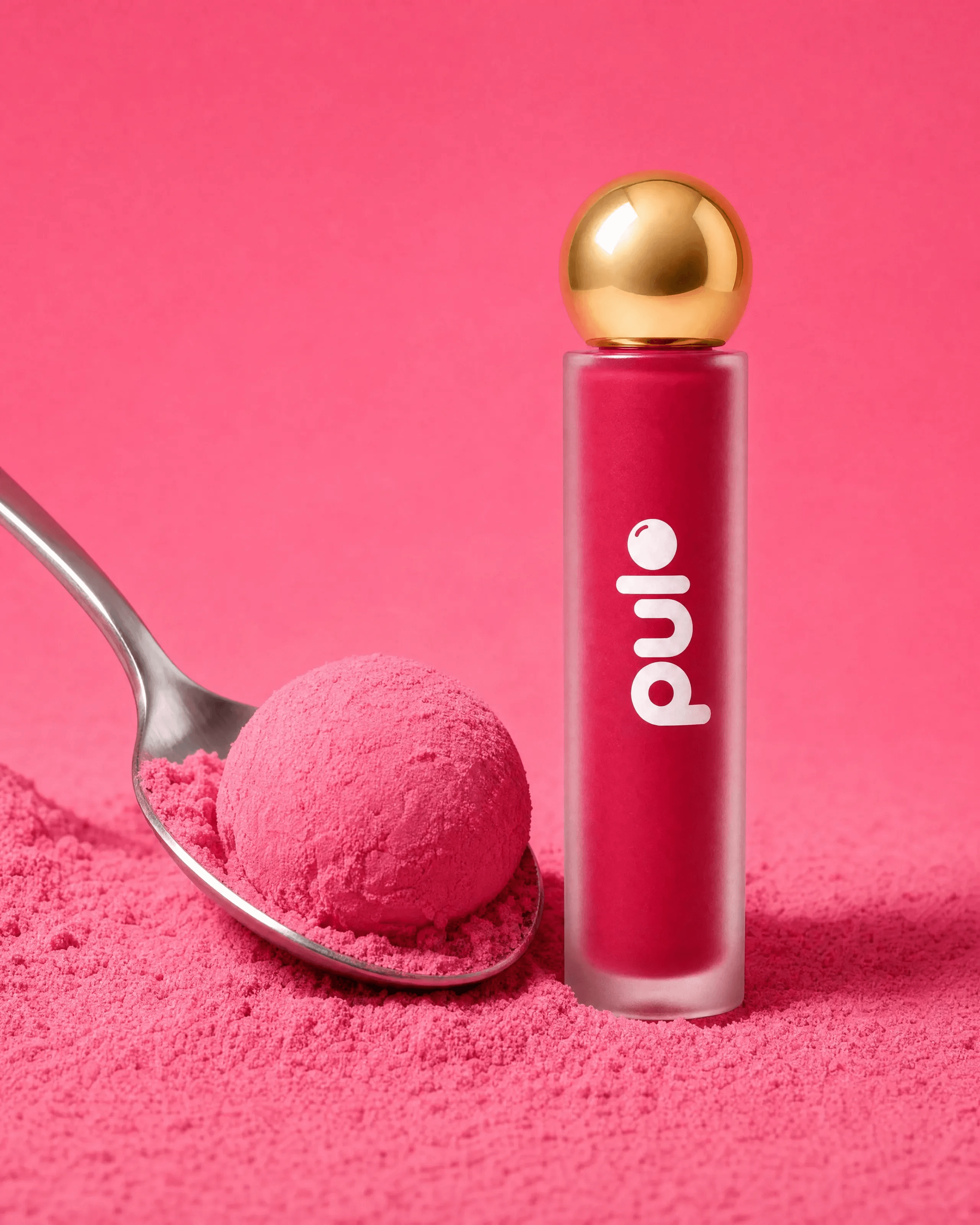
5. The Scoop
Original prompt
USE CASE: playful product photoshoot, PDP-style hero for ecommerce/social carousel — photographic realism, not a 3D render.
STYLE: photorealistic playful commercial product photography, shot like a real photo not a CGI render, food-texture visual pun, natural true-to-life color grading.
SCENE: a seamless solid saturated-but-natural raspberry-pink background matching the product's hero color, directional studio light with real falloff and a visible contact shadow, shallow depth of field, macro focus.
SUBJECT: a metal spoon with real brushed-metal reflections scooping into a mound of fine powder textured like the product's raspberry-magenta shade — real powder texture: visible fine grain, soft irregular clumping, subtle shadow occlusion between particles, not a smooth CGI gradient. Standing beside it, the exact same PULP product shown in the attached reference images — a frosted glass cylindrical bottle with a glossy gold spherical cap and doe-foot applicator wand, deep raspberry-magenta liquid, the rounded plump lowercase "pulp" wordmark and matching bead icon printed vertically on the bottle, rendered as real glass and metal with genuine specular highlights and micro-imperfections.
DETAILS: do not change the product shape, bottle design, cap, wordmark, logo, or liquid color from the reference — use it exactly as shown, but render its material as real glass and metal. Natural, slightly muted color palette, not an oversaturated "brand pop" look.
CONSTRAINTS: no other brand names or logos, no watermarks, no extra text, no distorted geometry, no hands, no plastic-looking CGI material, no smooth CGI powder gradient.
OUTPUT: "Output in exactly 1080px x 1350px (4:5 portrait format).
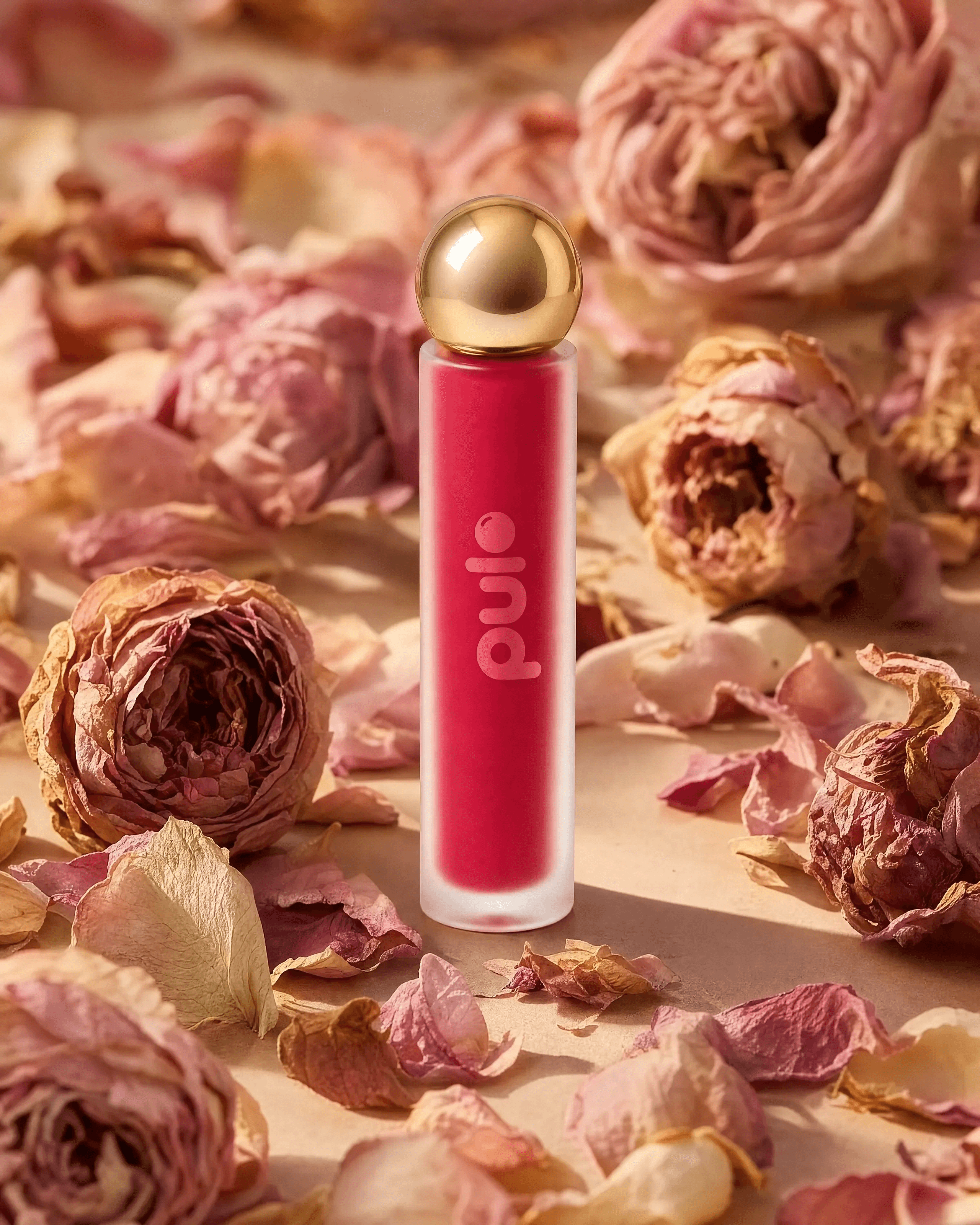
6. The Bloom
Original prompt
USE CASE: product photoshoot, PDP-style hero image for ecommerce/social carousel — photographic realism, not a 3D render, matching a specific reference composition exactly.
STYLE: photorealistic editorial still-life product photography, shot like a real luxury feminine beauty campaign photo not a CGI render, soft natural window-light styling, true-to-life color grading.
SCENE: replicate this exact composition and lighting: a pale warm stone/plaster tabletop surface (light beige-grey), soft warm directional light entering from upper-left as if through a window, casting long soft-edged natural shadows of the flowers and product across the surface toward lower-right. Whole dried garden rose blooms in dusty pink and blush tones cluster in the upper-left corner and the right side of the frame, with loose dried petals scattered across the foreground and around the base of the product. The product stands upright roughly center-left of frame, in sharp focus, with the flowers and background softly falling out of focus at the edges (shallow depth of field). Eye-level, straight-on camera angle.
SUBJECT: the exact same PULP product shown in the attached reference images — a frosted glass cylindrical bottle with a glossy gold spherical cap and doe-foot applicator wand, deep raspberry-magenta liquid, the rounded plump lowercase "pulp" wordmark and matching bead icon printed vertically on the bottle. Render the frosted glass with real specular highlights and subtle surface micro-imperfections, visible light transmission through the frosted body; the gold cap has real anisotropic metal reflections with a visible bright specular hotspot from the window light, not a flat CGI gold shader. Cap on, bottle standing upright among the dried flowers.
DETAILS: do not change the product shape, bottle design, cap, wordmark, logo, or liquid color from the reference — use it exactly as shown, but render its material as real glass and metal. Natural, warm, slightly muted color palette matching a real campaign shoot, not an oversaturated "brand pop" look. Real texture on the dried roses: curled dry petal edges, natural color variation, visible veining.
CONSTRAINTS: no other brand names or logos, no watermarks, no extra text, no illegible labels, no distorted geometry, no hands, no plastic-looking CGI material, no flat uniform studio glow, no oversaturation.
OUTPUT: "Output in exactly 1080px x 1350px (4:5 portrait format).
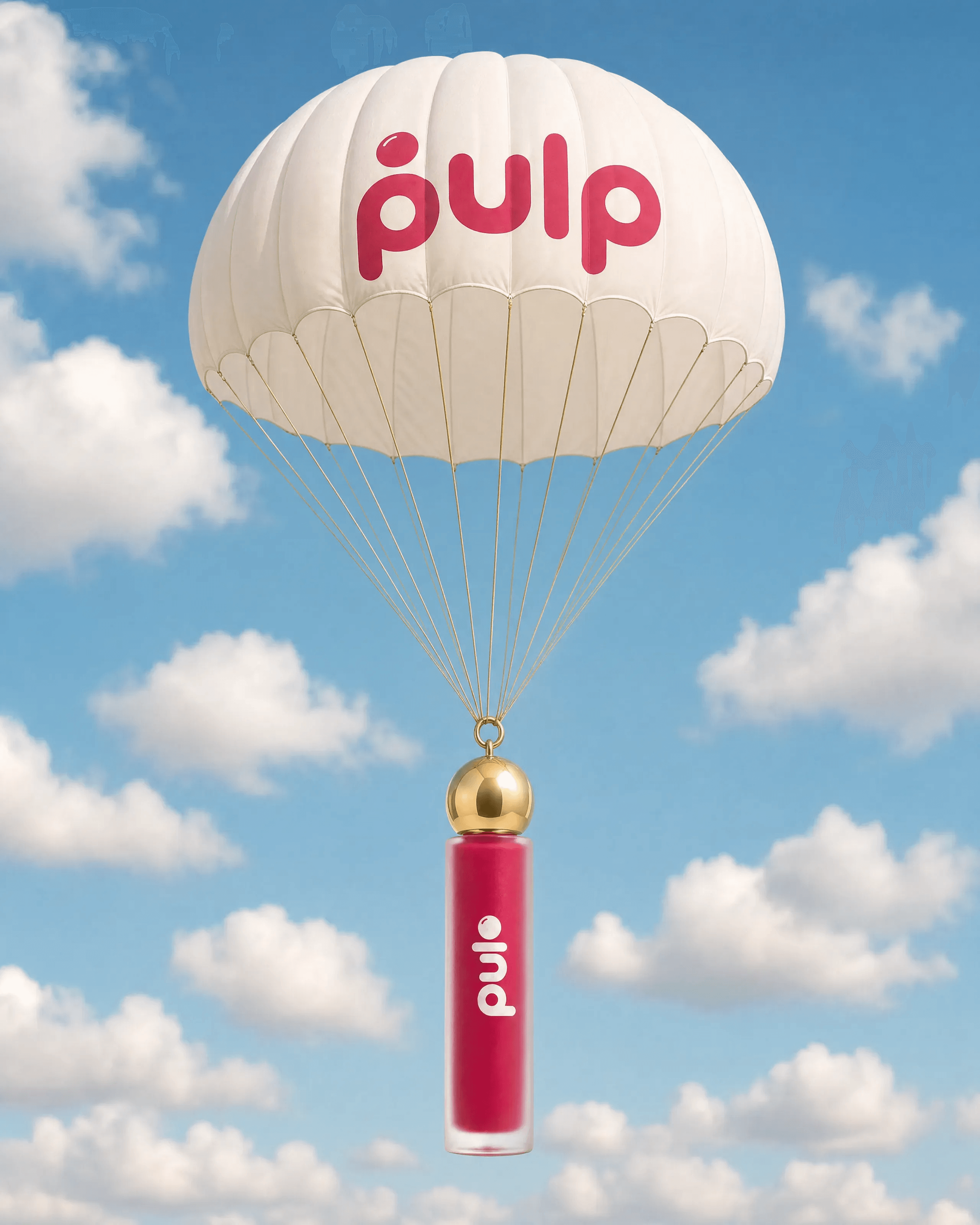
7. The Drop-In
Original prompt
USE CASE: surreal advertising campaign image, PDP-style hero for ecommerce/social carousel — photographic realism, not a 3D render.
STYLE: photorealistic surrealist product advertising, shot like a real commercial photo composited with practical elements, not CGI, natural true-to-life color grading.
SCENE: a real-looking clear blue sky with soft white clouds, bright daylight with real directional sunlight and a visible soft shadow logic on the parachute and bottle.
SUBJECT: a white parachute with the "pulp" wordmark and bead icon printed on its canopy in the same rounded raspberry-magenta brand style as the reference logo, with real fabric texture and stitching, gold-colored suspension lines leading down to and attached to the exact same PULP product shown in the attached reference images — a frosted glass cylindrical bottle with a glossy gold spherical cap and doe-foot applicator wand, deep raspberry-magenta liquid, the rounded plump lowercase "pulp" wordmark and matching bead icon printed vertically on the bottle, rendered as real glass and metal with genuine specular highlights and micro-imperfections, not flat CGI material. The bottle hangs in mid-air below the parachute.
DETAILS: do not change the product bottle shape, cap, wordmark, logo, or liquid color from the reference — use it exactly as shown, but render its material as real glass and metal. Natural, slightly muted color palette, not an oversaturated "brand pop" look.
CONSTRAINTS: no other brand names or logos, no watermarks, no extra text besides the brand wordmark on the parachute, no distorted geometry, no people, no plastic-looking CGI material, no oversaturation.
OUTPUT: "Output in exactly 1080px x 1350px (4:5 portrait format).
Additional supplied references and layouts
PULP supporting media
Packshot
Image-first workflow
Why these prompts work
Review checklist
Before approving a PULP result
FAQ
Get started with on-brand visuals
Your catalog into campaign-ready Creative
Riverflow connects your products, brand rules and creative workflows so your team can create on-brand photoshoots, ads, videos and edits across every campaign.