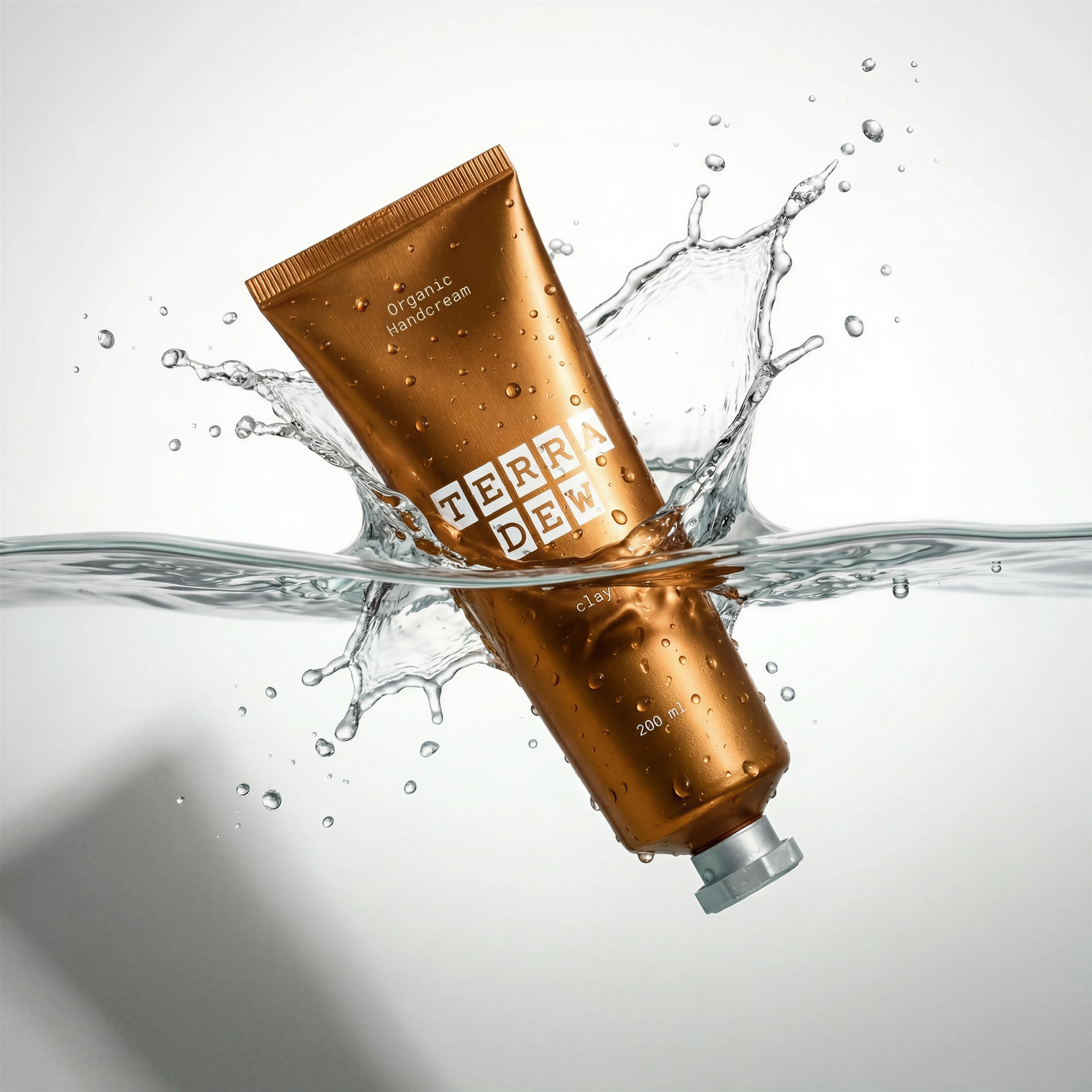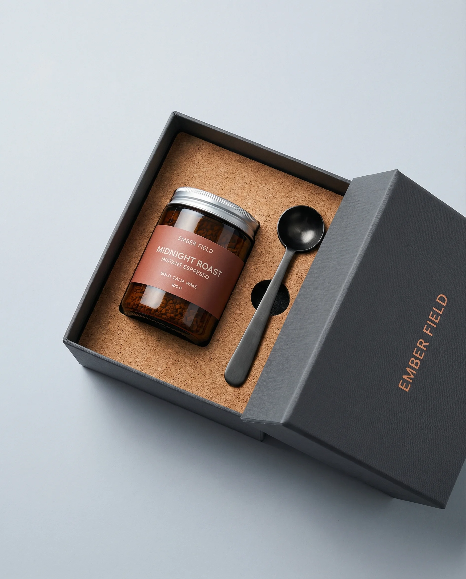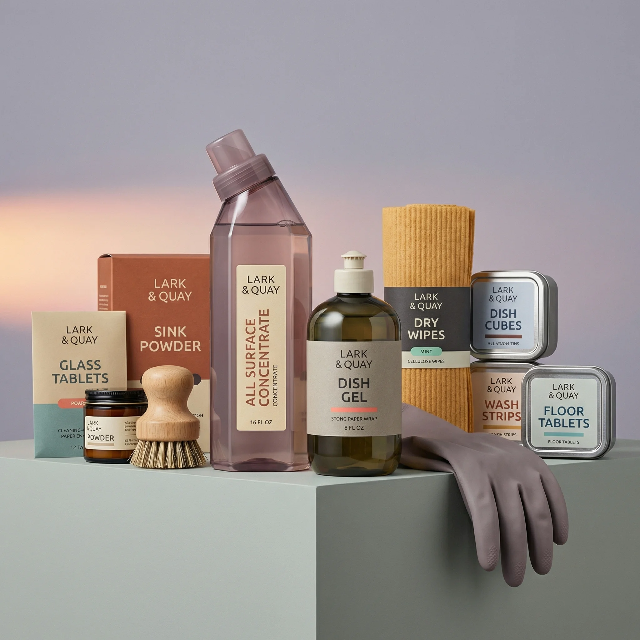
Scenes from the Riverflow library
The workflow
Brand references, product consistency, then campaign scenes
Prepare and lock the references
Generate each scene
Compare against the approved product
Copy the image prompts
DORÉ image prompts
Logo. Brand Identity
Original prompt
USE CASE: brand board / logo mark
STYLE: modern DTC bakery branding, warm rounded sans-serif wordmark, clean vector logo asset
SCENE: pure white seamless background, no shadow, no texture, no floor line, studio-flat lighting, frontal centered view
SUBJECT: standalone wordmark reading "DORÉ" — all letters set in a bold, heavy, rounded geometric sans-serif with soft rounded terminals and generous letter weight; the letter "O" is fully replaced by a stylized golden arc — a smooth curved crescent shape evoking the arch of a baked croissant — the arc must read clearly and unmistakably as a functional letter O within the word, matching the x-height and baseline of the other letters, not floating beside them or looking like a separate icon
DETAILS: "D", "R", "É" set in saturated toasted terracotta orange; the arc-O rendered in a brighter, richer caramel-gold tone to visually differentiate it from the rest of the wordmark; consistent stroke weight across all letters except the arc, which has a slightly thicker, more sculptural curve; even letter spacing, no accent marks other than the é; no additional icons, taglines, or decorative elements
TEXT (EXACT): "DORÉ"
TYPOGRAPHY: bold rounded geometric sans-serif, heavy weight, soft rounded corners, warm and friendly but premium bakery feel
PALETTE: #C1502E · #D98A3D · #E8A857
IMPERFECTIONS: none — this is a clean vector-style brand asset, perfectly crisp edges
CONSTRAINTS: no shadow, no gradient background, no texture, no mockup surface, no extra text, no watermark, no additional graphic elements, no 3D bevel or drop shadow on letters, pure flat color fills only
OUTPUT: "Output in exactly 2048px x 2048px (1:1 square format).
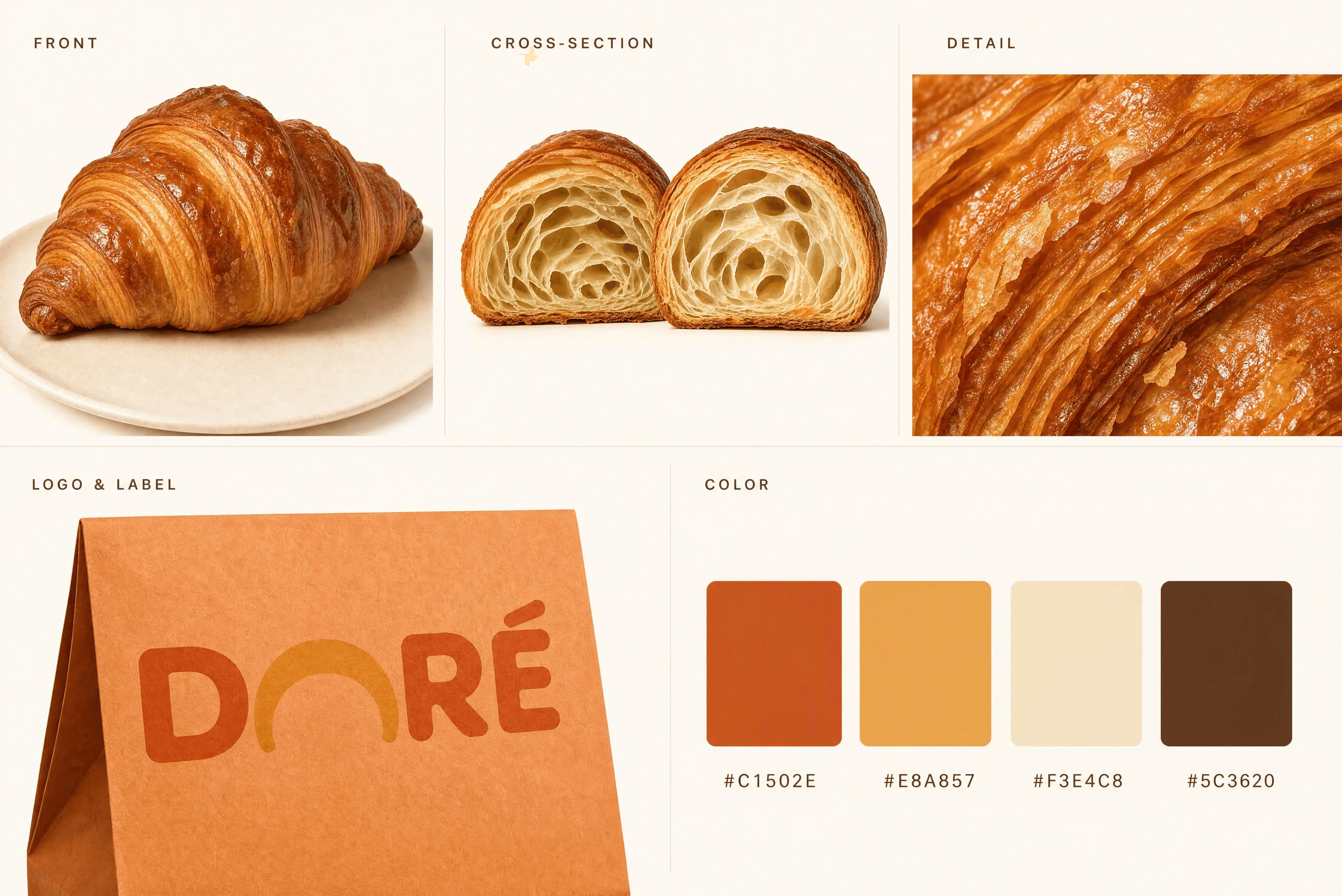
0. Product Reference Sheet
Original prompt
USE CASE: brand board / product spec sheet
STYLE: clean editorial product reference sheet, premium bakery brand documentation, professional catalog layout
SCENE: warm cream-white seamless background, soft even studio lighting, minimal shadows, five clearly separated labeled sections arranged in an organized grid layout, small elegant sans-serif section labels in warm dark brown
SUBJECT: a five-panel product spec sheet for the bakery brand DORÉ — Panel 1 labeled "FRONT": one whole baked croissant, three-quarter angle view, deep golden-caramel laminated pastry texture, crisp visible flaky layers, glossy egg-wash sheen catching soft studio light, classic crescent curve shape, resting on a small neutral cream plate or surface Panel 2 labeled "CROSS-SECTION": the same croissant sliced in half showing the honeycomb-like alveolar interior crumb structure and the tight spiral layering of laminated dough, cut edge facing camera Panel 3 labeled "DETAIL": extreme macro close-up of the croissant crust texture, individual flaky laminated layers, crisp shattered edges, glossy buttery sheen Panel 4 labeled "LOGO & LABEL": the exact DORÉ wordmark logo (bold rounded sans-serif, letters D R É in saturated toasted terracotta orange, the O fully replaced by a brighter caramel-gold stylized arc shaped like a croissant's curve) applied as a printed stamp on a simple terracotta-orange kraft paper bakery bag/box, shown at a slight angle to reveal the packaging material and print application Panel 5 labeled "COLOR": four clean square color swatches in a row with small hex code labels beneath each
DETAILS: consistent warm studio lighting across all panels, subtle soft shadows for dimension, high sharpness and clarity on food textures, generous white space between panels, thin hairline dividers separating sections
TEXT (EXACT): "FRONT" / "CROSS-SECTION" / "DETAIL" / "LOGO & LABEL" / "COLOR" / "DORÉ" / "#C1502E" / "#E8A857" / "#F3E4C8" / "#5C3620"
TYPOGRAPHY: section labels in a small elegant warm sans-serif, letter-spaced, uppercase; DORÉ wordmark exactly matching the provided reference logo, do not redesign it
PALETTE: #C1502E · #E8A857 · #F3E4C8 · #5C3620
IMPERFECTIONS: natural bakery imperfections on the croissant only — slightly uneven layers, authentic flaky shatter, real crumb texture; the logo and swatches remain perfectly clean and vector-crisp
CONSTRAINTS: no watermark, no extra decorative elements, no additional text beyond the labels listed, no gradient background, no distorted or illegible logo lettering, no halos or fringing around the croissant, keep the DORÉ logo pixel-faithful to the reference asset provided
OUTPUT: "Output in exactly 3600px x 2400px (3:2 landscape format).
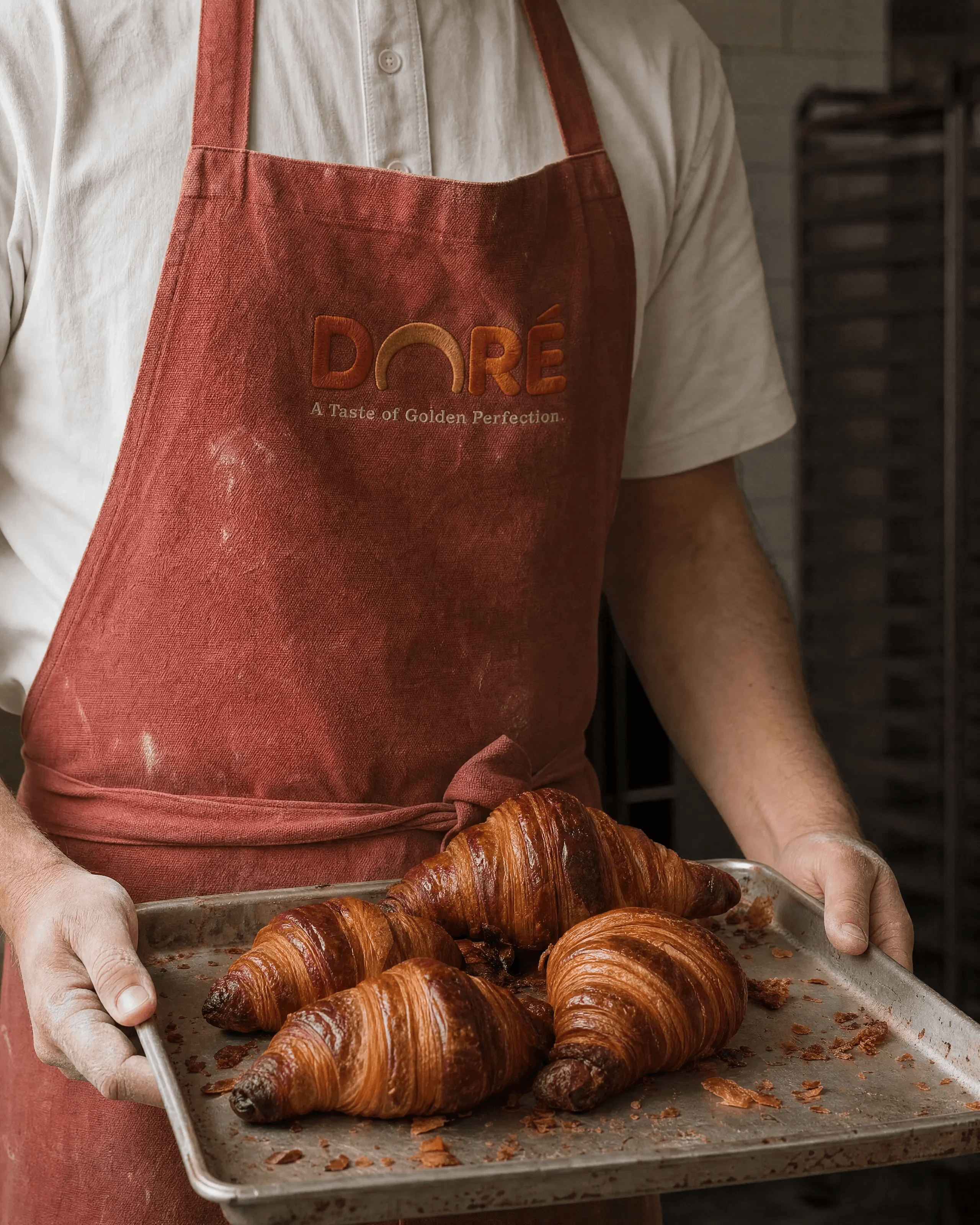
1. The Tray
Original prompt
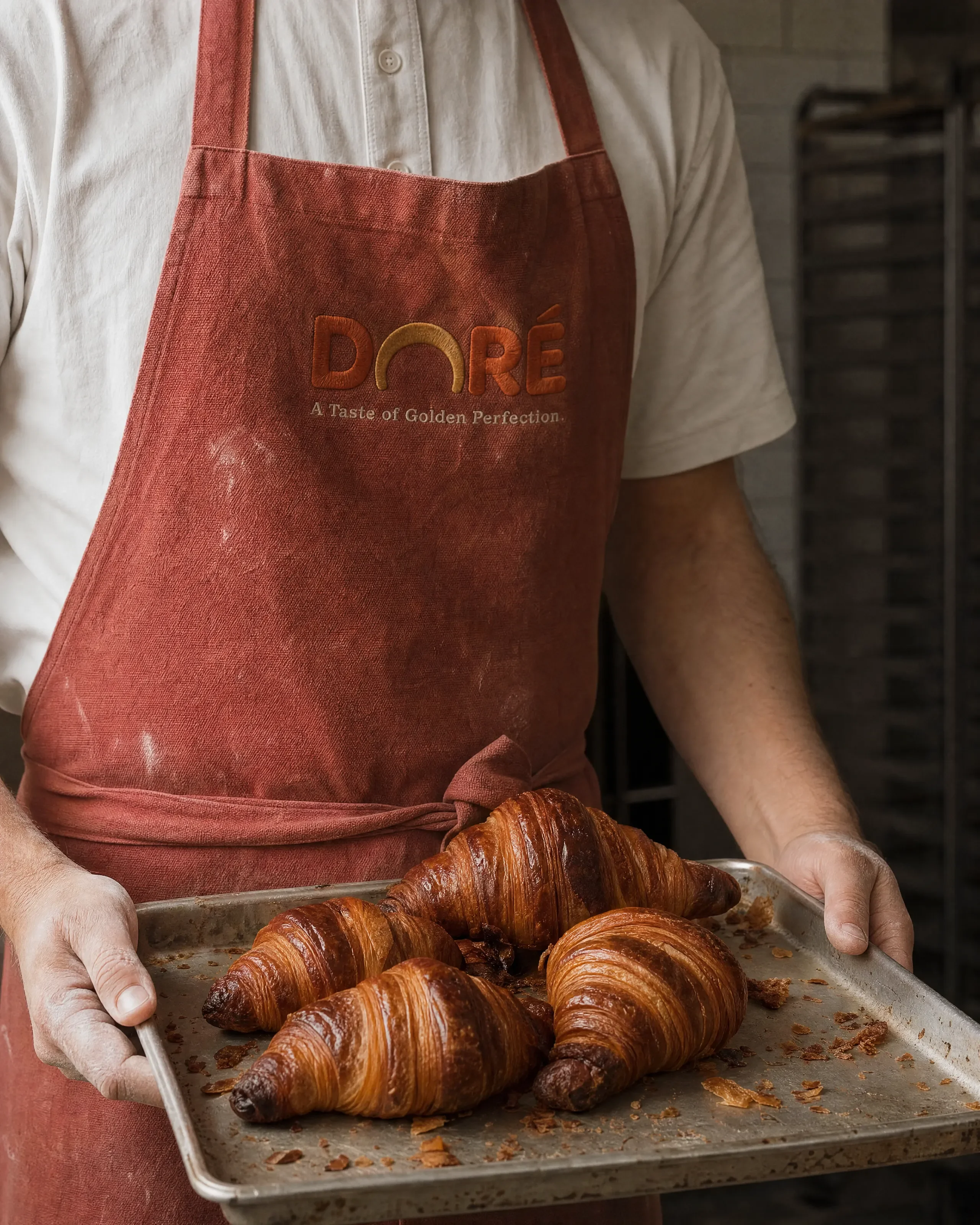
USE CASE: editorial lifestyle photograph for a premium bakery campaign — a real photograph, not a render
STYLE: quiet documentary food photography in the register of Kinfolk / Cereal magazine; restrained, tactile, unstyled-looking
REFERENCES: image 1 = composition reference (a real photograph — match its photographic realism, depth and colour restraint); image 2 = DORÉ product spec sheet (use ONLY for croissant shape and packaging design accuracy, do NOT copy its flat even studio lighting); image 3 = DORÉ logo lockup (use for exact wordmark letterforms and the golden arc replacing the O)
SCENE: inside a working bakery, mid-morning. Single large north-facing window off camera-left; light rakes across the subject and falls off hard into unlit shadow on the right. No fill card, no rim light. Background is the dim interior of the bakehouse, thrown well out of focus — suggestions of a stainless rack, tiled wall, flour dust in the air
SUBJECT: a baker photographed from chest to waist, face out of frame, wearing a washed cotton-canvas apron in a muted brick terracotta that has been laundered many times — visible weave, soft creases at the waist tie, a faint flour smear near the hip. The DORÉ wordmark is embroidered on the chest in thick matte thread, the stitching slightly raised and catching the side light, with the small line "A Taste of Golden Perfection" embroidered beneath it in a much smaller weight. They hold a well-used aluminium sheet pan, its surface scratched and dulled from hundreds of bakes, piled with freshly baked croissants
DETAILS: the croissants are the hero — deeply laminated, unevenly bronzed from the oven's hot spots, some darker at the tips, visible separated layers along the flanks, a few blistered bubbles on the crust, loose flakes and crumbs scattered across the pan, one croissant slightly collapsed against another. Shallow depth of field: the front two croissants are critically sharp, the back of the pan already softening
CAMERA: Phase One XF, 110mm, f/4, tripod, eye level with the pan
GRADE: muted and desaturated, warm neutral, matte lifted blacks, no vibrance boost, colour of a real campaign not of a screen
TEXT (EXACT): "DORÉ" / "A Taste of Golden Perfection" IMPERFECTIONS (mandatory): flour dust on the apron, crumbs on the pan, uneven bake colour, fingerprints and scratches on the aluminium, stray thread on the embroidery, one broken flake
CONSTRAINTS: photographic only — no 3D render, no CGI, no flat even studio lighting, no wraparound softbox glow, no glossy plastic surfaces, no oversaturated brand-colour backdrop, no perfect symmetry, no AI skin smoothing, no visible face, hands anatomically correct
OUTPUT: "Output in exactly 3456px x 4320px (4:5 portrait vertical format).
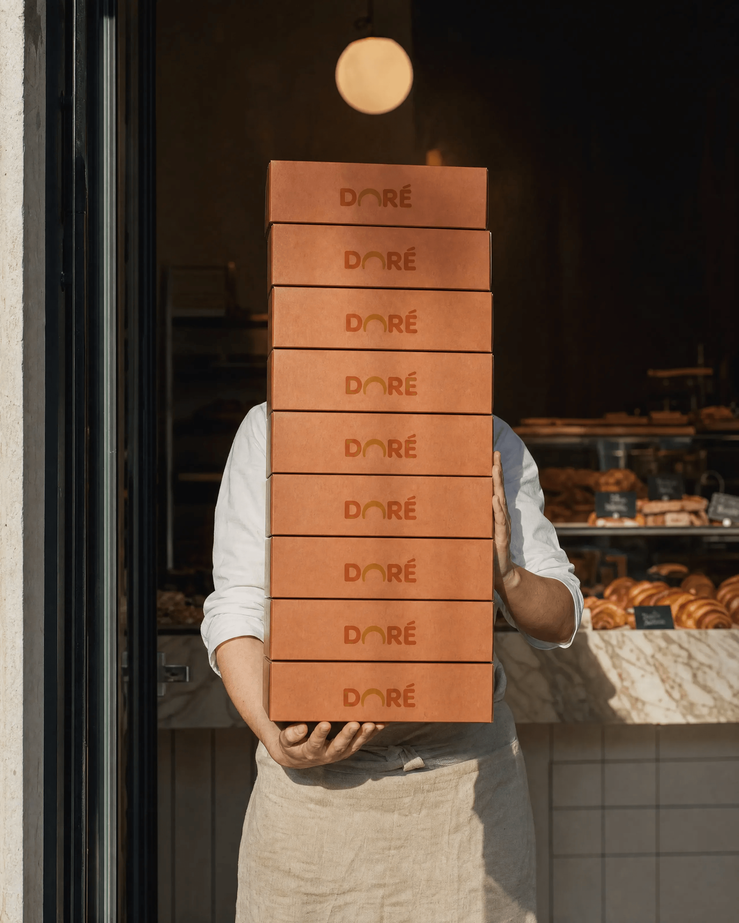
2. The Stack
Original prompt
USE CASE: editorial lifestyle photograph for a premium bakery campaign — a real photograph, not a render
STYLE: quiet documentary retail photography, restrained and tactile, the register of a real brand case study
REFERENCES: image 1 = composition reference (a real photograph — match its photographic realism, depth and colour restraint); image 2 = DORÉ product spec sheet (packaging design accuracy only, do NOT copy its flat even studio lighting); image 3 = DORÉ logo lockup (exact wordmark letterforms, golden arc replacing the O)
SCENE: the doorway of a real bakery. A pendant bulb glows above and behind the subject, with daylight spilling from camera-left; the light falls off hard, leaving the right side of frame in deep shadow. Behind, a marble counter and a glass display case of pastries go soft and dark out of focus
SUBJECT: a shop worker photographed from shoulders to thigh, face hidden behind the boxes, carrying a stack of eight flat takeaway pastry boxes. CRITICAL — the carry must be physically plausible: BOTH arms are engaged, one hand cupped flat underneath the bottom box taking the weight from below with the fingers visible under the base, the other forearm braced vertically against the side of the stack to steady it. The stack rests on the forearm and against the chest, tilted very slightly back toward the body PRODUCT INTEGRITY (absolute requirement): every box is factory-fresh, structurally perfect and identical — same length, same width, same depth, all eight stacked flush and square. Each box is fully closed with its lid seated down on its base all the way round. No torn panels, no detached or floating flaps, no gaping seams, no dents, no crushed or bent corners, no collapsed or sagging box, no lid hanging open, no box deformed by the grip. The lowest box in particular must be completely intact, square and closed, its front face flat and continuous
DETAILS: the boxes are uncoated recycled board in a muted brick terracotta with visible paper fibre and a matte litho-printed DORÉ wordmark on each front face, the print sitting into the fibre. Realism comes from material and light only: the fibre grain, the matte ink, the way the pendant light grazes the top box and dies off down the stack, dust drifting in the beam, a fine flour haze on the linen apron. Shallow depth of field — the middle boxes critically sharp, the top box and the display case behind already softening
CAMERA: Phase One XF, 80mm, f/4, slight low angle looking up the stack
GRADE: muted, desaturated, warm neutral with cool shadow, matte lifted blacks, no vibrance boost
TEXT (EXACT): "DORÉ"
CONSTRAINTS: photographic only — no 3D render, no CGI, no flat even studio lighting, no wraparound softbox glow, no glossy laminate, no oversaturated brand-colour backdrop, no AI skin smoothing, no visible face. No damaged, broken, crushed, torn or deformed packaging anywhere in frame. Hands and arms anatomically correct with five fingers each, correctly attached, and clearly load-bearing
OUTPUT: "Output in exactly 3456px x 4320px (4:5 portrait vertical format).
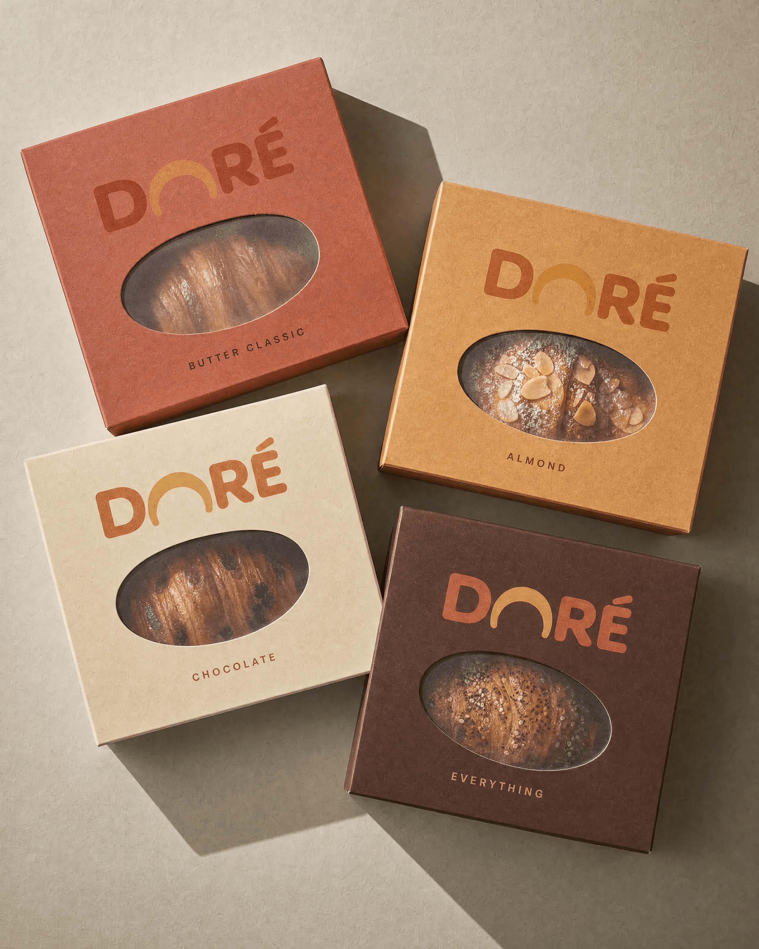
3. The Flavours
Original prompt
USE CASE: packaging photograph for a premium bakery campaign — a real photograph of real printed boxes, not a render
STYLE: tabletop packaging photography as shot for a design studio's case study; physical, raking light, honest materials
REFERENCES: image 1 = layout reference only (four boxes arranged at angles — keep the arrangement, do NOT copy its flat graphic look or its saturation); image 2 = DORÉ product spec sheet (croissant and packaging design accuracy only, NOT its flat studio lighting); image 3 = DORÉ logo lockup (exact wordmark letterforms, golden arc replacing the O)
SCENE: four flat pastry boxes laid on a sheet of warm grey-beige uncoated paper with visible tooth, photographed from directly above. A single hard light source from the upper left rakes across the boxes, throwing crisp directional shadows down and to the right, with real contact shadow pressing tight under each box edge and a soft gradient falling off into the lower-right corner of the frame
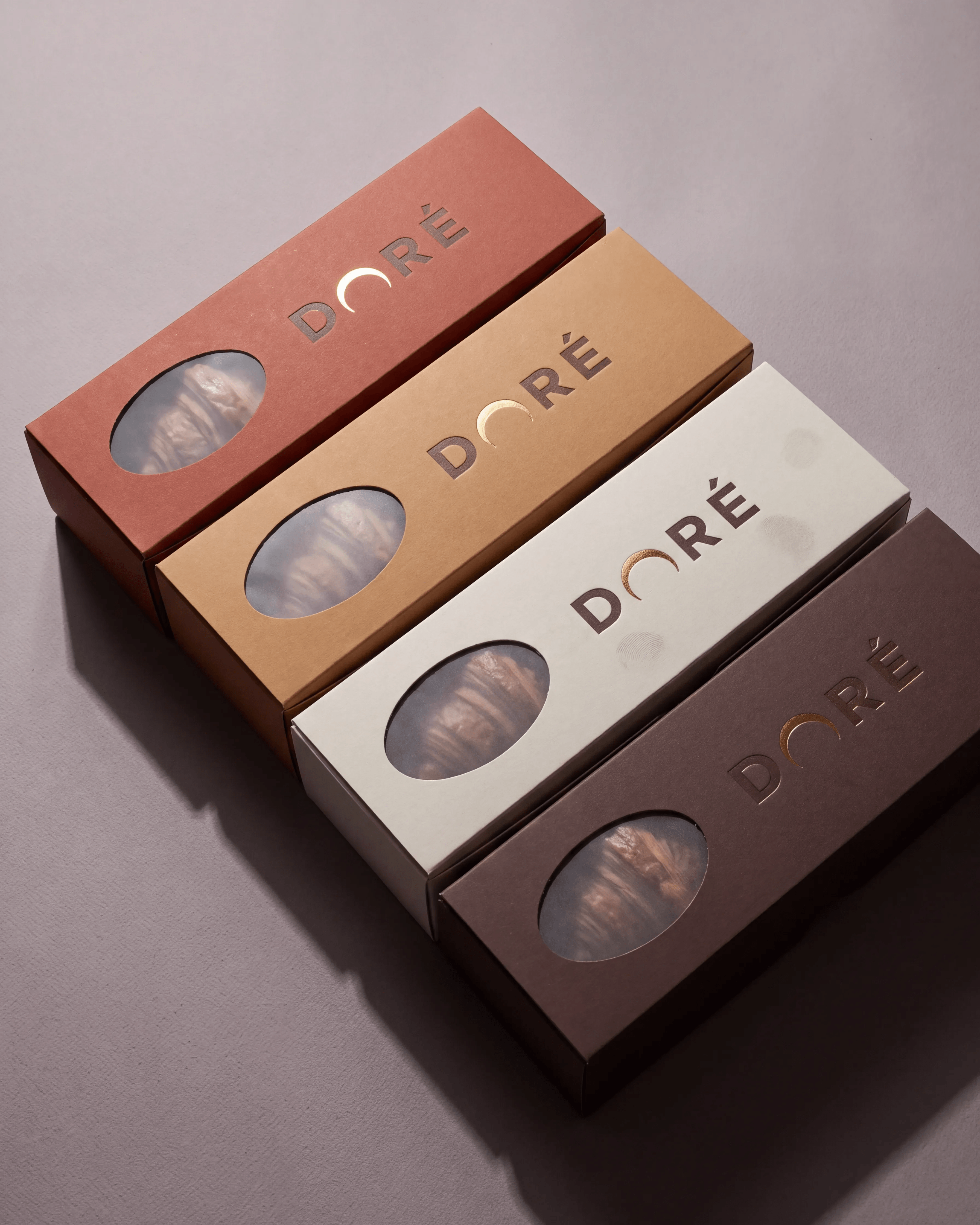
SUBJECT: four DORÉ takeaway boxes, tumbled at slightly different angles so they overlap at the corners, each a different flavour in a different muted colourway — brick terracotta, dusty caramel, chalk cream, deep cocoa brown. Each lid carries the DORÉ wordmark printed in one flat matte ink, a small letter-spaced flavour name beneath it, and a die-cut oval window covered in matte glassine through which one real baked croissant is visible PRODUCT INTEGRITY (absolute requirement): all four boxes are factory-fresh and structurally flawless — crisp square corners, straight unbroken edges, flat uncreased faces, lids seated flush and level on their bases all the way round, die-cut windows cleanly cut with the glassine taut and unwrinkled. No crushed, dented, bent, torn, split, scuffed, warped or damaged corners or edges anywhere in frame, on any box. The boxes differ only in colour, flavour name and angle of placement, never in condition
DETAILS: realism comes from material and light, not from wear — uncoated recycled board where the matte ink sits into the fibre rather than on top of it, the clean raw board colour visible along the die-cut window edge, the faint tooth of the paper stock, the slight sheen difference between printed and unprinted board, the taut glassine catching a soft highlight. The croissants behind the glassine are softened and slightly desaturated by the film, with real laminated layers and a visible almond flake or chocolate sheen where the flavour calls for it
TEXT (EXACT): "DORÉ" / "BUTTER CLASSIC" / "ALMOND" / "CHOCOLATE" / "EVERYTHING"
TYPOGRAPHY: wordmark exactly as the logo reference; flavour names small, letter-spaced, single weight
PALETTE: muted and dusty — brick terracotta, dusty caramel, chalk cream, deep cocoa brown on warm grey-beige paper. Desaturated, no pop, no neon
CAMERA: Phase One XF, 80mm, f/8, dead overhead
GRADE: muted campaign grade, matte lifted blacks, no vibrance boost
CONSTRAINTS: photographic only — no 3D render, no CGI, no flat even studio lighting, no glossy varnish, no oversaturated colour, no repeated wordmark wallpaper background, no perfect grid alignment. No damaged, broken, crushed, dented, torn or deformed packaging anywhere in frame
OUTPUT: "Output in exactly 3456px x 4320px (4:5 portrait vertical format).
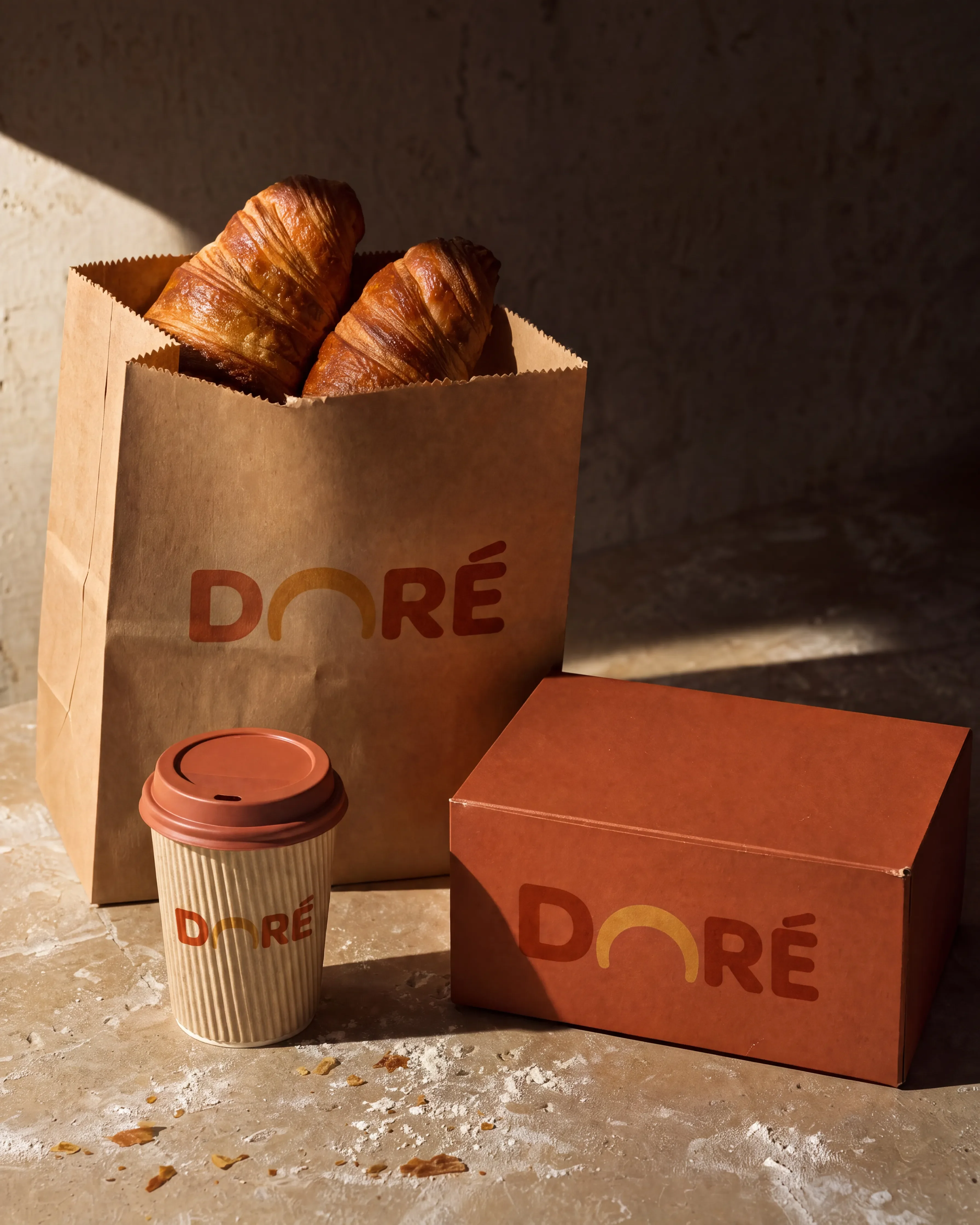
4. The Essentials
Original prompt
USE CASE: packaging still life for a premium bakery campaign — a real photograph of real paper goods, not a render
STYLE: material-first packaging photography for a design studio case study; honest paper, raking light, restrained colour
REFERENCES: image 1 = arrangement reference only (a grouped packaging family — keep the grouping idea, do NOT copy its illustrated mascot, its taglines, its flat lighting or its saturation); image 2 = DORÉ product spec sheet (croissant and packaging design accuracy only, NOT its flat studio lighting); image 3 = DORÉ logo lockup (exact wordmark letterforms, golden arc replacing the O)
SCENE: three pieces of packaging grouped on a worn limestone or raw plaster tabletop with real surface pitting and a faint flour dusting. Hard directional daylight enters from camera-left at a low angle, casting long crisp shadows to the right and pressing dark contact shadows under each object; the right third of the frame falls away into shadow. Background is the dim wall behind, out of focus
SUBJECT: a kraft paper bakery bag standing and folded open at the top with two baked croissants leaning out; a rigid takeaway box in muted brick terracotta board sitting closed beside it; a single-wall corrugated paper cup with a matte lid in front. Each piece carries only the DORÉ wordmark, printed in one flat matte ink — no mascot, no illustration, no tagline, nothing else
DETAILS: the kraft bag shows real fold memory, crease lines, a slightly torn top edge and visible paper fibre; the box board is uncoated so the ink sinks into the fibre; the cup shows the corrugation ridges and a seam line where it is glued. The croissants are unevenly bronzed with separated laminated layers, blistered crust and a few flakes fallen onto the stone
CAMERA: Phase One XF, 110mm, f/5.6, slightly above eye level of the objects, three-quarter view
GRADE: muted, desaturated, warm neutral, matte lifted blacks, no vibrance boost
TEXT (EXACT): "DORÉ" IMPERFECTIONS (mandatory): crease and fold memory in the kraft bag, torn top edge, glue seam on the cup, ink sunk into board fibre, flour dust and loose flakes on the stone, one scuffed box corner
CONSTRAINTS: photographic only — no 3D render, no CGI, no flat even studio lighting, no wraparound softbox glow, no seamless saturated brand-colour backdrop, no mascot or illustrated character, no taglines, no glossy laminate, no perfect symmetry
OUTPUT: "Output in exactly 3456px x 4320px (4:5 portrait vertical format).
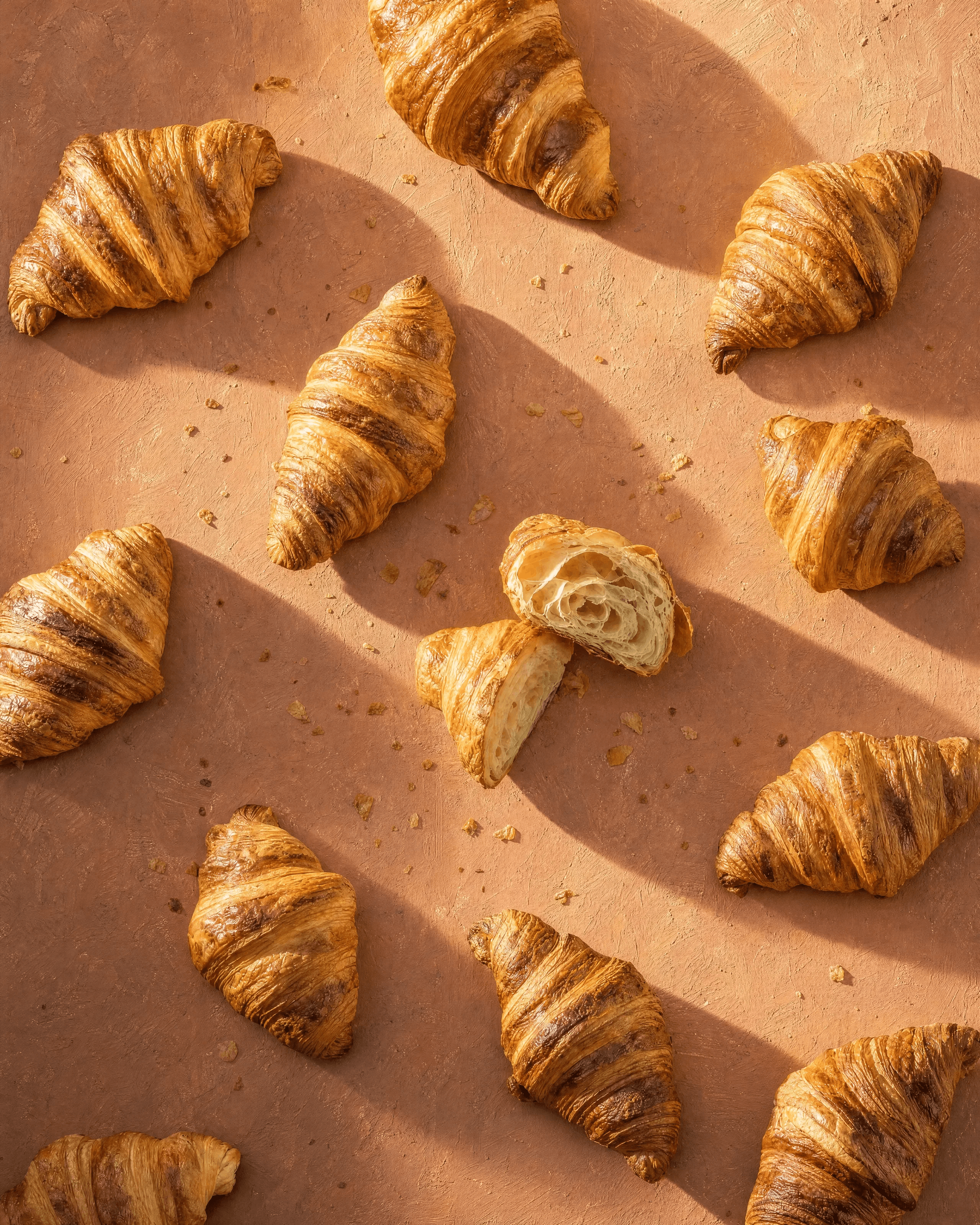
5. The Pattern
Original prompt
USE CASE: graphic food photograph for a premium bakery campaign — a real photograph of real croissants, not a render
STYLE: sculptural food photography with hard raking light; the repetition is real objects on a real surface, not a digital tile
REFERENCES: image 1 = layout reference only (a diagonal repeat of croissants — keep the rhythm, do NOT copy its plastic-smooth pastry, its flat orange or its saturation); image 2 = DORÉ product spec sheet (croissant shape accuracy only, NOT its flat studio lighting); image 3 = DORÉ logo lockup (not shown in this frame, for palette reference only)
SCENE: real baked croissants laid in a loose diagonal grid on a sheet of hand-painted plaster board in a dusty, desaturated brick terracotta with visible brush texture, grain and slight colour unevenness. A single hard low sun-like source from the upper right rakes across the surface, so every croissant throws a long, crisp, directional shadow to the lower left, with a tight dark contact shadow where it touches the board. Light falls off noticeably toward the bottom-left corner of the frame
SUBJECT: nine to twelve croissants, photographed from directly above, each one genuinely different — different bake colour, different degree of curl, some fatter, some with a torn end, one broken in half revealing the honeycomb crumb and spiral lamination
DETAILS: every croissant is deeply laminated with separated, blistered, unevenly bronzed layers; flakes and crumbs are scattered on the board between them, some casting their own tiny shadows; the placement is hand-laid, not mathematically perfect — spacing and angles vary
CAMERA: Phase One XF, 80mm, f/8, dead overhead
GRADE: dusty and desaturated, warm neutral, matte lifted blacks, no vibrance boost, no orange pop
PALETTE: dusty brick terracotta board, bronzed golden-brown pastry IMPERFECTIONS (mandatory): loose flakes and crumbs, one broken croissant, uneven bake colour, brush texture and grain in the painted board, irregular spacing
CONSTRAINTS: photographic only — no 3D render, no CGI, no flat even studio lighting, no digital seamless tiling, no identical repeated copies of the same croissant, no glossy plastic pastry, no oversaturated orange, no perfect grid
OUTPUT: "Output in exactly 3456px x 4320px (4:5 portrait vertical format).
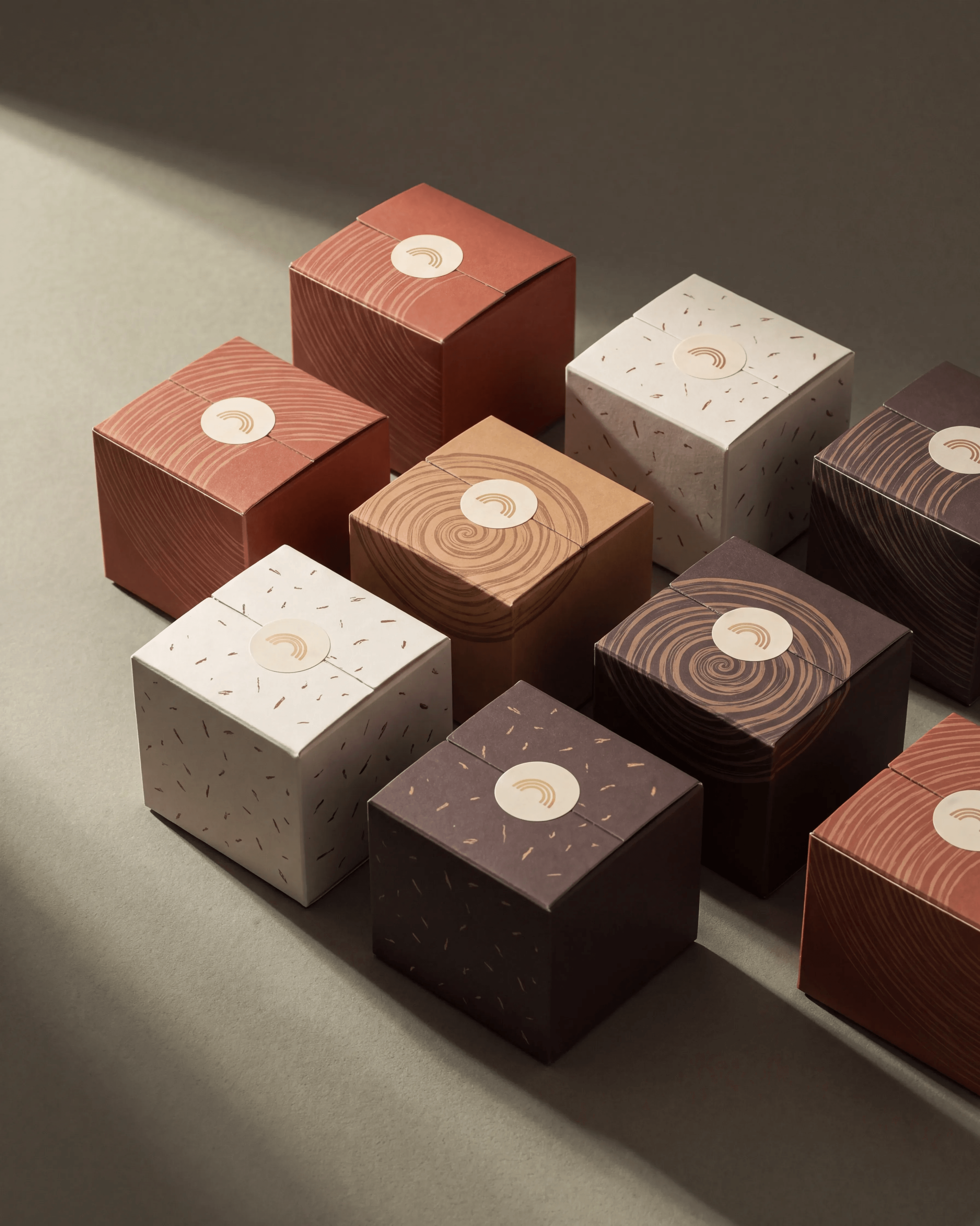
6. The Set
Original prompt
USE CASE: packaging photograph for a premium bakery campaign — a real photograph of real printed boxes, not a render
STYLE: tabletop packaging photography for a design studio case study; physical paper, raking light, restrained dusty colour
REFERENCES: image 1 = arrangement reference only (a cluster of small printed gift boxes at varied angles — keep the cluster, do NOT copy its brand, its patterns, its flat lighting or its saturation); image 2 = DORÉ product spec sheet (packaging design accuracy only, NOT its flat studio lighting); image 3 = DORÉ logo lockup (exact wordmark and golden arc for the seal)
SCENE: a cluster of small square gift boxes arranged loosely on a sheet of muted olive-grey uncoated paper with visible tooth. A single hard light from the upper left rakes across the cluster, catching the top faces and the near edges, leaving the far sides in real shadow and pressing tight dark contact shadows between the boxes. Light falls away toward the bottom-right corner. Shot from a high three-quarter angle, not dead flat
SUBJECT: eight to nine small rigid gift boxes in muted DORÉ colourways — brick terracotta, dusty caramel, chalk cream, deep cocoa — each printed with a different quiet pattern derived from croissant lamination: fine parallel curved striations, a spiral cross-section motif, a scatter of fine flake marks. Every box is closed with a small circular cream sticker seal carrying the golden arc mark from the logo PRODUCT INTEGRITY (absolute requirement): every box is factory-fresh and structurally flawless — crisp square corners, straight unbroken edges, lids seated flush and level on their bases all the way round, faces flat and uncreased. No crushed, dented, bent, torn, split, warped, crooked or open boxes. No damage of any kind anywhere in frame. The boxes vary only in colour, pattern and angle of placement, never in condition
DETAILS: realism comes from material and light, not from wear — uncoated board where the matte ink sits into the fibre rather than on top of it, the clean cut edge of the board catching the raking light, the very slight texture of the paper stock, the soft shadow the sticker seal casts on the lid, a faint fingerprint on one cream lid. Depth of field shallow enough that the far boxes soften
CAMERA: Phase One XF, 80mm, f/6.3, high three-quarter angle
GRADE: muted, dusty, desaturated, matte lifted blacks, no vibrance boost
CONSTRAINTS: photographic only — no 3D render, no CGI, no flat even studio lighting, no glossy varnish, no oversaturated colour, no perfectly repeating pattern, no perfect grid alignment, no third-party branding, no damaged or imperfect packaging
OUTPUT: "Output in exactly 3456px x 4320px (4:5 portrait vertical format).
7. The Moment
Original prompt
USE CASE: street lifestyle photograph for a premium bakery campaign — a real photograph, not a render
STYLE: candid urban food photography, handheld, available light only, the register of a real editorial shoot
REFERENCES: image 1 = composition reference (a real photograph of hands holding takeaway packaging — match its photographic realism, its available-light look and its colour restraint); image 2 = DORÉ product spec sheet (croissant and packaging accuracy only, NOT its flat studio lighting); image 3 = DORÉ logo lockup (exact wordmark letterforms, golden arc replacing the O)
SCENE: outdoors on a pavement, overcast midday, soft directional light coming from above and slightly behind the subject so the top of the package is lit and the underside falls into shadow. Background is wet grey asphalt with a blurred painted line, thrown far out of focus at f/2.8
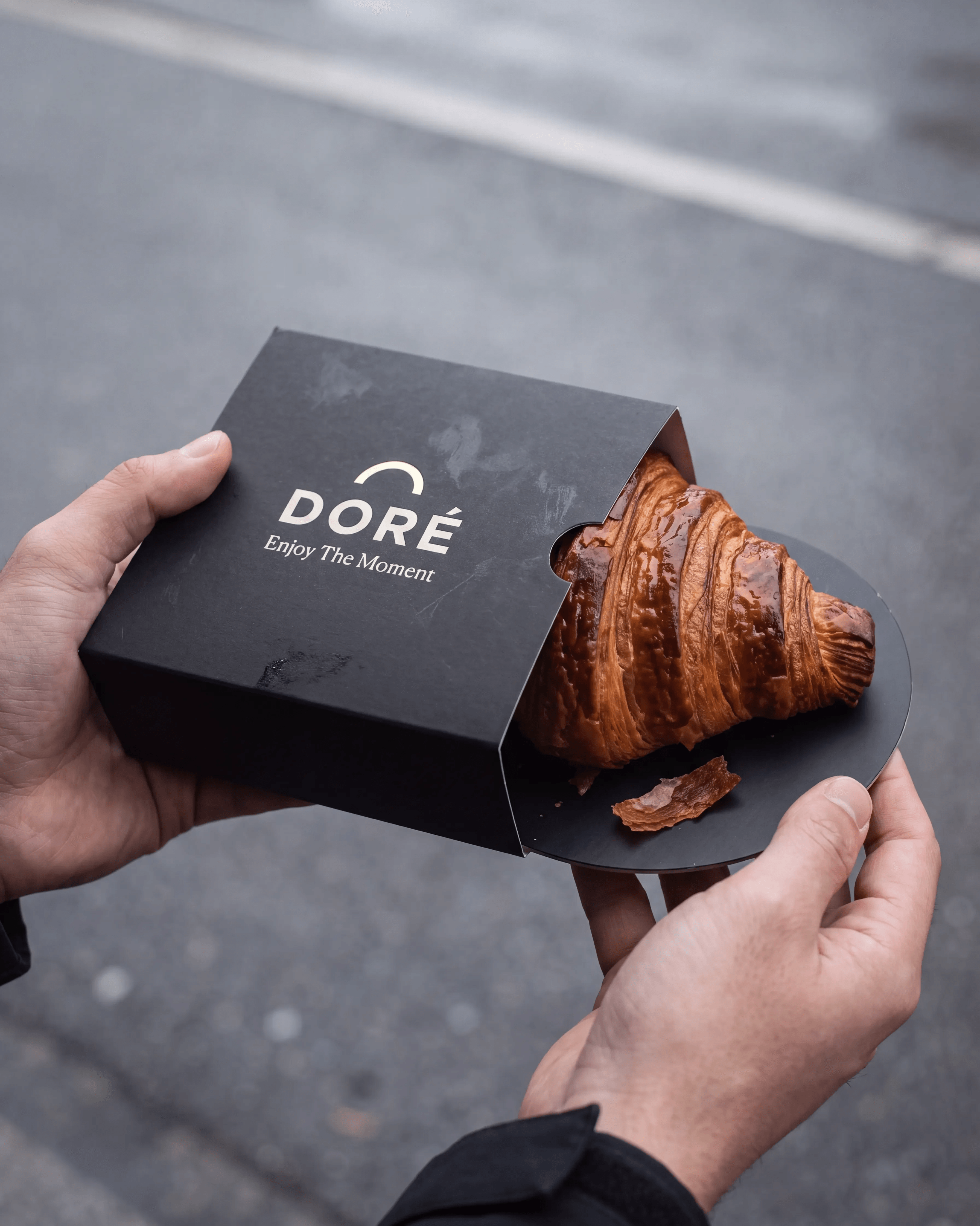
SUBJECT: two hands holding a matte black paperboard sleeve, half slid open at the top flap to reveal one baked DORÉ croissant sitting on a matching black circular base. The sleeve front is printed with the DORÉ wordmark and, beneath it, the line "Enjoy The Moment" in a small light script, both in a soft off-white ink that sits into the uncoated black board
DETAILS: real hands — visible knuckle creases, a nail, tendon shadow, skin texture and warmth, one thumb pressing the board hard enough to bow it slightly. The black sleeve is genuinely matte and shows a scuff and a faint fingerprint. The croissant is unevenly bronzed with separated laminated layers, a blistered crust and a single flake fallen onto the black base, catching the light
CAMERA: 35mm full frame, 50mm lens at f/2.8, handheld, slight forward lean, shot from just above the hands
GRADE: overcast neutral, low saturation, matte lifted blacks, no vibrance boost
TEXT (EXACT): "DORÉ" / "Enjoy The Moment" IMPERFECTIONS (mandatory): scuffed board, fingerprint on the matte black, one loose flake on the base, real skin texture, board bowing under the thumb, slight motion in the background blur
CONSTRAINTS: photographic only — no 3D render, no CGI, no flat even studio lighting, no glossy laminate on the sleeve, no oversaturation, no visible face, no third-party branding, hands anatomically correct with five fingers each
OUTPUT: "Output in exactly 3456px x 4320px (4:5 portrait vertical format).
8. The Gift
Original prompt
USE CASE: luxury packaging photograph for a premium bakery campaign — a real photograph of real boxes, not a render
STYLE: quiet luxury packaging photography; real foil, real board, hard directional light, restrained dusty colour
REFERENCES: image 1 = arrangement reference only (four long boxes fanned in an overlapping diagonal row — keep the fan, do NOT copy its brand, its ornament, its flat lighting or its saturation); image 2 = DORÉ product spec sheet (croissant and packaging accuracy only, NOT its flat studio lighting); image 3 = DORÉ logo lockup (exact wordmark letterforms, golden arc replacing the O — this is the shape to be foil-stamped)
SCENE: four long rectangular boxes fanned in an overlapping diagonal row on a sheet of dusty greyed-lilac uncoated paper with visible tooth and a gentle cockle. A single hard light from the upper right rakes low across the boxes so the foil stamping flares only where the angle catches it and stays dull elsewhere; crisp directional shadows fall to the lower left with tight contact shadows under each box. The lower-left corner of the frame falls away into shadow
SUBJECT: four DORÉ gift boxes in muted colourways — brick terracotta, dusty caramel, chalk cream, deep cocoa — each lid carrying the DORÉ wordmark stamped in real metallic gold foil, slightly debossed into the board so the edges of the letterforms catch light unevenly. Each box has a die-cut oval window covered in matte glassine revealing one baked croissant inside
DETAILS: the foil is genuinely metallic and directional — bright and near-white where it faces the light, dark bronze where it turns away, never uniformly gold. Uncoated board with visible fibre, raw board colour at the die-cut edge, a slight deboss shadow around each stamped letter, one lid seated a millimetre proud of its base, a faint fingerprint on the cream box. The croissants behind the glassine are softened and desaturated by the film, with real laminated layers
CAMERA: Phase One XF, 110mm, f/7.1, high three-quarter angle
GRADE: muted, dusty, desaturated, matte lifted blacks, no vibrance boost
TEXT (EXACT): "DORÉ" IMPERFECTIONS (mandatory): uneven foil catch, deboss shadow around letterforms, raw die-cut edges, board fibre, one proud lid, fingerprint, paper cockle in the background sweep
CONSTRAINTS: photographic only — no 3D render, no CGI, no flat even studio lighting, no uniform flat gold, no glossy varnish, no oversaturated pastel background, no ornamental filigree, no third-party branding, no perfect alignment
OUTPUT: "Output in exactly 3456px x 4320px (4:5 portrait vertical format).
Image-first workflow
Why these prompts work
Review checklist
Before approving a DORÉ result
FAQ
Get started with on-brand visuals
Your catalog into campaign-ready Creative
Riverflow connects your products, brand rules and creative workflows so your team can create on-brand photoshoots, ads, videos and edits across every campaign.